Few people occupying senior roles in the design world have the bollocks to sum up the digital age (yeah, the one that pays their wages) as a “clusterfuck of visual content”. Richard Turley did. He is the designer who’s become known for his unnerving knack for going into a brand and totally turning on its head; take his transformation of Bloomberg Businessweek from staid, dull mag into a bastion of smart and daring editorial design. And said clusterfuck was exactly what inspired his role in the redesign of MTV’s visual identity, when he joined the channel as its first senior vice president of visual storytelling and deputy editorial director, in 2014.
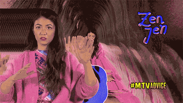
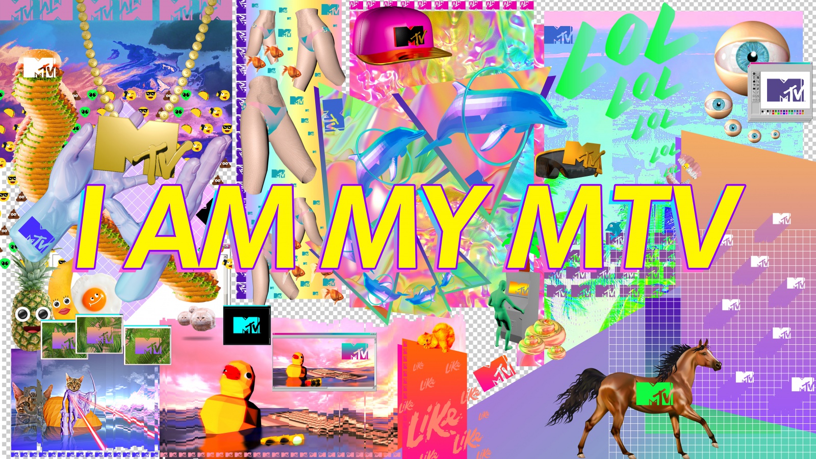
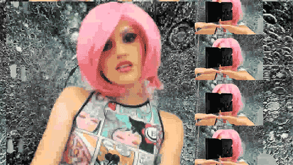
Entirely maximal, thoroughly anarchic, pretty weird and ultimately very, very fun is probably the best way to describe the aesthetic Turley brought to MTV when he and his team set about transforming its look and feel. His rapid-fire. scattergun way of mixing and remixing peculiar pop-cultural icons, memes, Tumblr-like content and anything else that happened to look cool was brought to the fore and mashed right up. At the launch of the new branding in June 2015, MTV described the new look as “louder, shorter and hyper-visual”. A big change was the slogan, shifting from “I want my MTV,” to “I am my MTV” in a bid to signal its new commitment to audiences and user-generated, responsive content.
Underpinning Turley and the MTV team’s design work for the brand was a drive towards playing up the sort of thing that underpins the internet as we know it: weird user-generated content. Among his initial moves at the channel was creating reactive TV idents that responded in real time to current events and live social media conversations; as well as encouraging viewers to send in their own artwork for use across dents and stings.
“We knew adopting familiar aesthetics of youthful expression (think laser cats or comic sans) wouldn’t work”
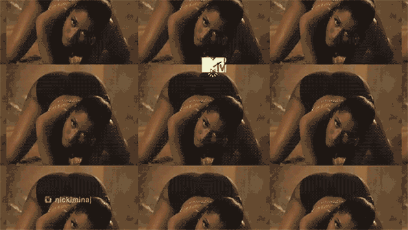
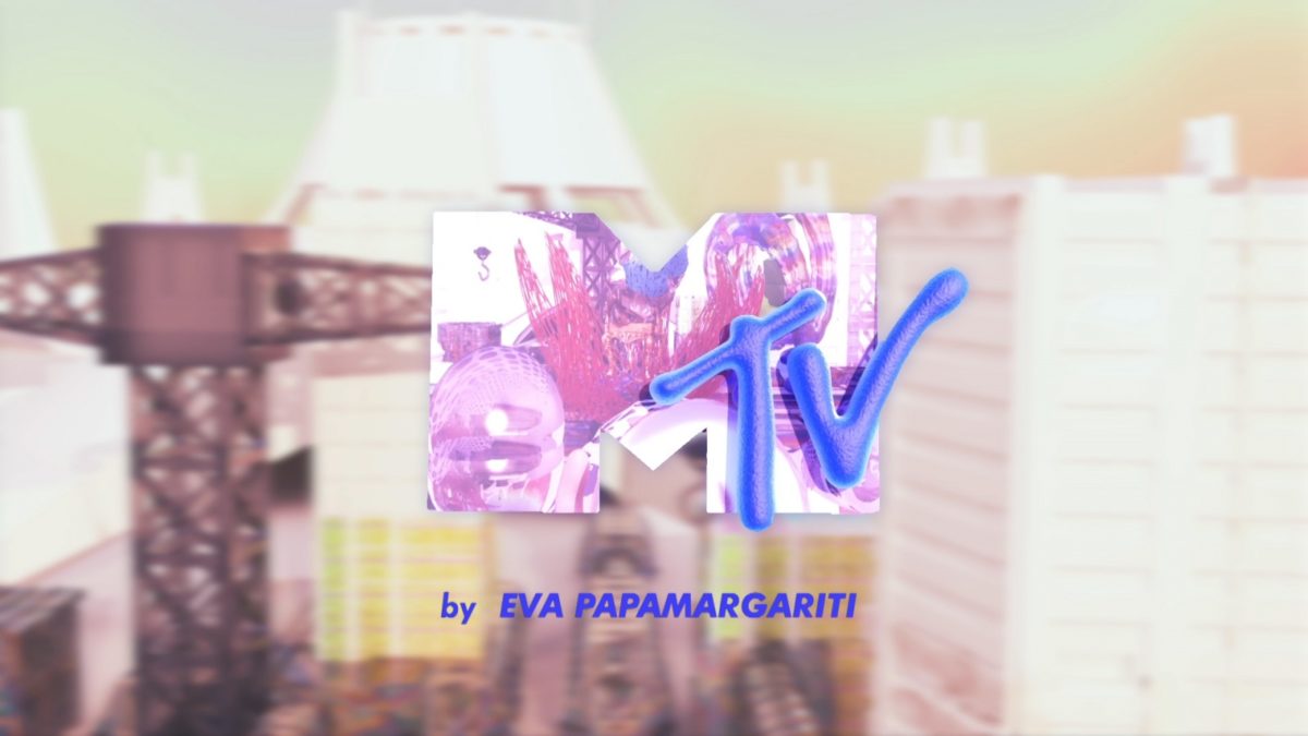
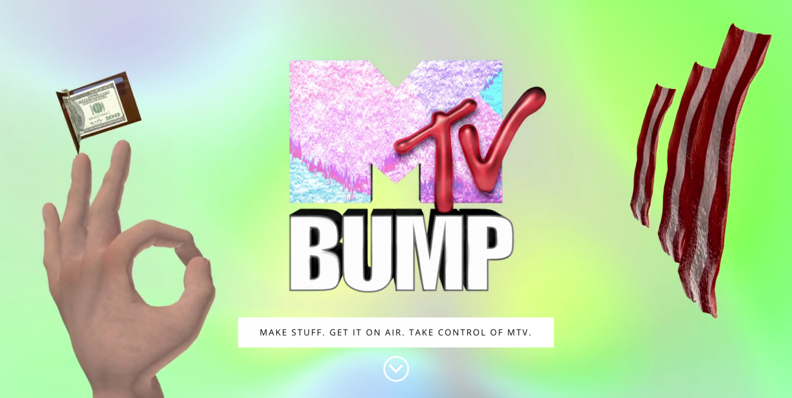
Around the launch of the rebrand, the MTV team worked with B-Reel Creative to allow people to upload their own visuals through Instagram and Vine (RIP) using the #MTVbump hashtag, which might be shown on-air in as little as two hours. This “amateur” content rubbed shoulders with visuals commissioned out to artists including Thomas de Rijk, Device, Johnny Woods and Eva Papamargariti—according to MTV, this was to build on the channel’s legacy of “introducing its audience to video art, including early work from Keith Haring, Jean-Michel Basquiat, Spike Jonze, Kenny Scharf and Doug Aitken, as well as Andy Warhol’s 15 Minutes.”
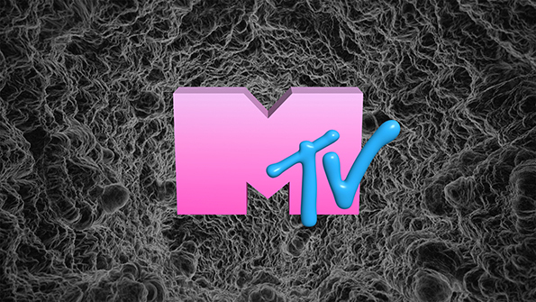
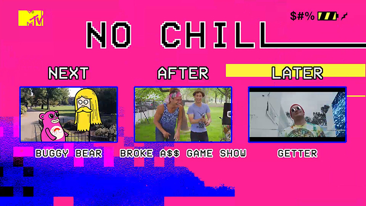
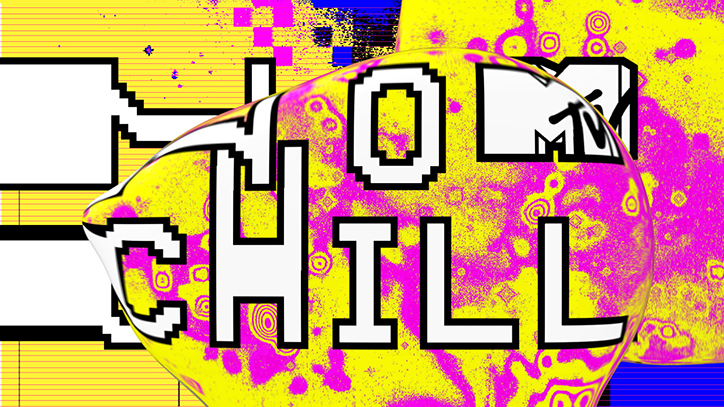
Prior to the launch of the new branding across more than 160 countries across the world, Turley had already been hard at work on projects including a new 3D logo, 300 animated backgrounds and a set of brand emojis for MTV Always On, as well as designs for MTV No Chill, which he described as being part of his efforts to channel the energy of “youthful rebellion” into television. Turley told It’s Nice That the idea was for No Chill to “reflect its irreverent attitude: unruly, unhinged with multiple voices and visual points of view,” and to test the limits of MTV. “We knew adopting familiar aesthetics of youthful expression (think laser cats or comic sans) wouldn’t work,” he added, describing deliberately eschewing art direction in favour of a more experimental approach. “The cacophony could only come from… unexpected combinations and happy accidents.”
As anyone who’s ever been on Twitter won’t be surprised to learn, people didn’t hold back on their opinions of the new MTV branding: responses ranged from comparing it to being “being eyefucked by bullshit” and making “tumblr look like MoMA” to “fucked up in a good way!”
It’s pretty likely that this sort of response was exactly what the design team was aiming for. MTV’s sudden return to youthful, brash insouciance was a rapid departure for a channel that had perhaps become a little staid since its wild and utterly fitting look launched the channel in the early 1980s, with designs by the legendary ad man George Lois—the man who came up with the “I want my MTV!” campaign that lasted more than thirty years. It’s worth remembering that, back then, there was nothing else like it: 24-hour music video channels had never been done before, and in a precursor of sorts to the likes of AdultSwim today, it spearheaded some risqué but hilarious animated series, such as Beavis and Butt-Head.
“Sometimes it would be this bad grungy typography, or weird chopped-up editing…typographic gymnastics, eclecticism, combining bad fonts that don’t work together”
As Jeffrey Keyton, design director at MTV, told AIGA, in those early days “There was art for art’s sake…in some ways MTV was like YouTube before YouTube back then…” He added there was “a lot of cheesy TV graphics, a lot of stereotypes of what [MTV] was supposed to be about. Sometimes it would be this bad grungy typography, or weird chopped-up editing. Probably more typographic gymnastics, eclecticism, combining bad fonts that don’t work together.” Peyton set about cleaning the whole thing up in 2013, only for Turley and his team to fuck it right back up again, and brilliantly so, just a couple of years later.
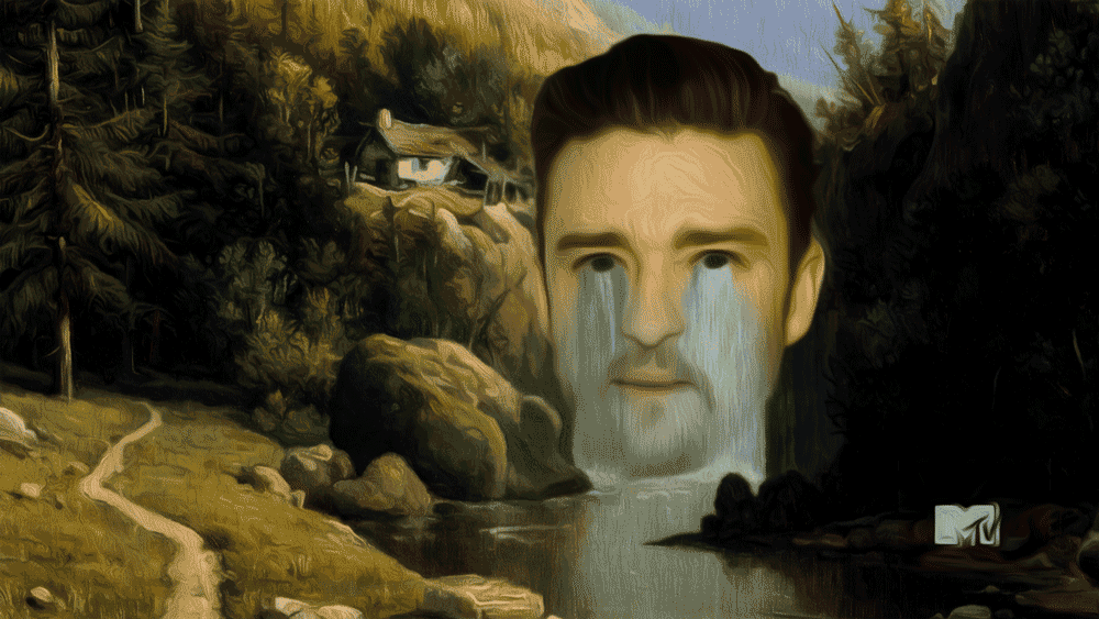
Though some surmised that the channel was trying a little too hard (coming across like that Steve Buscemi “How Do You Do, Fellow Kids?” meme in TV form), the 2015 redesign was undoubtedly savvy, witty and smart. It distilled the then-burgeoning “ugly design” graphics trend that was popping up everywhere, and took it to its ultimate, in-your-face, commercial conclusion. Hell yeah, it’s a clusterfuck, a cacophony; but you can’t argue with platforming young creatives on a global TV network. Nor can you argue with somehow making that GIF of Justin Timberlake’s face, literally crying a river, a legitimate part of your brand strategy.