Art gallery websites have never been more visible than in lockdown. Their design, it follows, has never been more crucial to sell work, encourage digital “footfall” and reassure people that a public gallery is still very much “open”. Ease of navigation and clarity, as well as how nice it is to look at, all count. While a flurry of Covid-catalysed innovations like VR viewing tools, live streamed videos and high-definition walkthroughs have emerged, ultimately, a gallery’s website is still our most prominent tool in engaging with it.
Although gallery spaces are now eerily quiet, art-focused digital design studio Artlogic has never been busier—seeing a more than fourfold increase in sales of its designs. These are often pre-made templates created by the agency, according to David Castle, head of Artlogic websites. He’s seen commercial galleries rapidly jolted into a new understanding of the importance of their online presence, beyond something akin to a brochure or “vehicle” to direct people to the physical site.
“Where other sectors like high street shops have taken online seriously for years, it’s taken a very long time for many galleries to pick up the pace,” says Artlogic director of design and web development, Tom Brickman. “There’s been a slight pushback to the online experience.”
The reluctance of commercial galleries to innovate could be put down to a number of things. Namely, an “if it ain’t broke” mentality from more traditional commercial galleries, and an undeniable glamour to that rather air-kiss-heavy, wining-and-dining mode of dealing in art that’s all about IRL schmoozing. It all amounts to an aura that could seemingly never be matched by faceless digital shopping carts, but crisp white walls and a swanky Mayfair postcode have suddenly become strangely desolate and ultimately redundant.
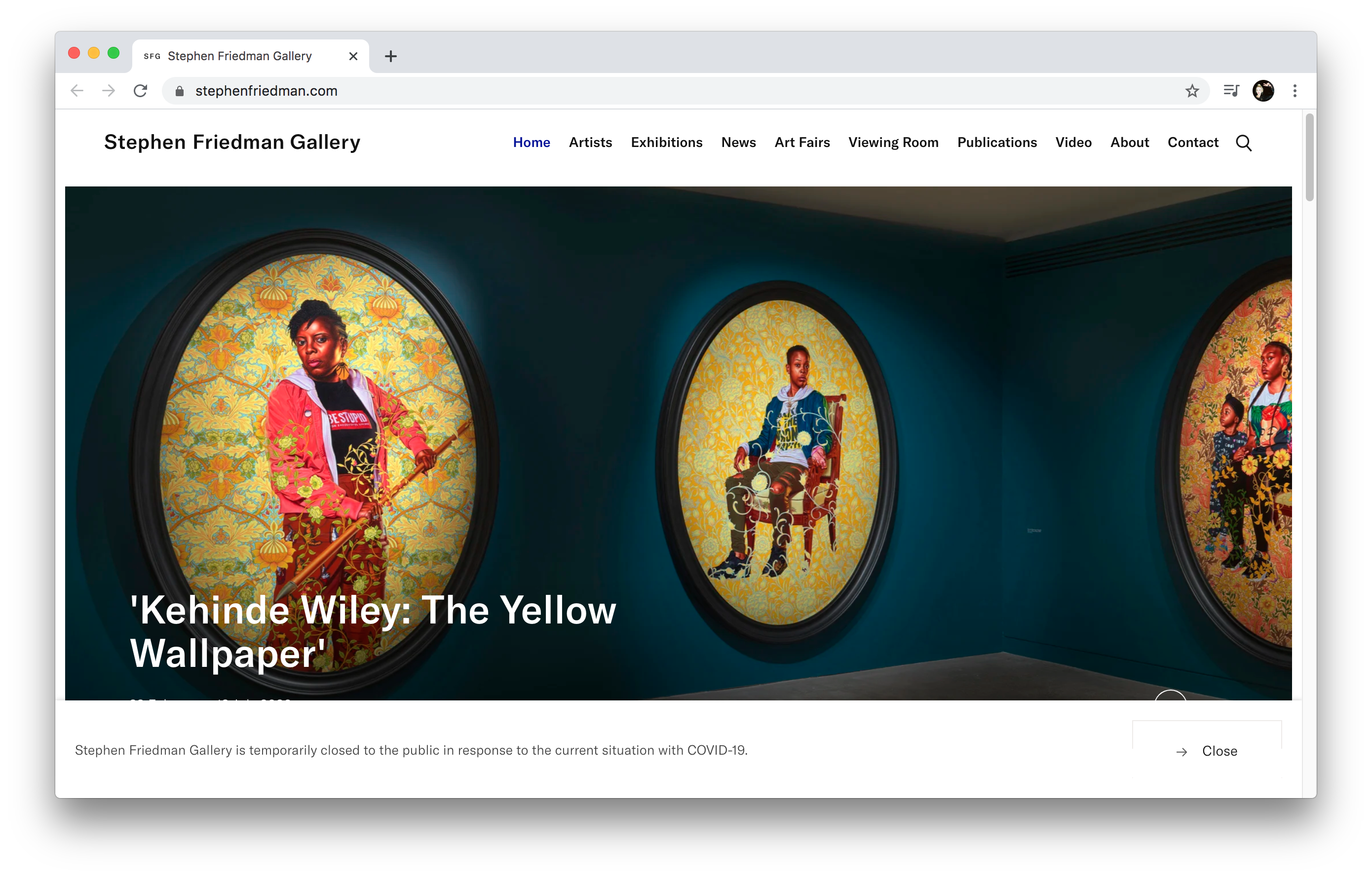
Artlogic’s work focuses on commercial gallery clients, such as Simon Lee Gallery, Marian Goodman Gallery, Michael Hoppen Gallery and Stephen Friedman Gallery. For Stephen Friedman, they recently created a comprehensive new design, including an online viewing room in response to lockdown. But as anyone who spends a lot of time thinking about art and art galleries will attest, such accoutrements aren’t exactly a rarity now—you can barely move online for woozy digital walkthroughs, chatter about acronyms like AR, VR or 360-degree artwork views. So what’s the key to yet another white cube space standing out?
“When you’re looking at art, often the value is in the story—who that artist is and what they do. People want to know the background”
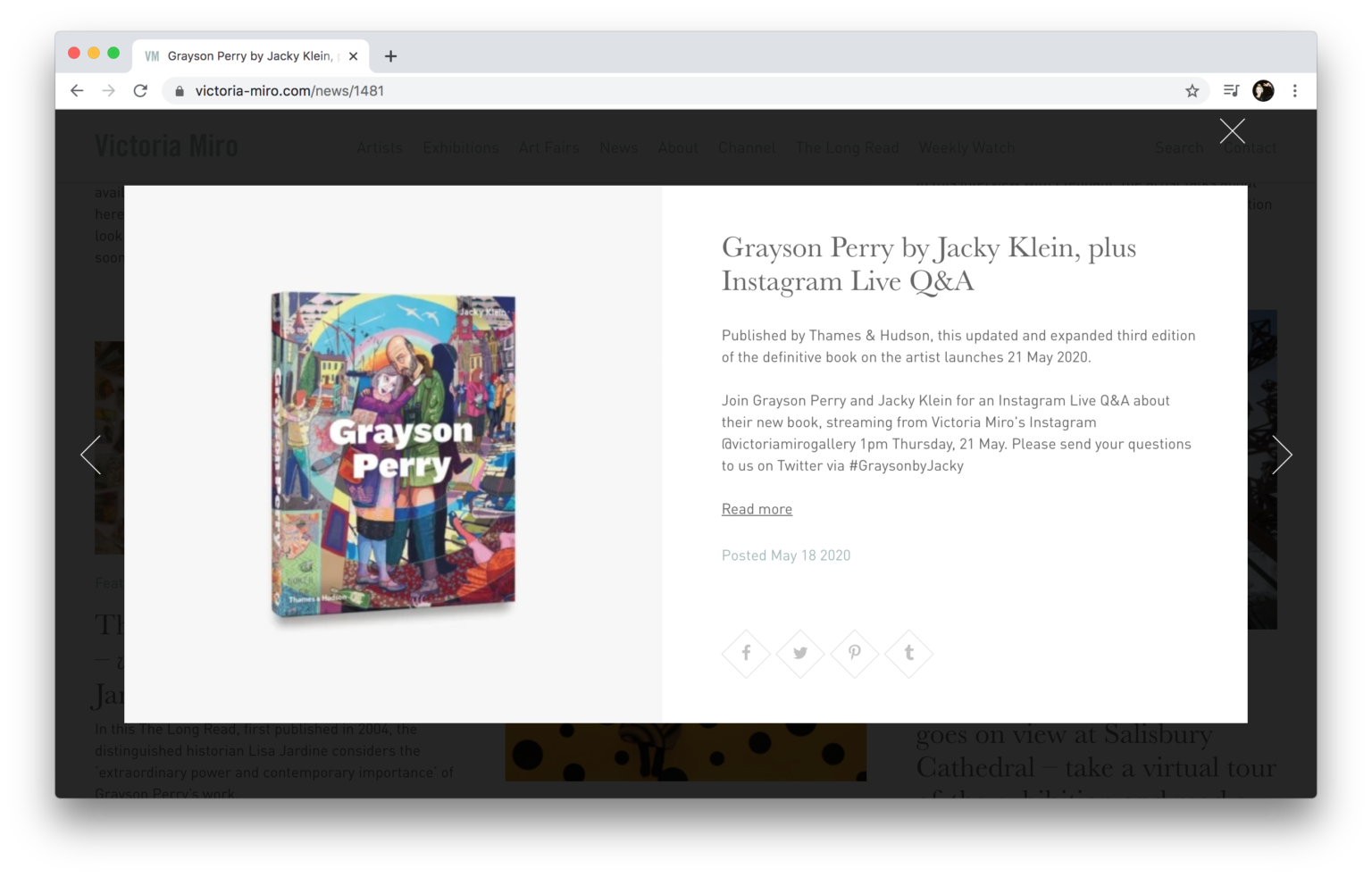
According to Brickman, it’s all about the stories, and the people behind the art—not so different, then, from the traditional person-to-person mode of dealing. In website terms, this means a more “editorial” approach. Citing Artlogic’s work with Victoria Miro gallery, he says that taking an editorial approach that prioritises “content” such as text-heavy news pieces and videos has been invaluable. “When you’re looking at art, often the value is in the story and creating a narrative—who that artist is and what they do. People want to know the background. Ultimately the website is about selling a product, and editorial tangibly results in sales.”
The world of art sales and commercial concerns are entirely different to those faced by non-profit spaces; those devoted to emerging artists; and public attraction sites such as Tate Modern, which rely on footfall figures, inclusivity and accessibility to secure funding.
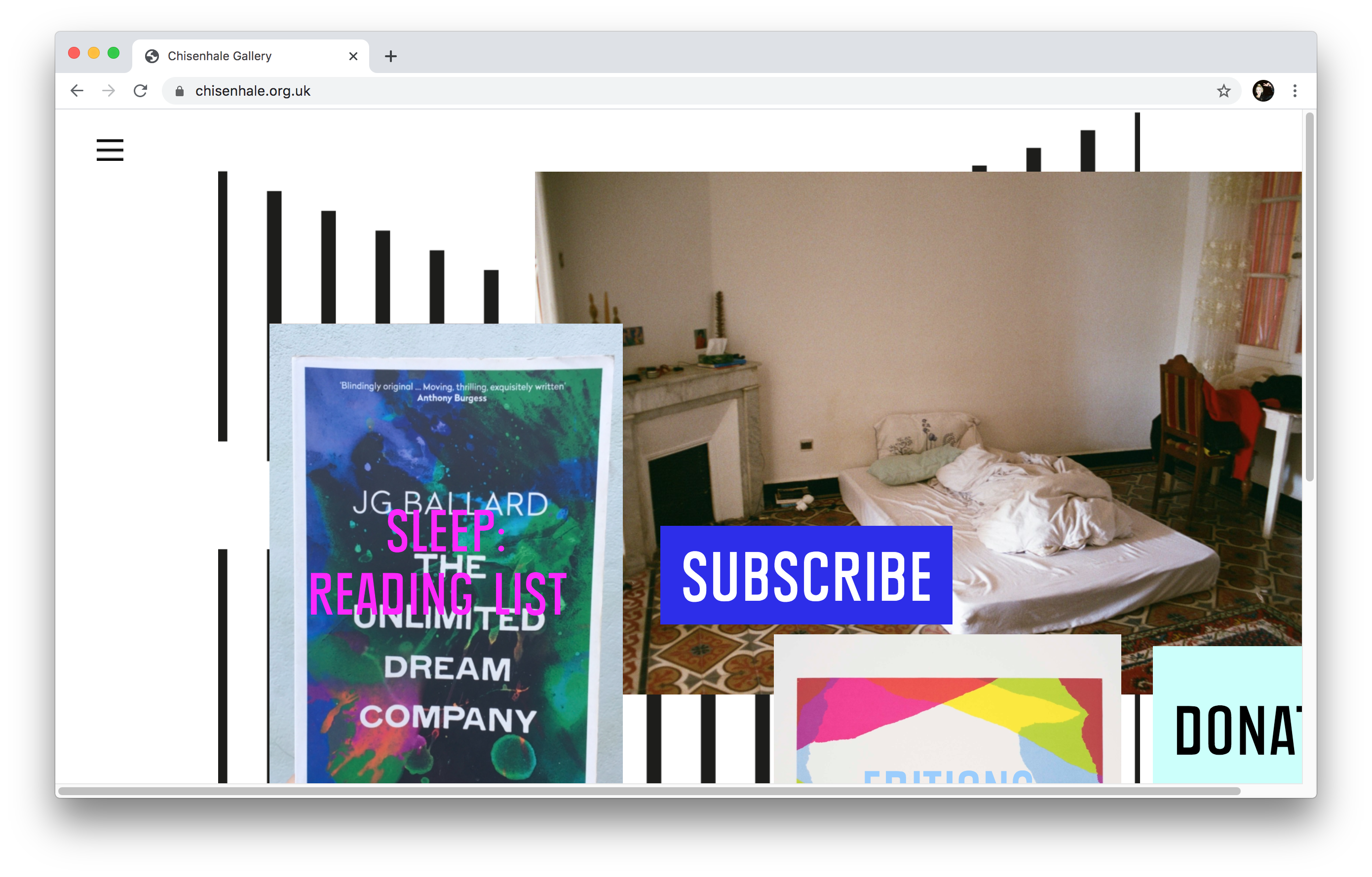
Sitting at an unusual place in the continuum from swanky sales room to vast cultural landmark is East London’s Chisenhale gallery. Its smart site design by Studio Frith mixes a dynamic, colourful homepage with incredibly easy navigation and a whole lot of information. It refreshingly bucks the trend for digital design minimalism, which can become boring at best and useless at worst.
Founder Frith Kerr says that the entire design identity strategy for the Chisenhale is rooted in two main concepts: the first being the uniqueness of the space itself, a former veneer wood panelling factory, and how that idea of veneer somehow reflects the curatorial approach.
- Chisenhale Gallery website, designed by Studio Frith
- Chisenhale Gallery website, designed by Studio Frith
“One of the key things about Chisenhale is its multi-platform way of thinking about art though all sorts of different strands, so we took the principle of the veneer to create an identity and typeface that’s also layered,” Kerr explains. The physical idea of layering informed the homepage’s use of flexible poster-like images, which act as marketing tools for new shows as well as practical information. “It gave them a really strong voice, and also then made space for the art itself so that there wasn’t any sort of conflict,” says Kerr.
This idea is offset with playful, attitudinal sensibilities rooted the other main conceptual starting point for Chisenhale’s designs—the gallery’s uncanny ability to spot earlier career artists on the brink of very big things (Rachel Whiteread and Wolfgang Tillmans for instance; and, in 2012 alone, Helen Marten, Benedict Drew, Lynette Yiadom-Boakye, Ed Atkins and Eddie Peake.)
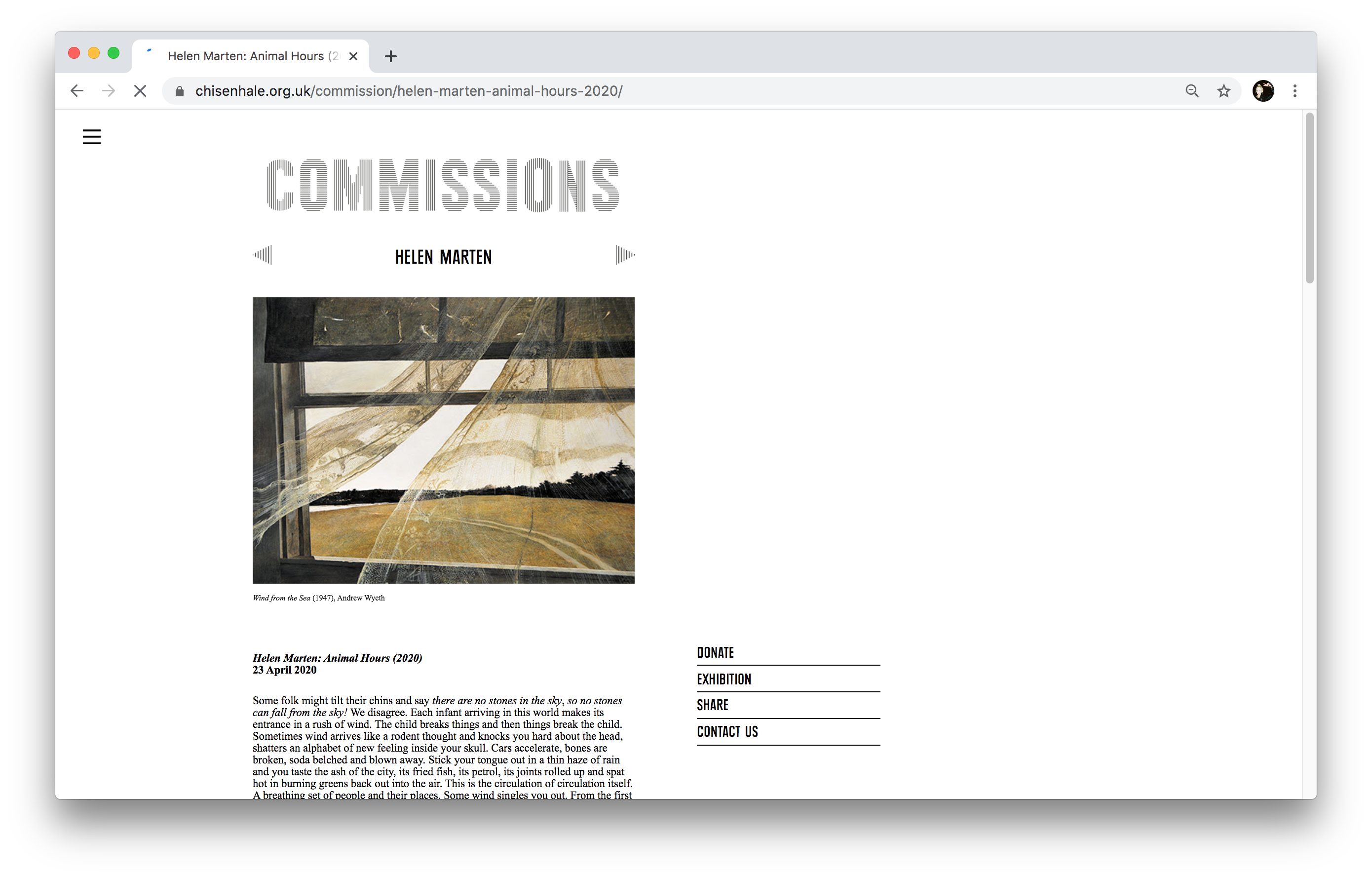
“The website is a window to these artists that soon go on to international repute,” says Kerr. “It’s about the incredible work being commissioned specifically for the gallery’s physical space, but it wasn’t meant to mimic or recreate it. It also doesn’t behave like a commercial gallery with commercial concerns—it’s about giving young artists a platform on an international level.”
“The website is a window to these artists that soon go on to international repute”
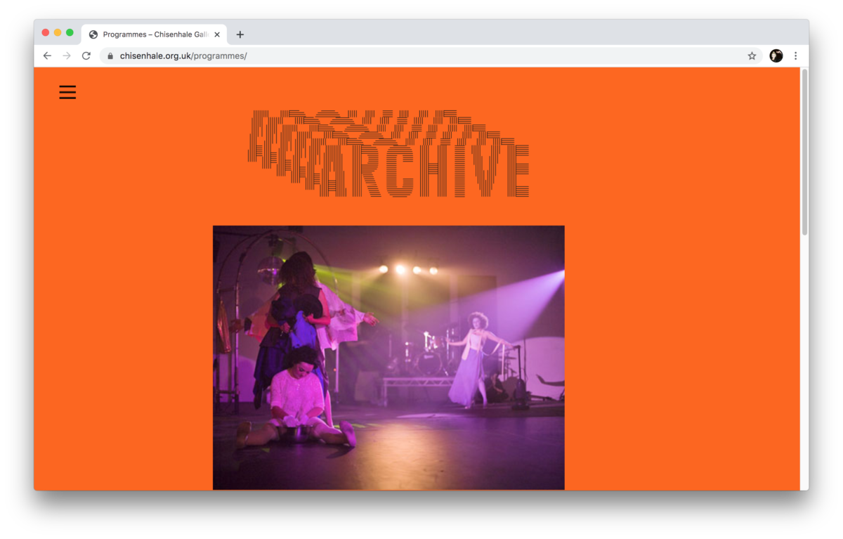
One of the site’s key design considerations was the realization that many would only experience Chisenhale online, so it had to “express and mirror the energy and the art you’d experience if you did visit,” as Kerr puts it. The site also hosts photographic documentation of the gallery’s always-packed show openings to give a sense of its community feel. As such, there’s not only information on current shows but a comprehensive list of past commissions and additional artist texts, videos, imagery and sound pieces to make the site a superbly clear and helpful resource. This is vital to its frequent work with schools and other outreach programmes.
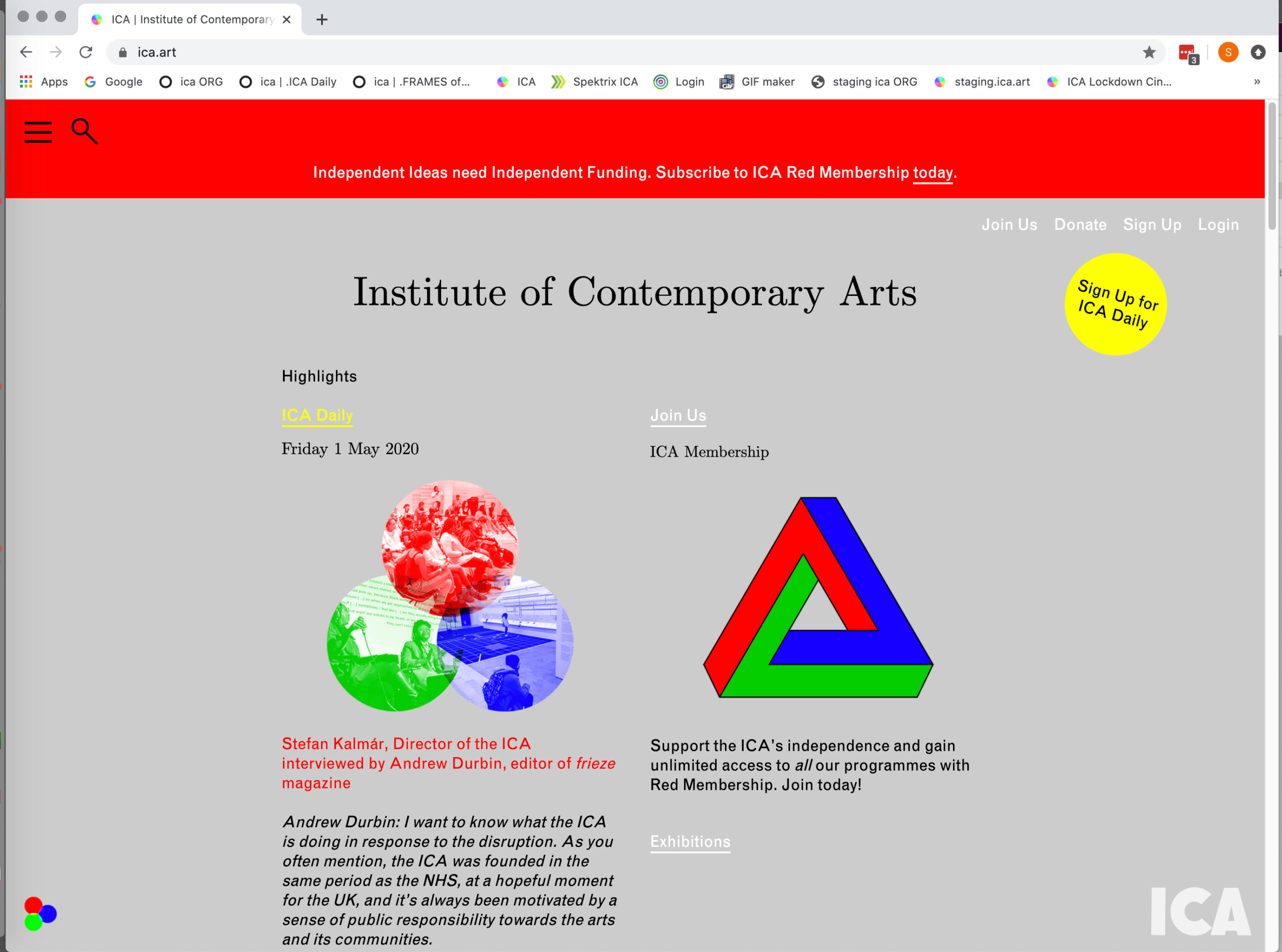
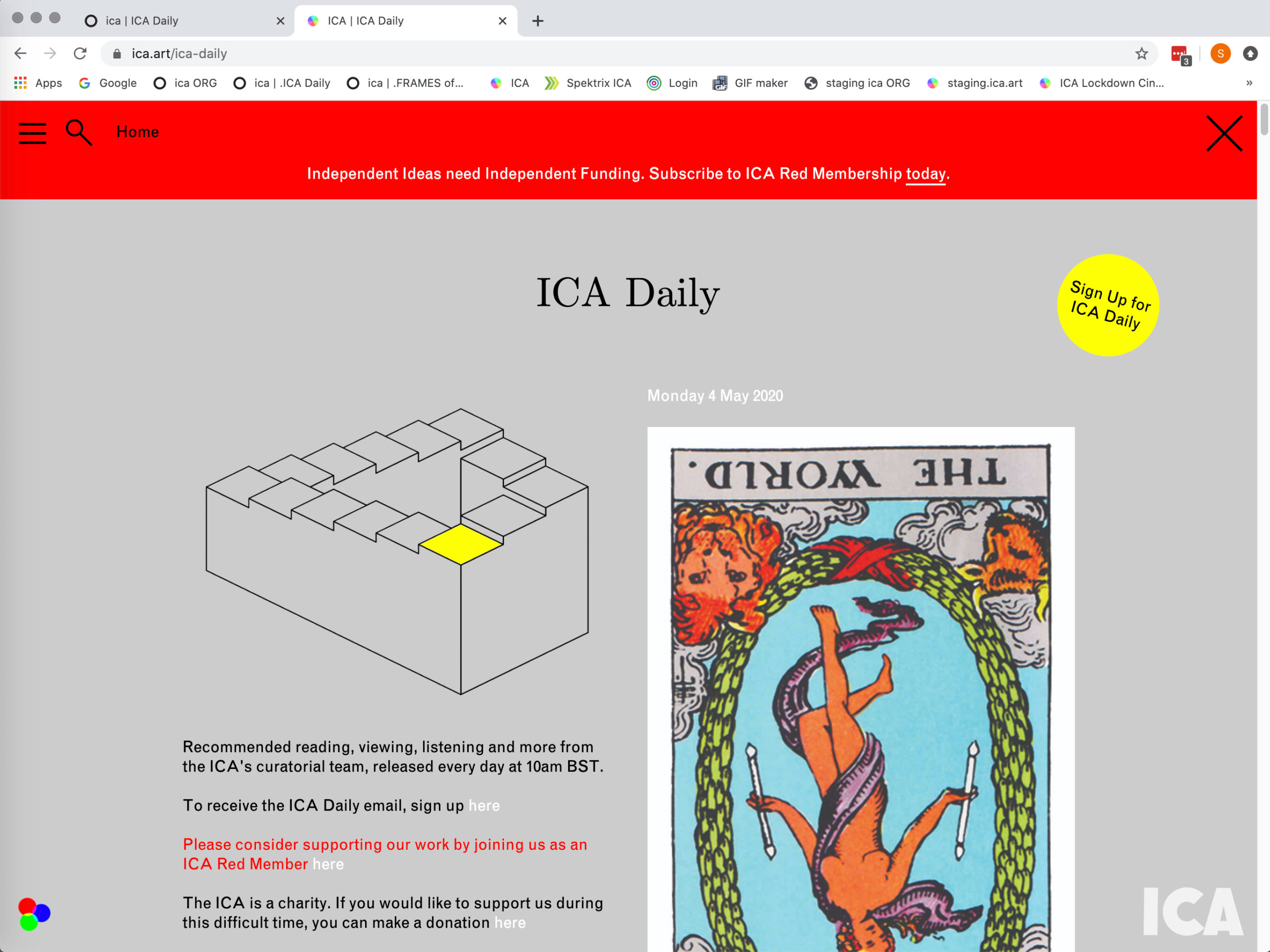
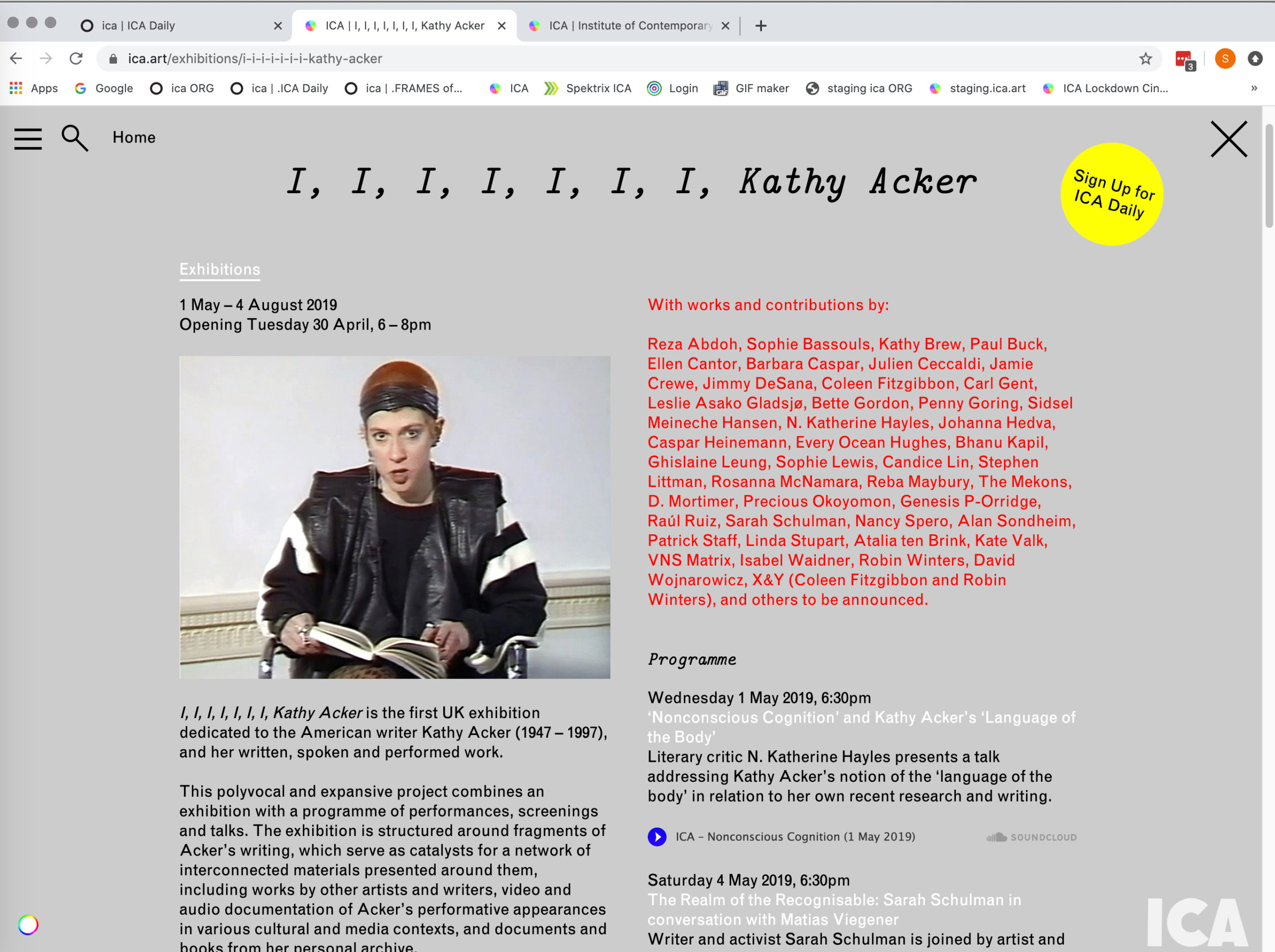
London’s Institute of Contemporary Arts is another institution that has to juggle numerous considerations in how it communicates, and who it speaks to. “It’s a very complex place; so in terms of site design, it makes it equally complex because there’s so many competing strands of programming: the exhibitions, live events, talks program—but you’ve also got a fully functioning cinema, the Rochelle canteen, the bookstore and things like that,” says ICA head of design Stuart Bertolotti‑Bailey.
The expansive cinema programme means automation and a reliable ticketing sales platform are vital for the site’s functionality. “All that sounds fairly boring and technical, but it has a huge influence on what the site has to do, what it looks like and how it works,” he says.
The current ICA website was launched alongside the institution’s design overhaul in 2016, ushered in when Stefan Kalmár joined as director. “Everything went back to basics, including the logo, the signage, typefaces, and of course the website,” says Bertolotti‑Bailey. The key ingredients of the design are “emphatic use of red, green, and blue,”—the “digital primary colours,” as the designer puts it—on top of a uniform grey background.
The site uses fonts Monotype Grotesque and CMU Serif (or Computer Modern), which is used extensively by the likes of scientists and mathematicians. “It looks completely neutral—sort of anonymous but emphatically academic,” says Bertolotti‑Bailey. “We definitely wanted to avoid anything looking like a ‘graphic design’ sort of ‘identity’. We wanted to step outside of looking contemporary and create something more authoritative and traditional.”
“We wanted to avoid anything looking like a ‘graphic design’ sort of ‘identity’—to step outside of looking contemporary”
The ICA site was created to act “as a kind of app”, based on a calendar function that dictates the whole structure of the website. Bertolotti‑Bailey laments, “The funny thing is, you can’t see this now, because we’ve turned the calendar function off now that we live outside time.”
The Chisenhale site’s bold use of Times New Roman—the system font we all love to hate—makes for clarity and confidence, especially next to the more experimental bespoke line-based Chisenhale brand type. “We’ve always enjoyed playing with those conversations between typefaces,” says Kerr. “That really connected with how Chisenhale’s artists work: some of them work in a really cheap digital space, others are creating physical objects. It felt like it had the right sort of synergy with what was being shown, and was also being very practical and accessible.”
It seems clear that for commercial, mid-sized and vast public galleries alike, the way lockdown has propelled galleries to rethink their site designs and digital presence will have far-reaching, long-term legacies. There’s an entire new thinking around how such spaces complement and augment their physical counterparts, and their interactions with visitors.
The ICA’s daily email newsletter, introduced in response to lockdown brings together a set of recommendations from staff, with regular artist curatorial takeovers, and is “fundamentally different to any of the resources we’ve offered before,” says Bertolotti‑Bailey. “We might develop some sort of video streaming function that lives in a new space on the website.”
Commercial galleries being forced into embracing e-commerce functionality has meant a rapid move towards them “taking the online space seriously” in ways they weren’t before, according to Artlogic’s Tom Brickman. “What’s changing now will hopefully mean we’ll end up with galleries treating their website as if it were a second or third physical space.”
More broadly, lockdown has meant that everyone has had to significantly change the ways in which they live their lives. From who they share a home with, and managing those newly intensified relationships, to now-ubiquitous Zoom chats, to how we manage work and money, and fundamentally, what’s important to us when our choices are suddenly far more limited than they’ve ever been.
Covid-19 singularly stripped all our lives of a level of physicality. While it’s clear that a wave is no substitute for a hug, another consequence of our new distance-restricted interactions with the world might also mean we engage with physical artworks in an entirely new light once lockdown is fully lifted.
“We’ll end up with galleries treating their website as if it were a second or third physical space”
Frith Kerr suggests that the first “real” show she sees post-lockdown will feel far more intense than it might have before—that our senses will be heightened and that the “experience will become far more precious. In another positive take on the virus, she says that the way we’re now seeing artists communicate digitally has been imbued with a “sense of urgency that feels very alive— the immediacy is really wonderful.”
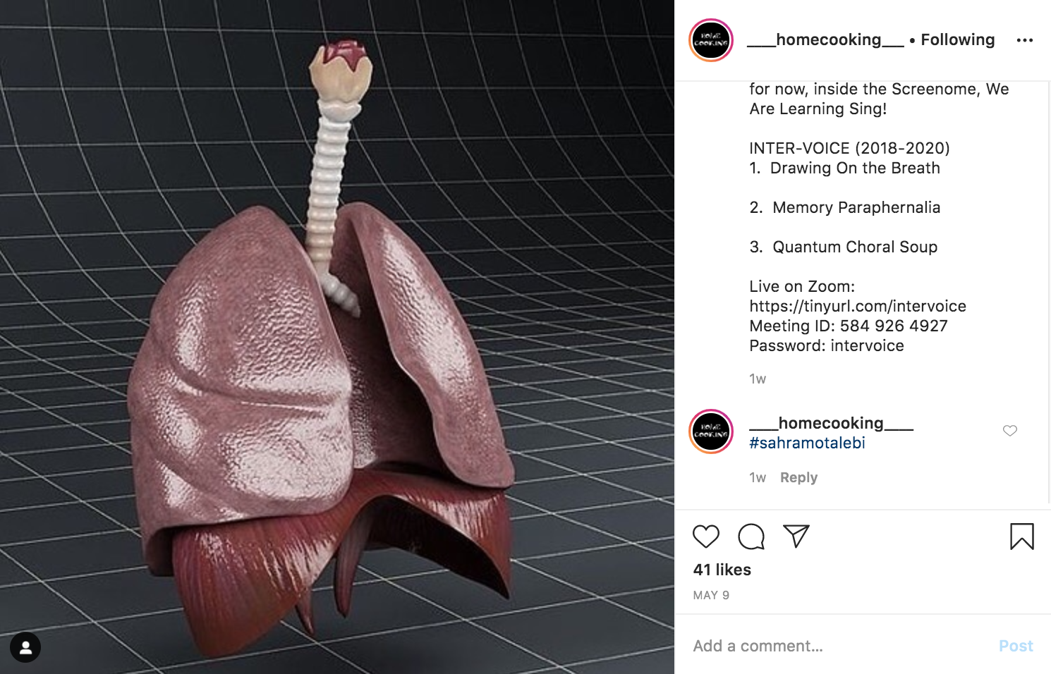
She makes reference to the artist collective-run Instagram account Home Cooking (@____homecooking____), for instance, billed as “an open-source digest of new activities, poetry, movement and live events”, founded in March 2020. “It doesn’t appear to me to have a formal structure,” says Kerr. “The other day I was looking and it had a live feed: I was on the top of a mountain with these three Alsatian dogs… I thought, ‘I don’t know what this is, I don’t know who this is’; but it was a kind of extraordinary source of time travel. And that’s what artists do—make a portal to another world.”