Typography confounds. To understand it better, I head out to talk to type designers who are well known for achieving something akin to perfection in their field. I wanted to speak to the fonts / founts of all wisdom, as it were: Anthony Sheret and Edd Harrington of London and LA-based Colophon Foundry / The Entente; Peter Bil’ak of Typotheque, a Dutch-based type foundry; and Kristyan Sarkis of TPTQ Arabic, which he co-founded with Bil’ak in 2009.
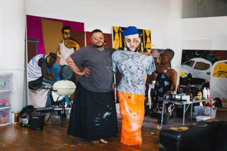
I begin by visiting Sheret and Harrington in their Hackney studio, where the pair, a long-standing type and graphic design double act, ponder my question about type design and perfection. Sheret defines the role of a type designer in loose and humble terms as “a collaborator who makes a tool and passes it on to another collaborator” while Harrington states: “I think a lot of people see type design as very research-driven. I actually think that type design now is more akin to fashion. There are new things that are going on. Certain voices during a period of time may not be relevant in five to ten years. It’s always linked to time.”
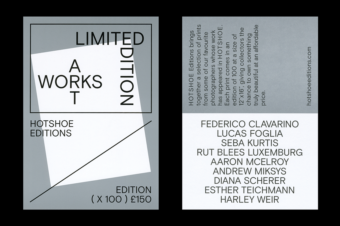
Their own work is timely—extensive work for Google mixes with that for photography magazine du jour HotShoe, while self-initiated projects like Montefiore see the pair doffing their caps to fashionably resurgent British type design heroine Margaret Calvert.
Harrington and Sheret both refer to type as “having a voice” and feel that perfection is a fleeting quality. “You get it to a perfect point but then you look back on it after a year, or six months, and inevitably it no longer seems perfect. Taste changes,” notes Harrington.
“When you think of perfection you naturally fall into these notions that a project’s success, particularly in graphic design and type design, is all down to timing,” says Sheret. “In terms of commercial work your work exists within a time frame. If it’s for a magazine the print period is within the year, if it’s for an identity it’s for a larger piece of time, if it’s for a book it’s for a larger piece of time than that, whereas art or photography exists, theoretically, perpetually.”
Is type design a good vehicle for a discussion of perfection?
“I don’t see perfection, I see purity,” says Harrington. “I think purity in my head is linked to mathematics. It could be a scribble but if it’s balanced, the sum of the parts aligned, I see purity and wholesomeness. I see this ‘perfection’ in what other people do.”
“Perfection always sounds so restraining, it’s not something you start with,” says Peter Bil’ak when I talk to him. “Beauty is something that interests me, beauty is something that is guided by convention, but at the same time it escapes convention, it’s both. I think many people agree on what is beautiful, but at the same time you never describe it because it escapes the traditional definition.”
“Karloff was a project that started by looking at what historically have been perceived as the most beautiful examples of typography”
Bil’ak mentions a recent type project entitled Karloff (named after the British horror actor) in which he played the part of the Dr Frankenstein of type design by welding together well-known ugly and beautiful pieces of type to create a “monstrous” typeface. “Karloff was a project that started by looking at what historically have been perceived as the most beautiful examples of typography, high-contrast typefaces created by Giambattista Bodoni and the Didot family. Bodoni laid down four principles of type design [‘from which all beauty would seem to proceed’, namely: regularity, clarity, good taste, and charm].
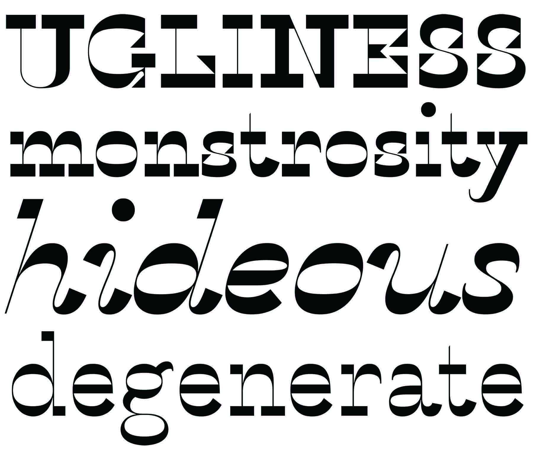
Around the same time there was one of the best examples of the ugliest: Italian, made in England in the 1820s, which was deliberately ugly, perverse, really provocative, in order to grab people’s attention. Karloff is the result, mixing the modern type of Bodoni and Didot with the monstrous Italians.”
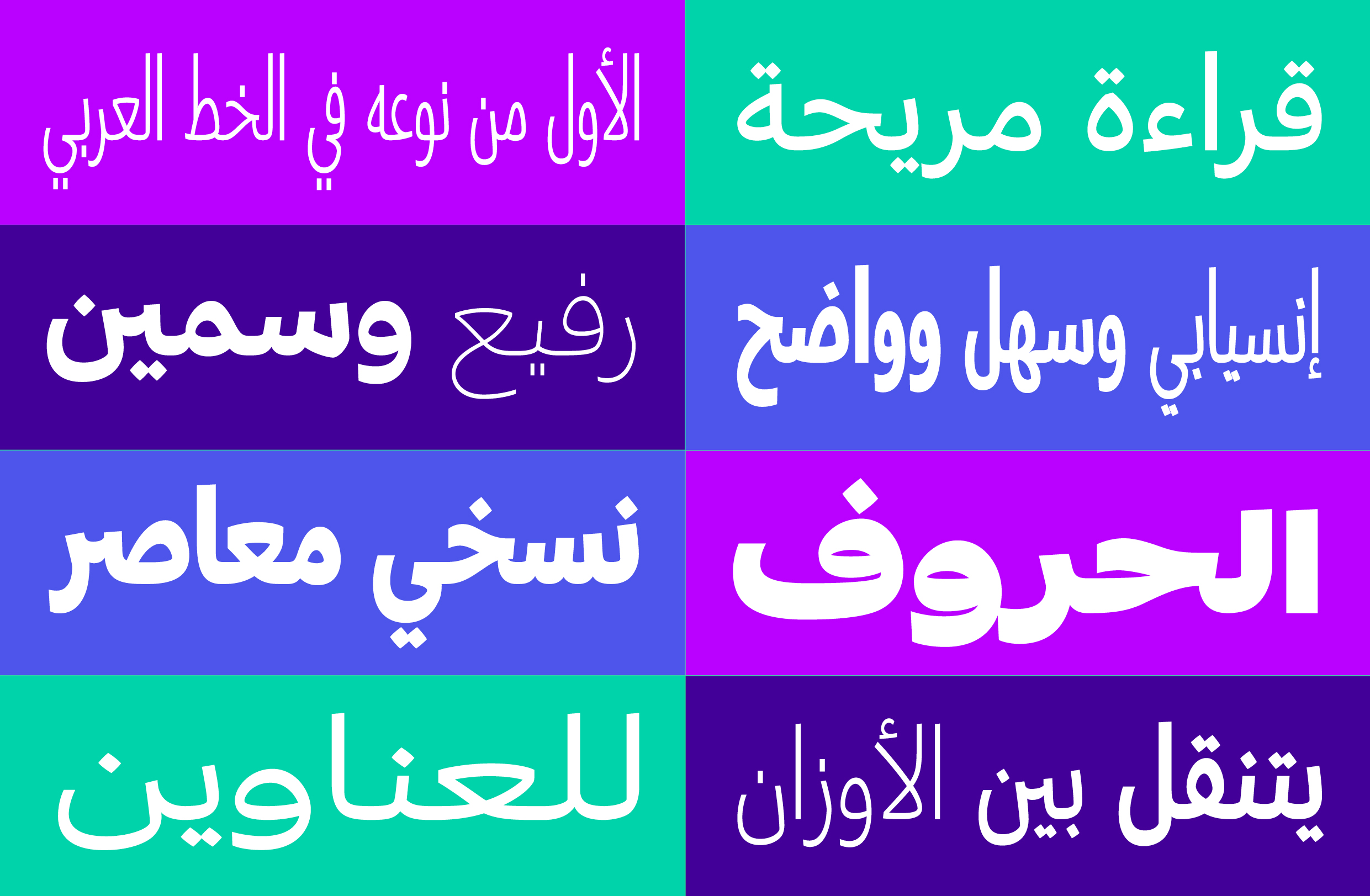
Bil’ak puts me in touch with his co-founding partner at TPTQ Arabic, Kristyan Sarkis, a graphic and type designer from Lebanon now based in the Netherlands. “First of all, in Islamic culture as a whole, the written word has been given a great importance, in that it represents the word of God,” Sarkis explains. He then goes on to note the role of traditional Arabic calligraphy and its relevance to typography, and observes of the current situation: “We don’t really have a big collection of Arab fonts digitally and fonts that reflect contemporary identity. There are fonts, but not by people with knowledge or education, and this is sadly increasing.” If you select an “Arabic” typeface on your computer you will probably get Baghdad, a pastiche of appropriated aesthetics.
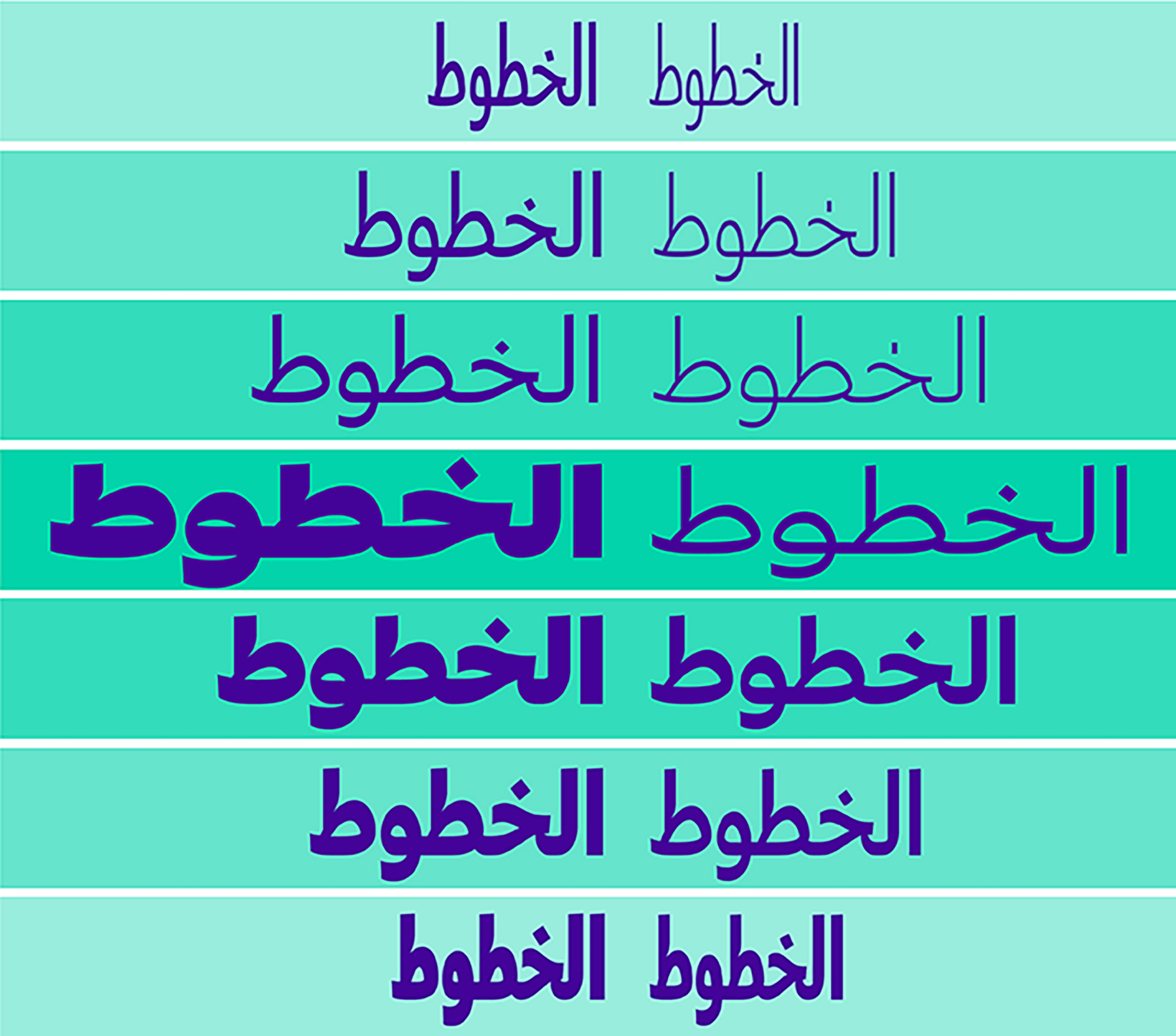
“Currently one of most popular trends is forcing Arabic script to look like Latin script,” observes Sarkis. “That’s something I don’t do. My work is not classical by any means. It depends on the project: some of them need to be more classical, some of them need to be super-contemporary, with a type system of forty different fonts, exploring weights with compressed versions. This is something very new to Arabic type and has never been done before.”
“Type designers spend a lot of time looking at tiny details to get them right, moving their construction one point up and one point down, and I think this is closely related to perfection”
Misplaced and mismatched type design is cartoonish, a mockery?
“Exactly!” says Sarkis. “Those ‘Arabian’ Latin typefaces are a parody, so in that sense this is the only situation where I think something needs to be done, and this, unfortunately, is very common.”
Does Sarkis see perfection in what he does?
“Not necessarily, no. I somehow taught myself to know that everything has an end, it has to have an end point and the end does not necessarily need to be perfect. Nothing would be perfect, I’d come back to it the next week or the week after and I’d see mistakes and so on and that is part of the process.”
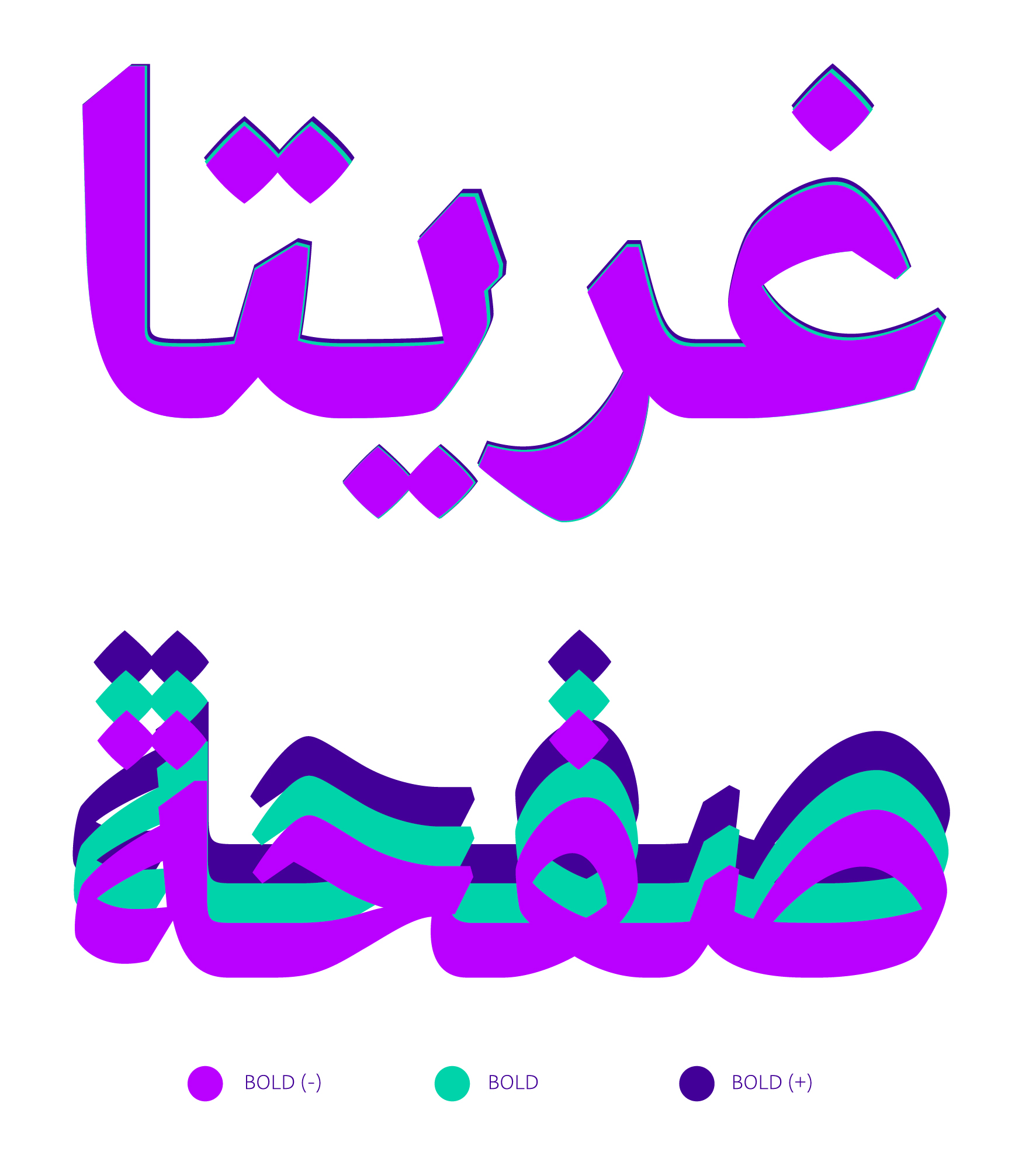
Greta Arabic, concept by Peter Bi’lak, 2012. Designed by Kristyan Sarkis and published in 2015, TPTQ Arabic
We discuss the question of time versus perfection. “Type is like software,” Sarkis explains. “All software needs to be updated. Sometimes this is a reflection of the development of the designer, so if the modification is needed—if the designer feels compelled to change it—then so be it.” Echoing Bil’ak, Harrington and Sheret on ideas of craft and perfection, he states: “Type designers spend a lot of time looking at tiny details to get them right, moving their construction one point up and one point down, and I think this is closely related to perfection, the attention to detail is there.”
Sheret takes a pragmatic view. “With type design there’s a bit of mystique to it, I guess, for lack of a better word. With clients, for example, they don’t really know so much about it. You can be like, ‘Well, we are doing this for these reasons’, you have to be like, ‘OK, you wouldn’t question a mechanic.’ Interestingly, we found it’s not like that at all in graphic design [where seemingly everyone has an opinion], but in type design you are allowed freer rein.”
Bil’ak offers: “Aiming for the best possible is good enough. Today perfection mainly has negative connotations. Perfectionism is a fear in disguise, it’s just being too worried about results which are out of your control, about feedback that you may receive, being too worried about other things.” Looking at typography as a voice, Bil’ak identifies nuance. “Typography is a representation of language and language is never perfect, and that’s why typography tries to emulate accents in different languages and so it’s hard to find perfection.”
Is perfection an expression of honesty of character?
“Honesty above all,” concludes Sarkis; “honesty and knowledge.” These characteristics of perfection are writ large in typography that gives tone to the words to which it gives visual expression.
This article originally appeared in Issue 32
BUY ISSUE 32