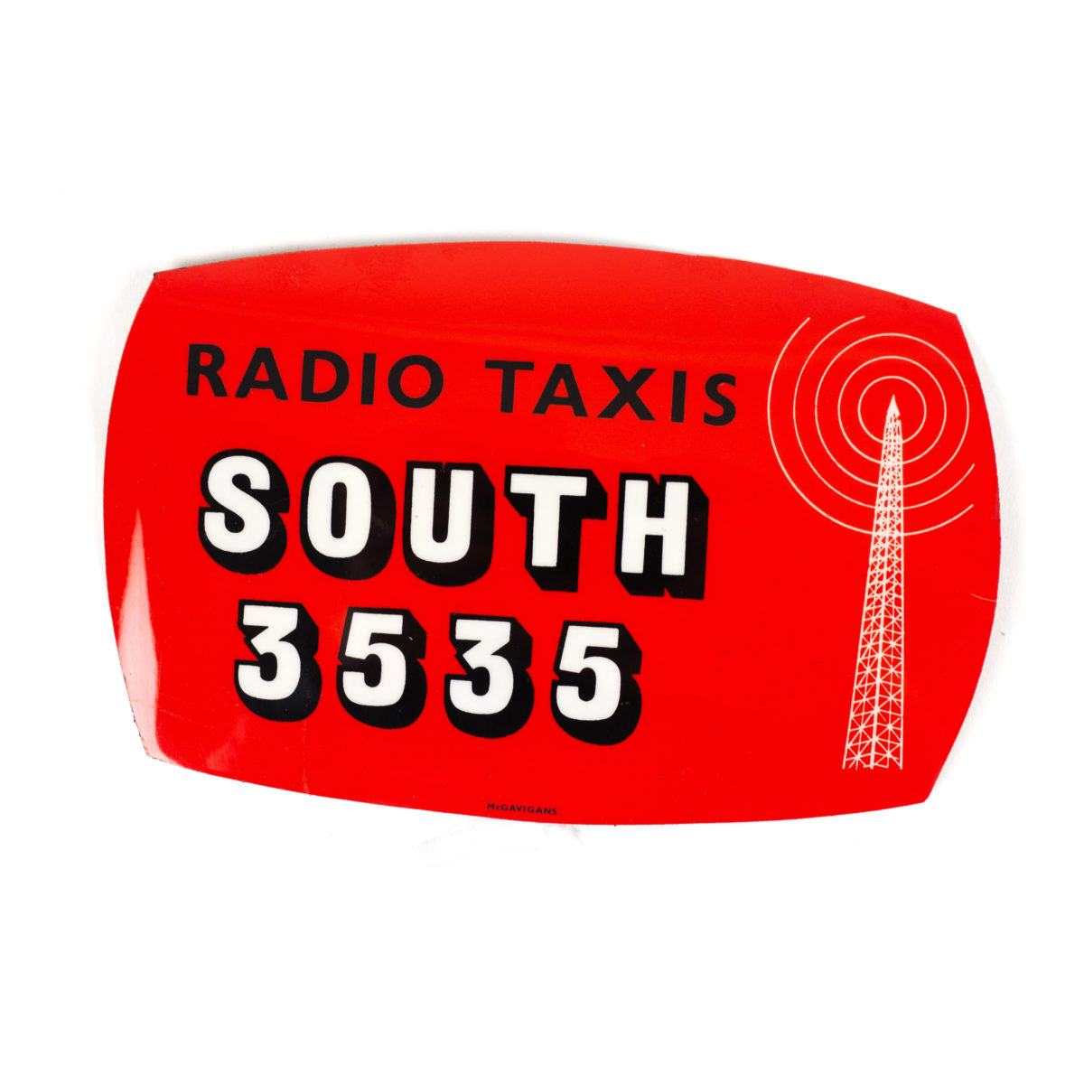
What is Label O’ Love?
Well, as the handle name @labeloflove suggests, these are some labels that are finally getting some love after years, often decades, even half-centuries. These little pieces of graphic design ephemera are the sort of thing that have long had the graphics/packaging/typography crowd going loopy, but which also tap into a collective sense of (often false) nostalgia—a little like, say, a Wes Anderson film, or Christmas, or Vaporwave.
The name is a clever hint at the people behind the project, Glasgow-based graphic design studio O Street; which also has smaller outposts in London and Colorado in the US. Their main account is @ostreetstudio, where you can get a glimpse of their work for clients as varied as Ulster Bank, theatre company Out Of Joint and Glasgow burger joint El Perro Negro; as well as their own very gorgeous, very hip beer branding. O Street describes it as “a peek into design’s industrious past, one sticky logo at a time. It’s a label of love.”
Why should you follow?
If you’ve any interest in graphic design, packaging design, typography, colour theory, or even the nature of how and why we buy things; Label O’Love offers a gentle, no-nonsense and beautifully presented selection of the labels of yesteryear. It also revels trends that have come and gone in packaging design and branding over the years.
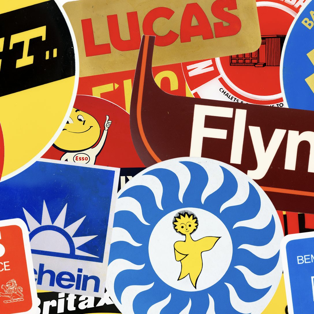
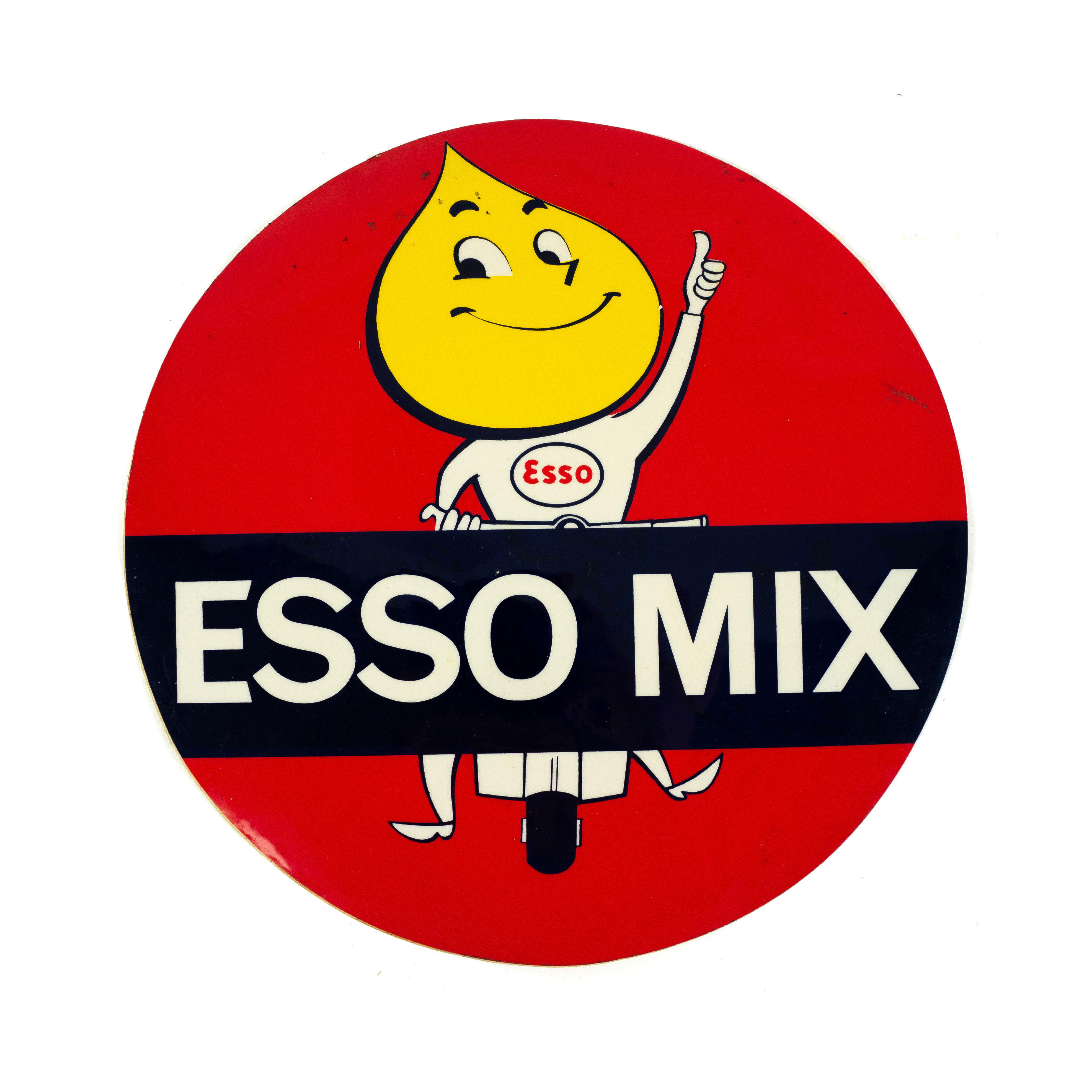
What’s interesting is that the ones that haves stood the test of time—and are still as arresting as ever—haven’t really changed all that much. They’re simple, use just a couple of colours and often feature a motif or character that’s cute enough for kids to tug on their parents’ sleeves to persuade them to buy the product. These design tropes also effectively speak to the parents, who hold the purse strings, to trust in the brand enough to actually cough up their cash. Take the adorable Esso yellow-teardrop-head-dude, for instance, or the brilliant logo for Scunthorpe-based central heating company Mr Therm.

Also, if you like nice things, or you’re a nice person who likes getting nice things for other people, then the account has also been extended into a line of t-shirts and other merch like this VERY CUTE INDEED little t-shirt.
The idea of presenting the branding and packaging of yesteryear on the Millennial mecca of Instagram is barely new; there are some other ones out there that get a helluva lot more specific. Take @mintneverhinged, which curates the best graphic stamps, often from countries that the traditional graphic design canon has ignored (the account has since been turned into book published by Unit Editions). The account @_pulp_culture, meanwhile, is a small but very impressive selection of vintage beer mats from the 60s and 70s, run by freelance designer Chris Bolton, who found these design treasures in his wife’s grandad’s attic after his passing in 2017.
What Instagram doesn’t tell you
The account is pretty straightforward; but its backstory is an interesting one. As O Street tells it, “One sunny day, we had something wonderful plopped into our laps: a big box filled with labels. Why’s that wonderful? Well, these labels are a glimpse into design’s industrious beauty of decades past: a commercial printer’s life work.”
It turned out one of the studio’s director’s relatives had operated a specialist label printing shop for decades, “working with a wide breadth of industries during Modernism’s heyday,” says O Street. “From logos to ads to mechanical schematics, the collection is a goldmine of real–world design inspiration. Now we are sharing this family-heirloom-turned- design-artefact.”