Pride felt different this year, and not just because of the absence of marches, parades and parties. After the weeks of intensified public conversation around racial injustice that preceded, it was no surprise to see the QPOC (queer people of colour) Pride flag doing the rounds on social media. The image features a dark-skinned fist raised in resistance, reminiscent of the Black Power salute, against a rainbow backdrop.
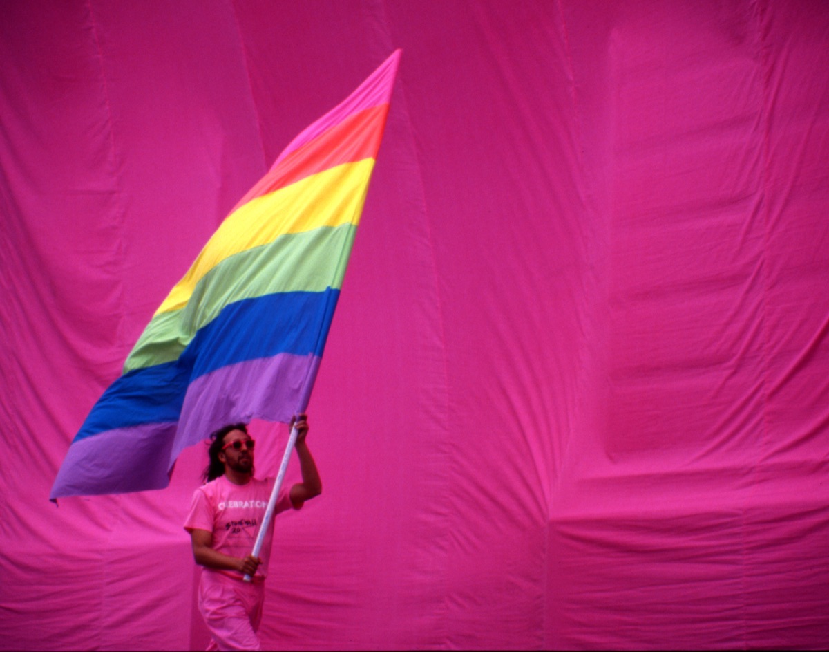
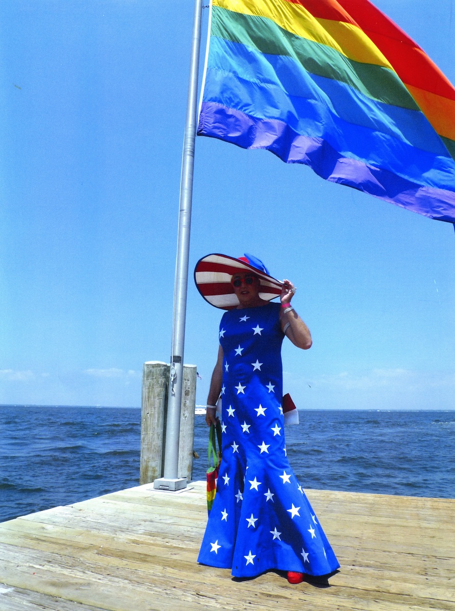
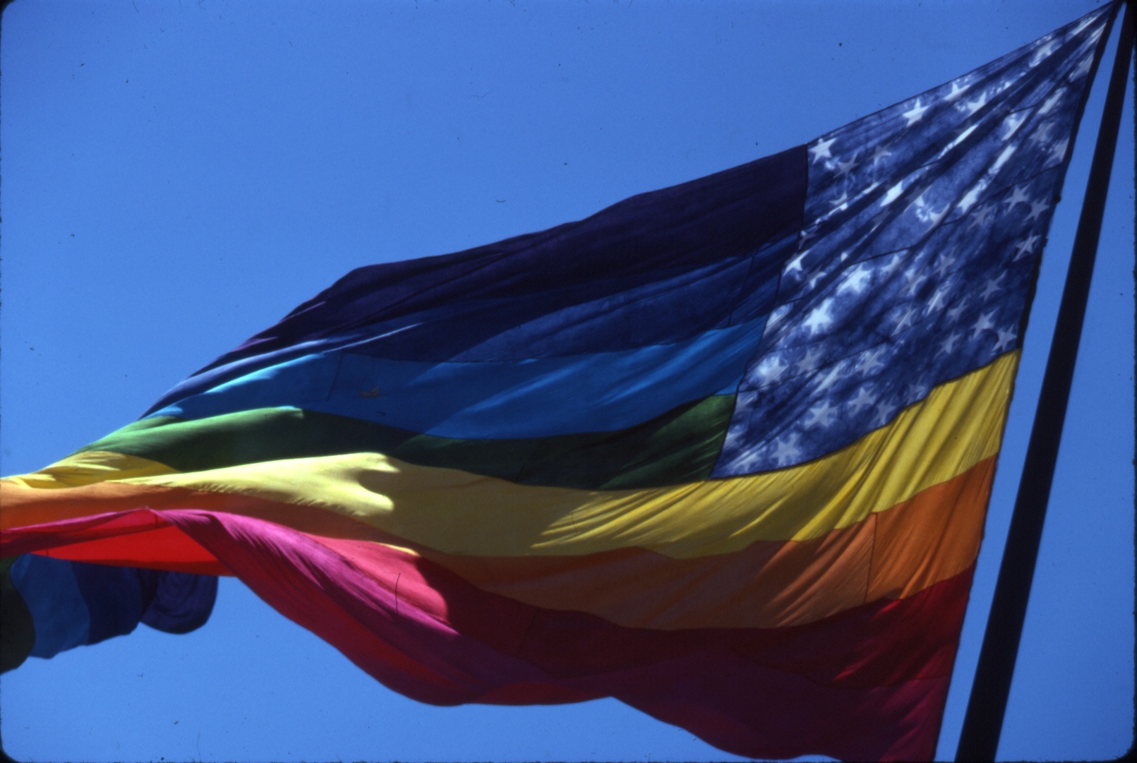
The rainbow flag is one of the most enduring symbols of gay identity, and exemplifies the profound political meaning that colours carry in visual culture. Pride this year felt like a moment for the LGBTQ+ community to confront its own complicated relationship with colour, in more than just the material sense.
Colours have played symbolic roles in queer society throughout history. In the 1970s, a coded system of coloured handkerchiefs became commonly used among gay men in western countries while cruising for sex. The queer social messaging of purple, violet and lavender ranges from references in Sapphic poetry to its associations with homosexuality and homosociality during the fin de siècle Aestheticism movement. The femininity of pink has been used by men to reject traditional masculinity, while black is the colour of choice for boys stomping on the gay techno scene of cities like Berlin.
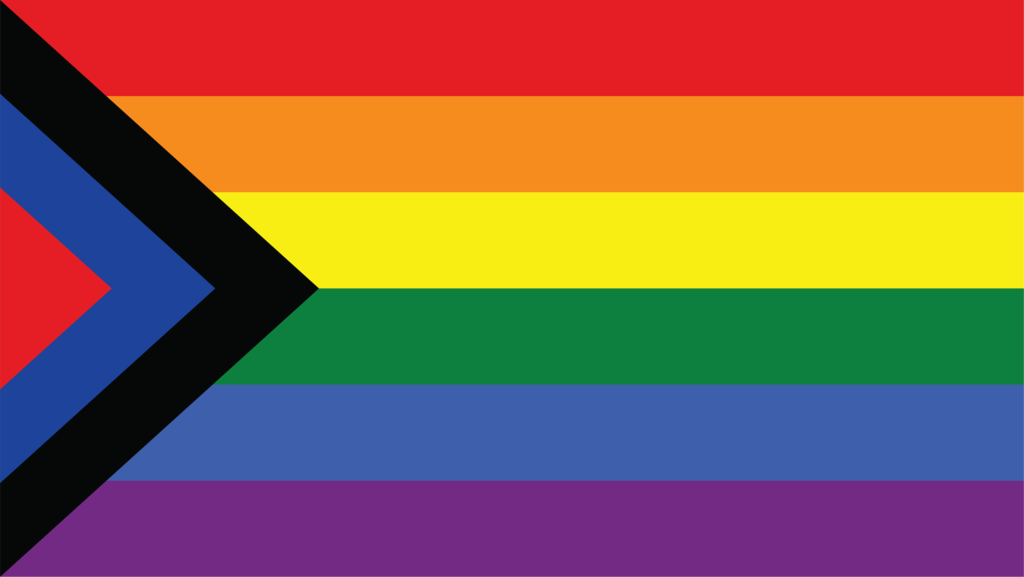
The creator of the rainbow Pride flag, Gilbert Baker, is currently the subject of an exhibition by San Francisco’s GLBT Historical Society. The flag has undergone several revisions since Baker’s original 1978 design, with colours added and removed, and layouts rearranged.
In 2017 the Philadelphia Office of LGBT Affairs commissioned a new Pride flag, which included brown and black stripes to represent non-white people; the following year, Portland-based designer Daniel Quasar created the “Progress” Pride flag, which added pink, light blue and white to represent the trans community.
The constant reshaping of the flag to include different groups can often feel like various parties battling it out for representation. But Joanna Black, the exhibition’s curator, says this shapeshifting is part of the flag’s intended purpose. “Baker thought of the flag as a living relic, something that should evolve,” she says. “He knew that it would have to change over time—that’s the whole point.”
While the desire for inclusivity is no doubt well-intentioned, the very nature of an inclusive flag is one that centres a certain identity, with others being peripheral. So what happens when you displace this arrangement of colours from its white, western context?
2018 also saw a new flag emerge from India. The US had introduced a brown strip as a gesture of inclusion. “But what relevance did that have in India, where we are all different shades of brown?” reflects Moulee, queer activist and director of Chennai’s Queer LitFest, who came up with the new Indian version. “I thought we needed something more relevant to us.”
“Being queer isn’t the only identity we carry”—Moulee
Moulee’s “Social Justice” flag incorporated blue and black to symbolise the Ambedkarite and Dravidian political ideologies, with red representing Socialism. He believes these movements are fundamental to India’s LGBTQ+ rights precisely because they challenge status quos like heteronormativity. “The existing mainstream discourse sometimes misses out the nuances of queer politics,” explains Moulee. “Being queer isn’t the only identity we carry.”
The Chennai flag used colours in a way that made sense in India. Black is considered inauspicious in Hinduism, so its usage challenged religious hegemony, while simultaneously pushing India’s queer movement into new ideological territory. It is a reminder that colour exists differently according to context. Colourfulness can represent the richness of diverse perspectives, but when figured in relation to whiteness, the very idea of colour is too often used as a means of othering.
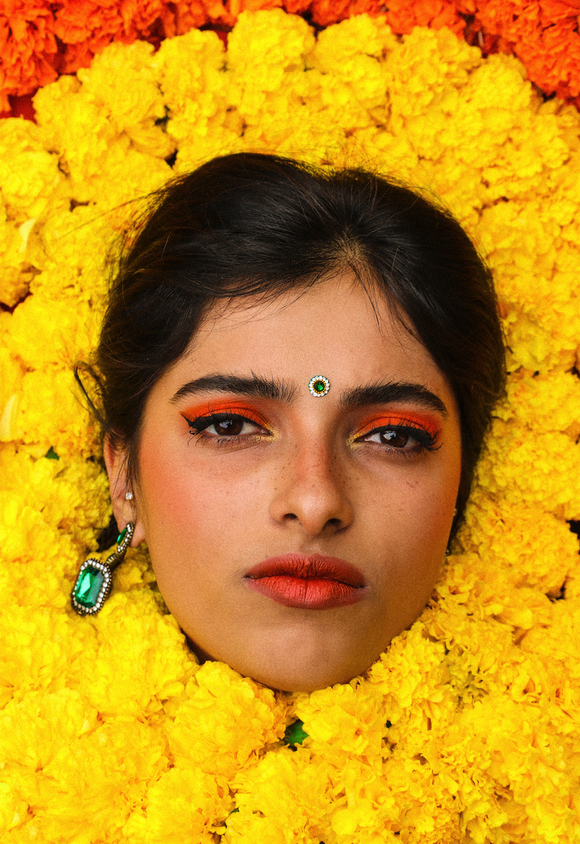
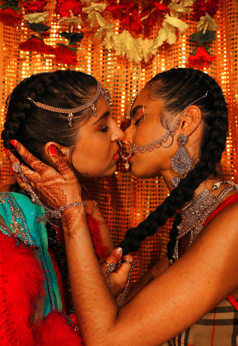
Italian-Indian artist Alia Romagnoli, who features in ARTIQ’s Queer Frontiers exhibition, only started noticing her own work as colourful when she moved to the UK five years ago, but it was never a conscious choice for her. “For foreigners, it’s the first thing they see,” she says. “But I grew up in India, so colour is the default. It isn’t something I think much about.”
By subverting Indian bridal iconography, or reclaiming the body through henna and tattoos, Romagnoli explores her queerness—a theme she sees as universal. But the insistence on the colourfulness of her work comes largely from the white gaze on South Asia. “There is a pressure to make your work something that white people would understand,” she says. “But we don’t talk about colour in the same way.”
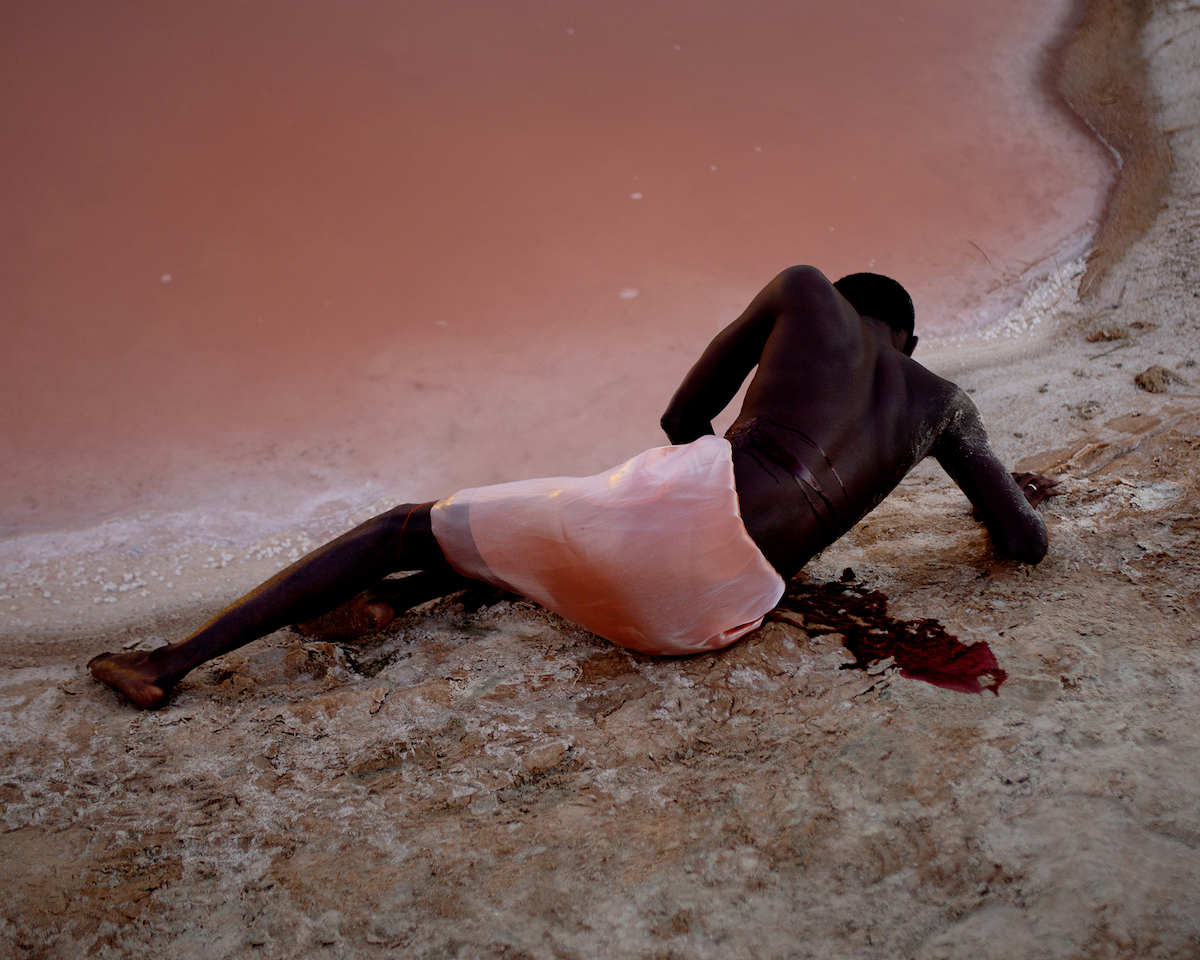
Colourfulness is by no means the only way to aesthetically explore queerness, especially for people of colour. Nigerian-Austrian photographer David Uzochukwu’s works feature vividly coloured landscapes—a bright pink sea, an electric green field—but what strikes you the most is his exploration of the rich shades and tones of the black body. This “colourful blackness” challenges the tendency of the white gaze to lump black identity into a homogenous, othered category, obliterating the nuance and variety within it.
“Traditional representation of blackness is reductive… It’s exciting to properly reclaim this thing that is projected onto us”—David Uzochukwu
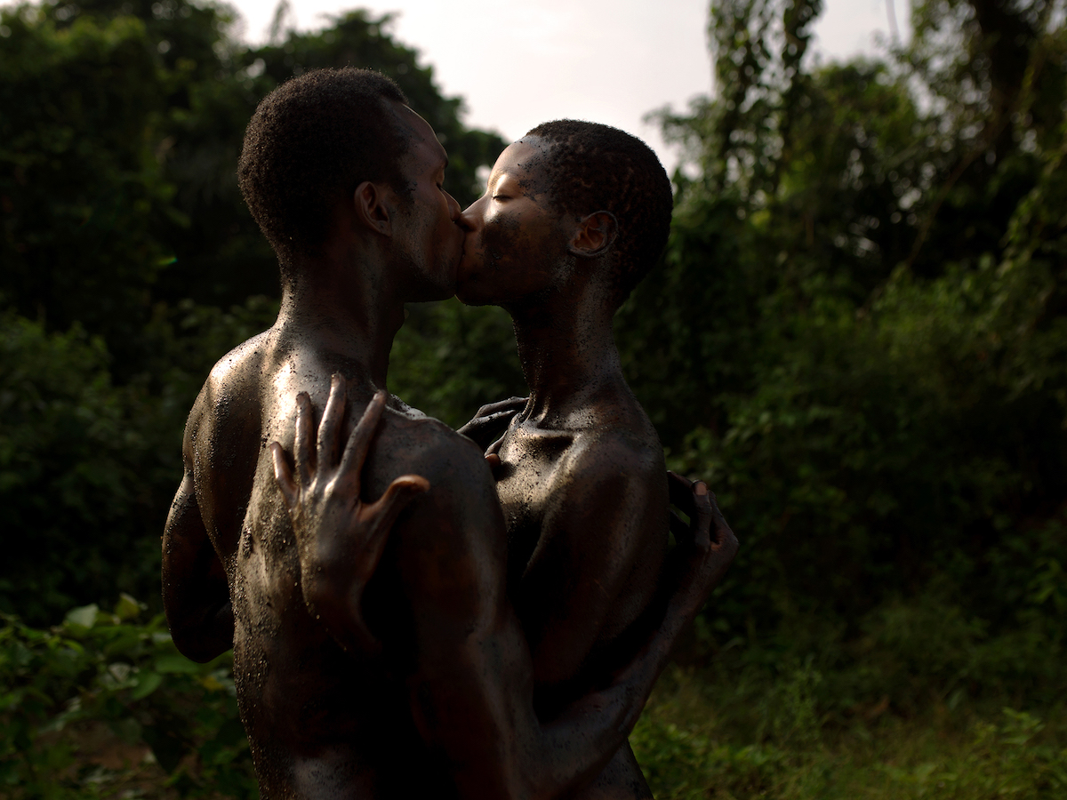
“Traditional representation of blackness is reductive,” says Uzochukwu. “People don’t look further than the blackness; so much gets lost. It’s exciting to properly reclaim this thing that is projected onto us.” Uzochukwu features in My Queer Blackness, My Black Queerness, a new digital project that aims to denounce white queer racism, and his works examine blackness both literally and in the sense of race. Through his aesthetic investigation of the colour—its depths and dimensions, the way it reflects light—he explores the deeper nature of his own blackness and the multifaceted nature of the black body.
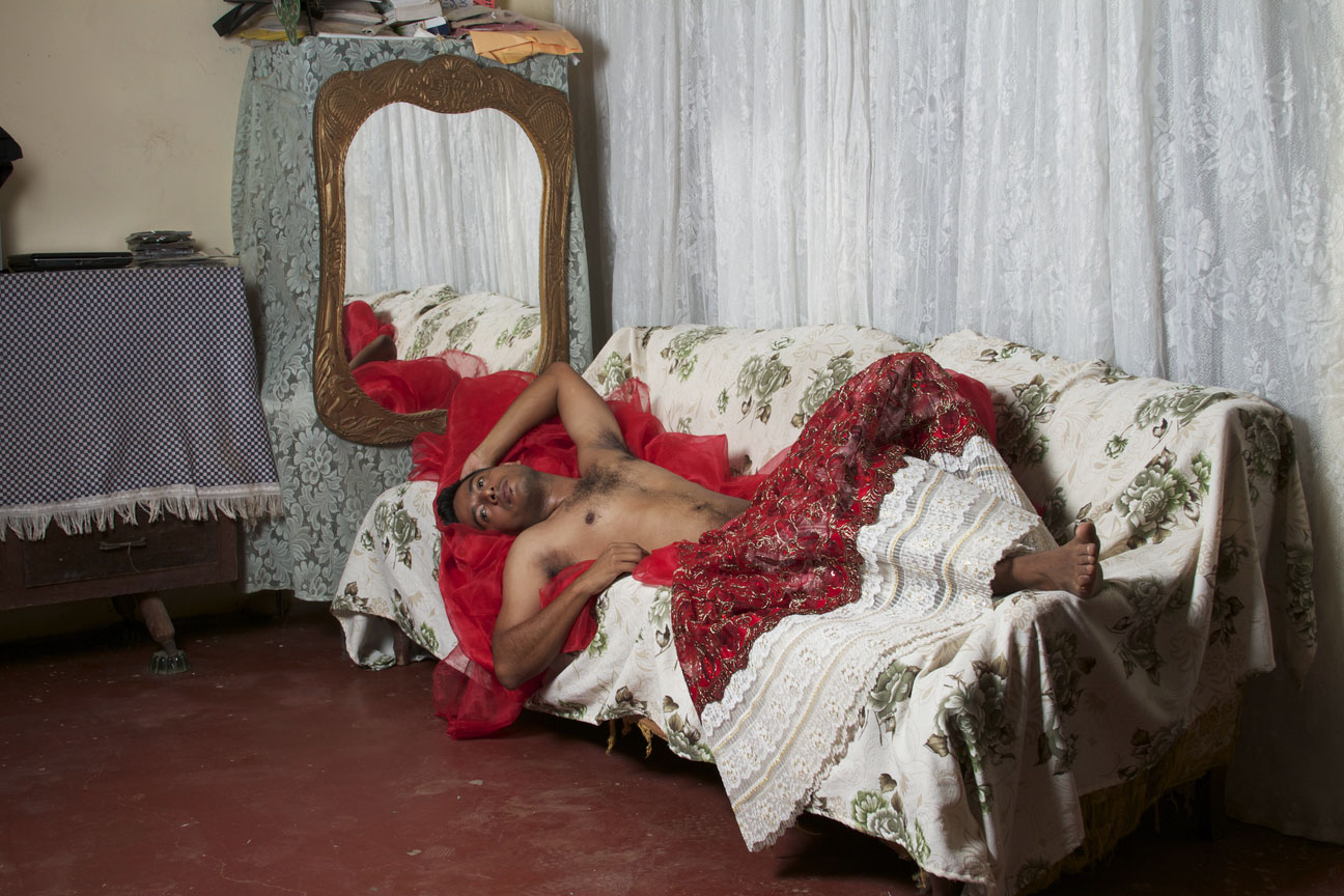
For people of colour, the complexity of one’s non-white race can often aid the journey of queer acceptance. Mexican photographer Nelson Morales used to reject his indigenous Zapotec heritage; it did not quite fit with the type of white, urban, male identity that he yearned for as a young gay man. Years later, his project on the Muxes (an indigenous transgender community in Mexico’s Wahaca region) took him on a journey of self-discovery.
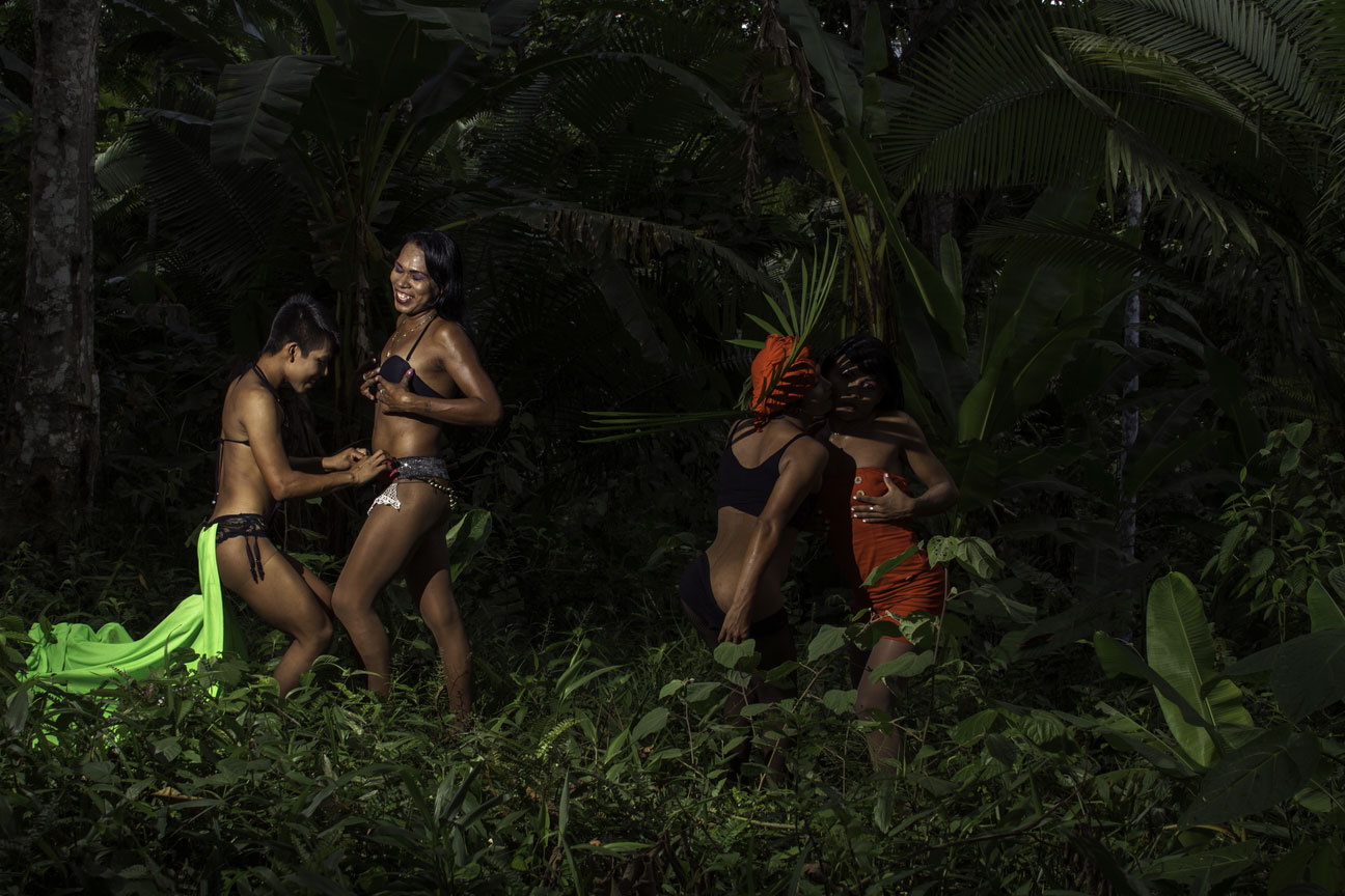
“We developed a very special relationship,” says Morales, who is part of TRNK NYC’s MIEN exhibition of queer artists of colour. “At the same time, I was discovering who I was.” In his self-portrait, he embraces his inner Muxe, appearing as a gender-fluid figure draped in a bright red skirt. It marks an embracing not just of his non-masculine queerness but also of the racial heritage he had previously resisted. “I accepted myself as an indigenous person of colour. This was the most important thing in my project.”
Colour functions far beyond its material existence. “Colour is not a human or a personal reality,” wrote James Baldwin in 1963; “it is a political reality.” Through their ability to codify identity, rebellion and power in ways often imperceptible to the uninitiated, colours have deeply subversive possibilities for queer people, conveying messages that might not otherwise been spoken. They also present a powerful means of interrogating the eyes that view them: if the default is white, it’s no wonder everything else looks colourful.