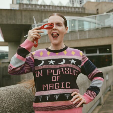
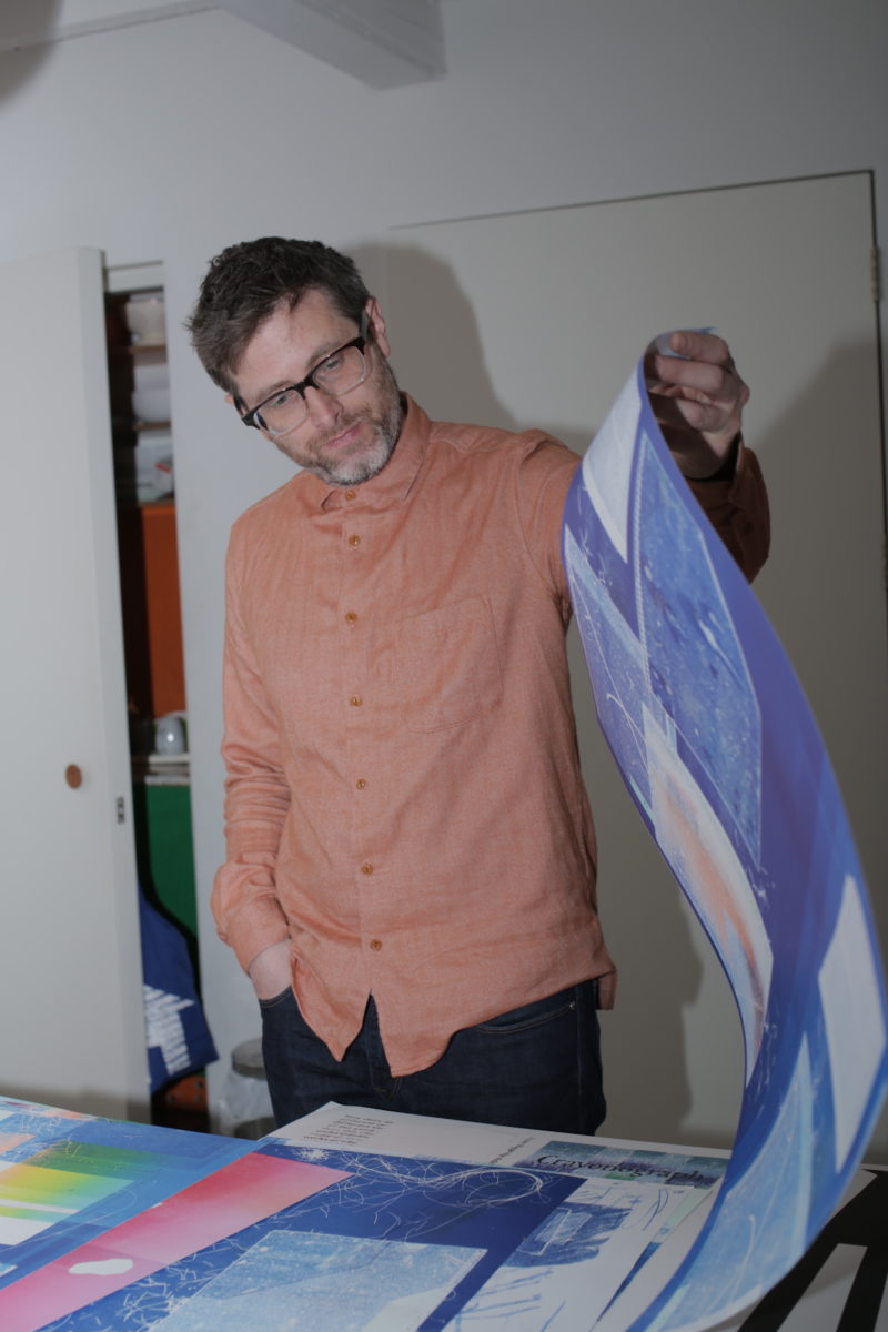
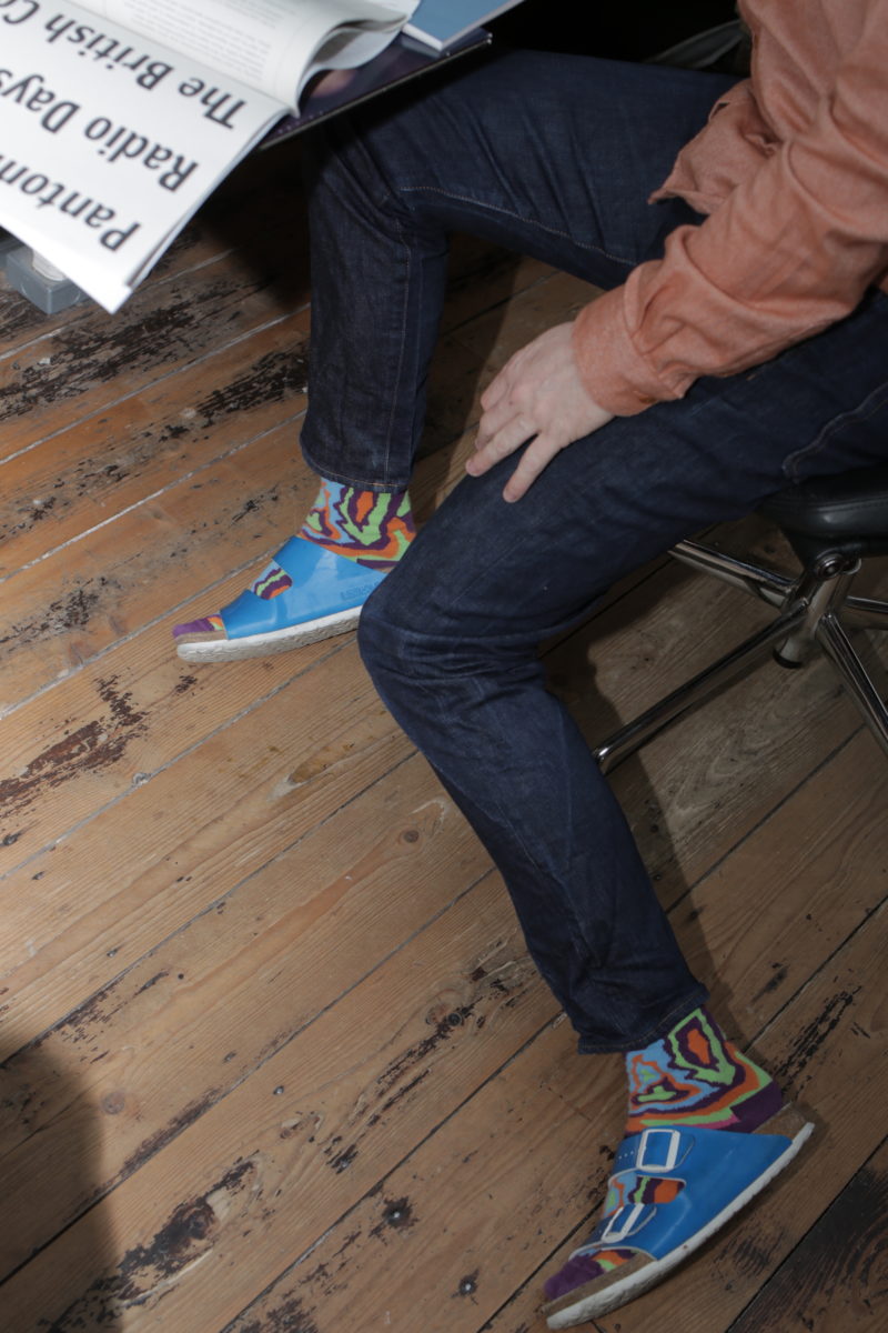
Fraser Muggeridge’s eponymous studio somehow manages to boast a portfolio in which each project is vastly different from the next; yet somehow, you can always tell that it’s them. Distinguished by an approach to typography that’s as wild as it is rigorous, the studio has made a name for itself in making work that takes no shortcuts, and a fair few risks. Like his work, Muggeridge isn’t afraid to to veer into things that others might deem a bit outré (his rainbow socks and sandals combo, on the day we visit, for example).
Before we shoot the studio, we’re emailing about what we hope to chat about. Namely, his work with cultural institutions, which includes the Barbican, Whitechapel Gallery, the Serpentine, Camden Arts Centre and pretty much any other institution you can think of. “There is nothing good about working for cultural institutions,” he writes. “I have no idea why people say that it’s great.”
He’s not being entirely provocative for provocation’s sake; though the fact he keeps on working for them hints that perhaps it ain’t really so bad. While most designers we interview about such things praise the freedom such clients offer over more commercial projects, or the pleasure of working with artistic subject matter, Muggeridge acknowledges that while it’s “quite fun” to manage projects and work on arts publications, there are times when the fact that clients don’t, say, submit the content for a book you need to actually design it, or understand things like image-resolution, there’s a certain level of frustration.
“There is nothing good about working for cultural institutions”
But rather than blame galleries or staff, instead he reckons this shift is down to technology: when you can just send a Dropbox file with piecemeal text and images to the person designing a book, it facilitates a certain “flakiness”, he says. “We all like the idea of doing a million things at once, but we can’t concentrate or focus,” he says, of the freedoms offered by the internet. “I love that today we can work so globally, but working like that can be confusing.”
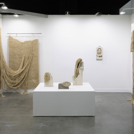
Outside of the digital realm, Fraser Muggeridge Studio is based in East London’s Bethnal Green, having moved there around three years ago from a site near Smithfield Market. It’s certainly a good place to be a graphic designer, it seems: A Practice For Everyday Life is just a few doors down the street; Hato a ten minute walk down the road, OK-RM a stone’s throw away.
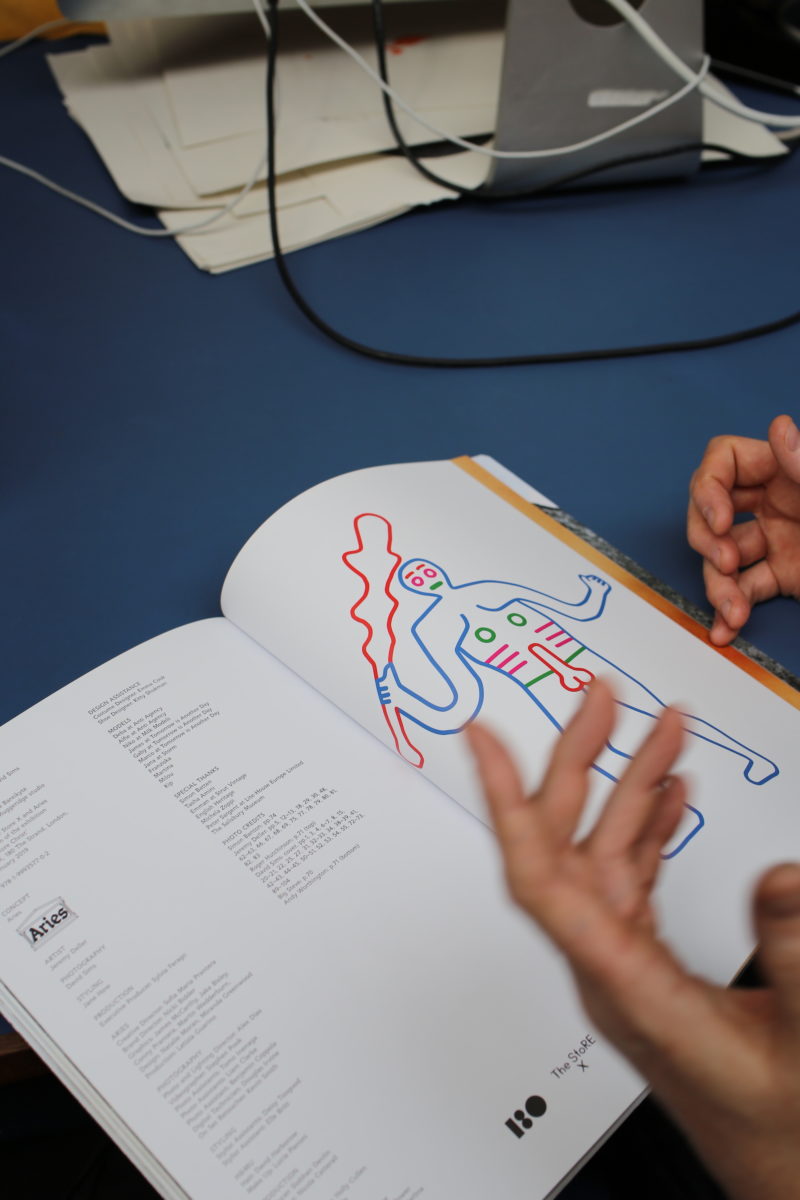
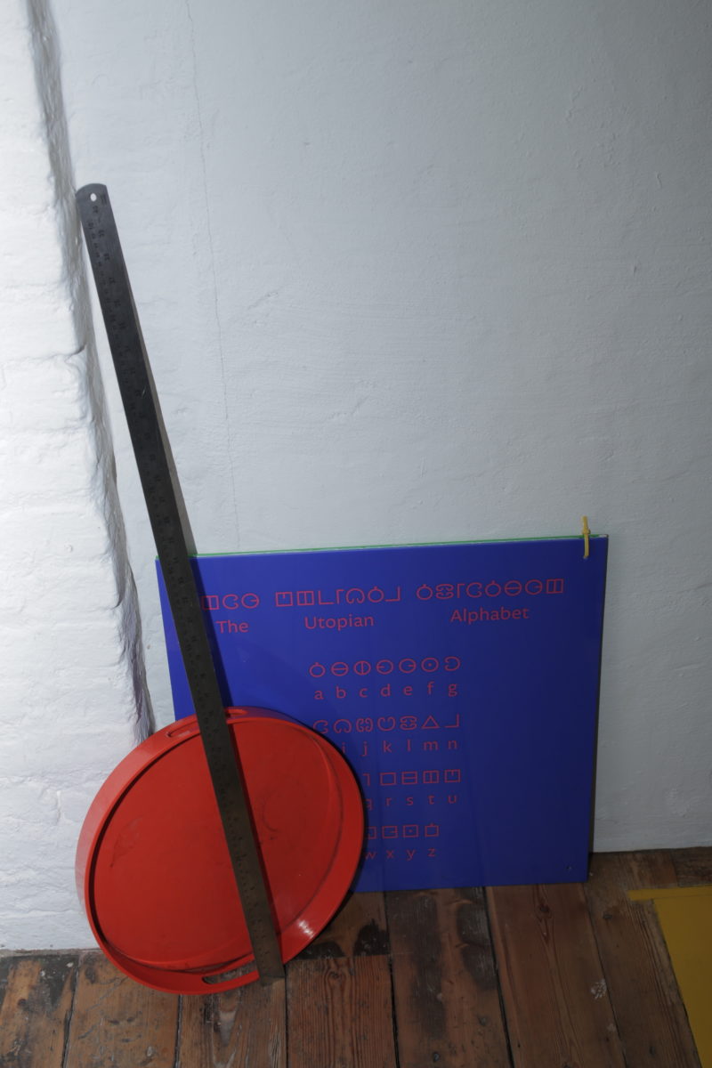
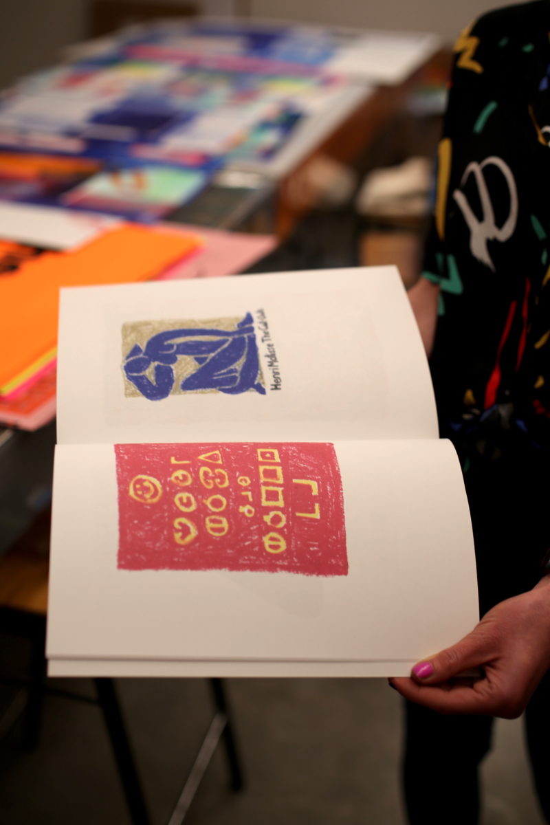
Someone who pops by a lot is Jeremy Deller, who Muggeridge has worked on numerous projects with including the Wiltshire Before Christ exhibition with photographer David Sims and fashion brand Aries at The Store X in London earlier this year; various Fuck Brexit products (including a rather brilliant Sports Direct-style mega-mug); and the 2016 Utopia show at Somerset House, for which Muggeridge and his studio created a “Smiley” flag, a reworked edition of Thomas More’s book of the same name and a graphic identity centred on a new Utopia alphabet system. So what makes Deller so great to work with? “Obviously working with artists depends on the person,” says Muggeridge. “It’s a different dynamic with Jeremy: I know how he thinks and why he does what he does. What makes a really good collaboration is openness, honesty and the willingness to take a few risks.”
“What makes a really good collaboration is openness, honesty and the willingness to take a few risks”
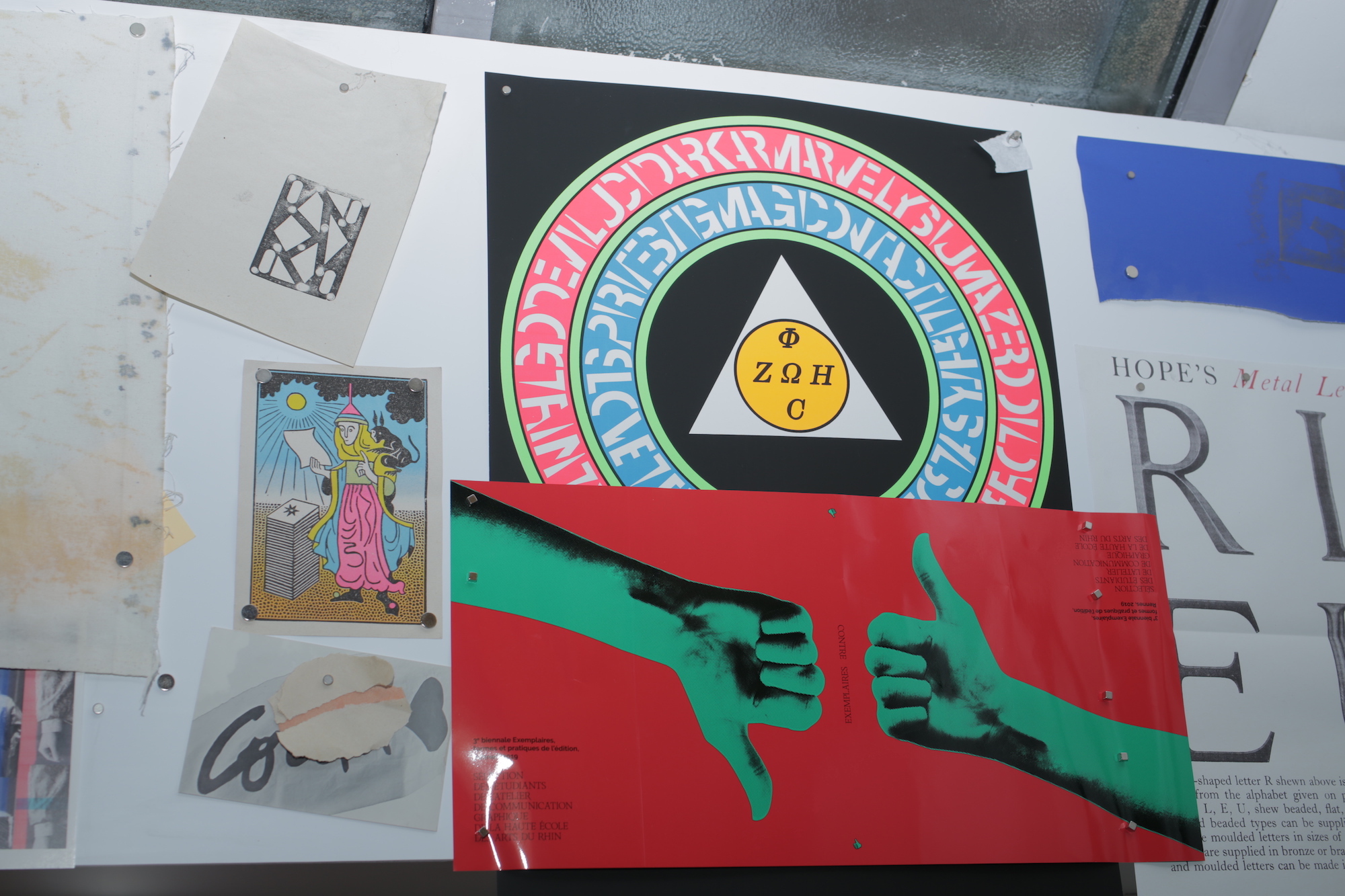
Those risks aren’t just on a conceptual level, but a technical and process-based one. While it might be assumed that the arts-based clients are the most open to that, a recent project that exemplifies riskiness when it comes to production is the studio’s work with type foundry Commercial Type to create a new specimen book. It’s an unusual project for the studio in a few ways: for one, they’re working with a series of pre-existing typefaces rather than creating their own; and for another, the printing is a logistical maelstrom of numerous paper sizes and stocks, with various internal folds and eighteen different covers, each bearing numerous fonts printed over one another to create delicious inky layers of lettering and shapes.
Fun to look at, a headache for the printers. “We often make things very hard for ourselves,” says Muggeridge. “I think that actually, graphic design can be quite easy: people think it’s all just about moving things around on screen, but we make things really difficult. So we kind of create our own problems that we have to negotiate and get out of.”
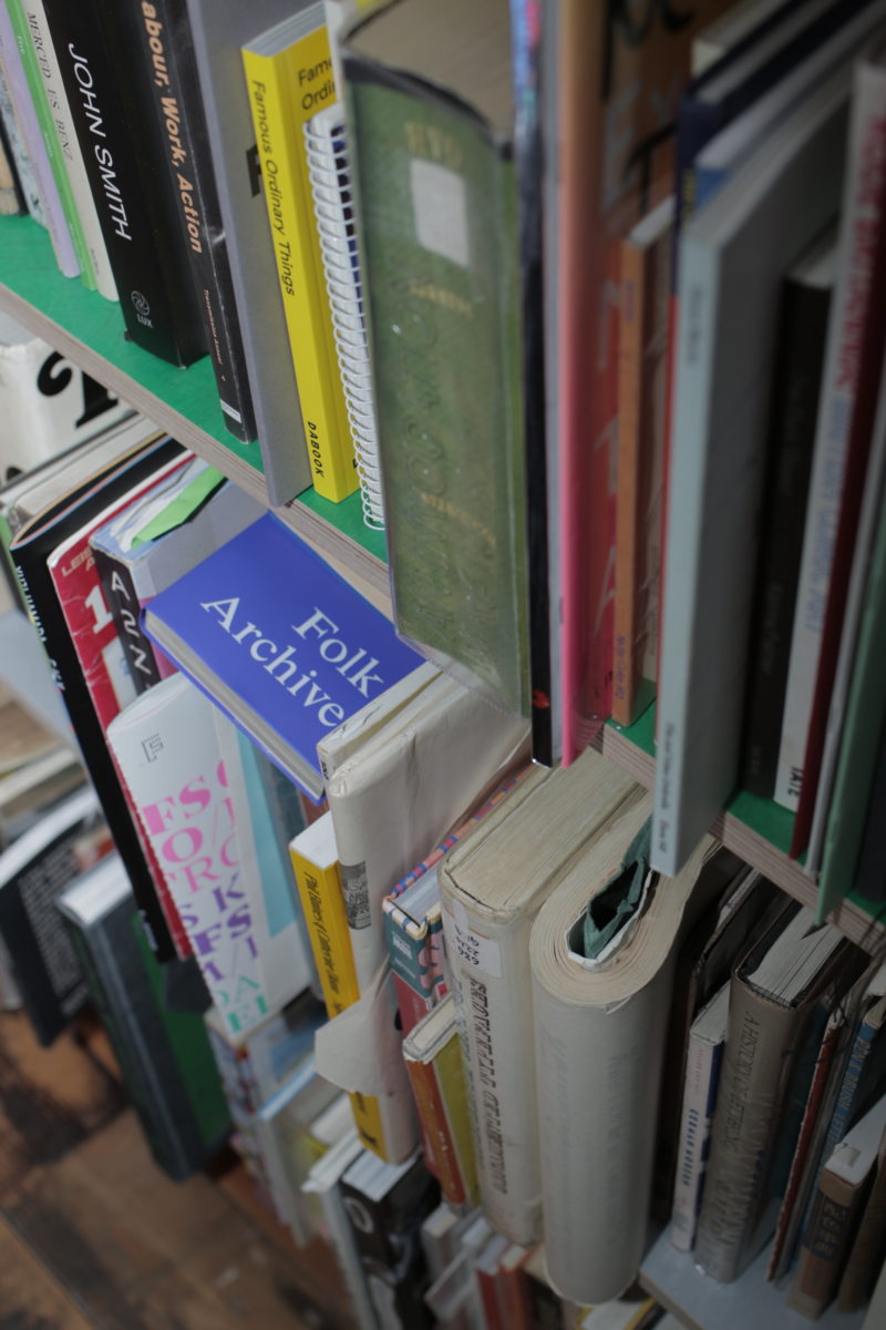
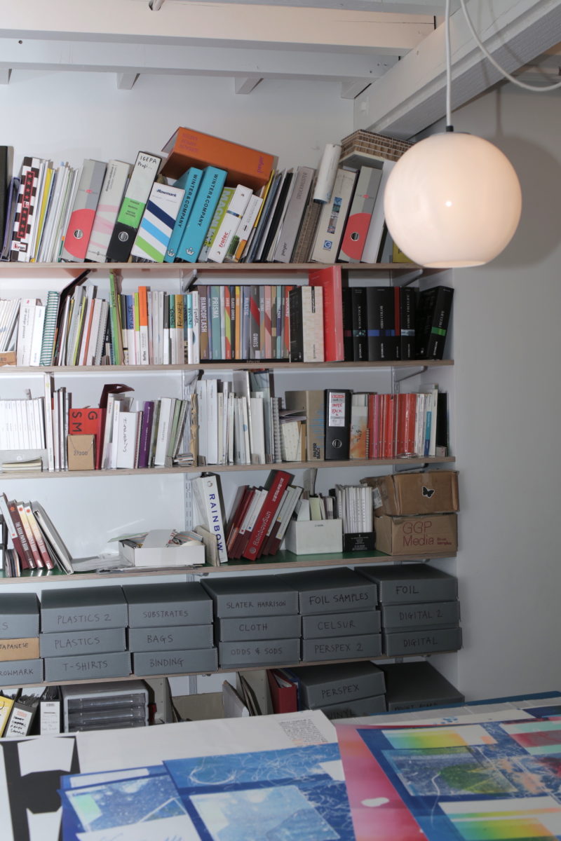
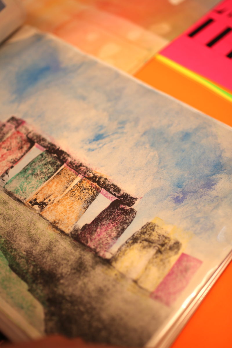
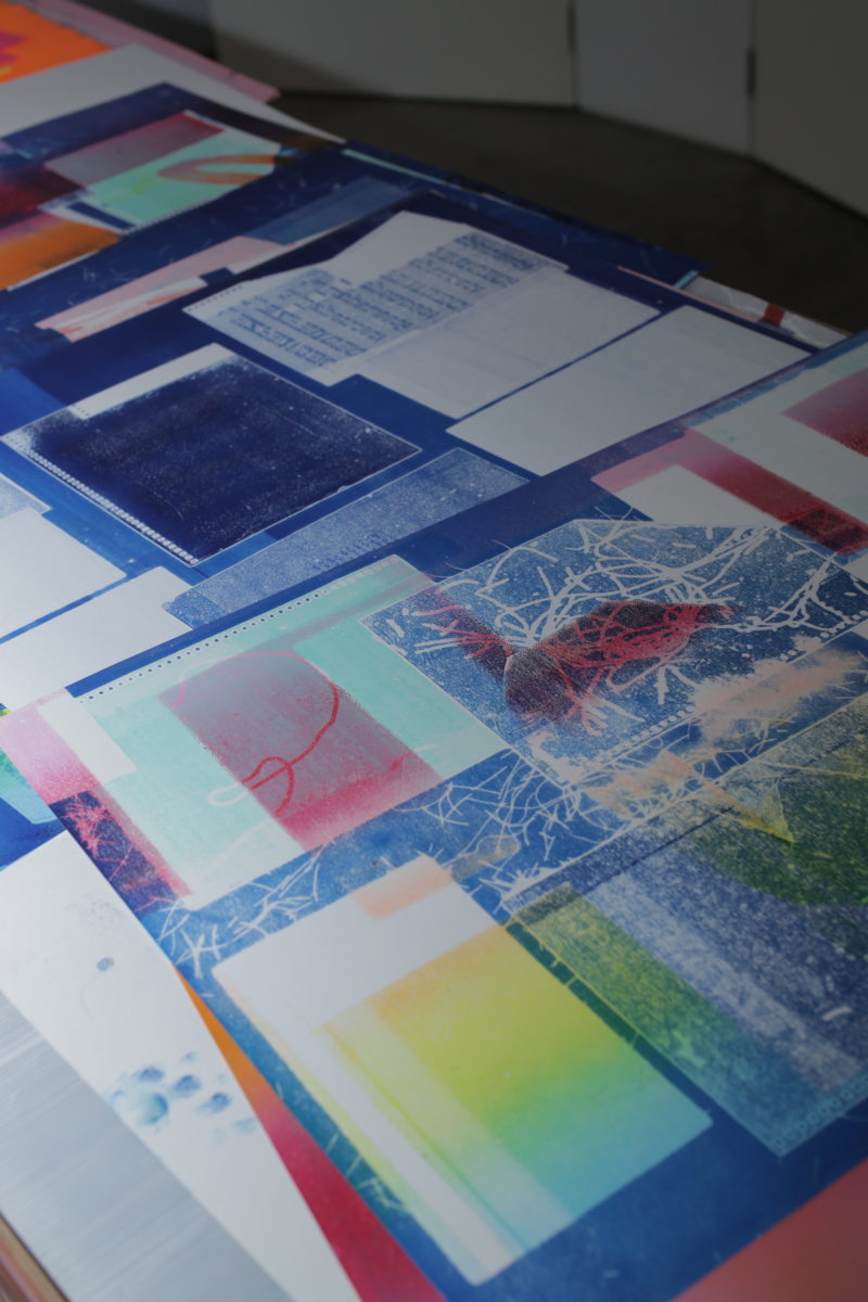
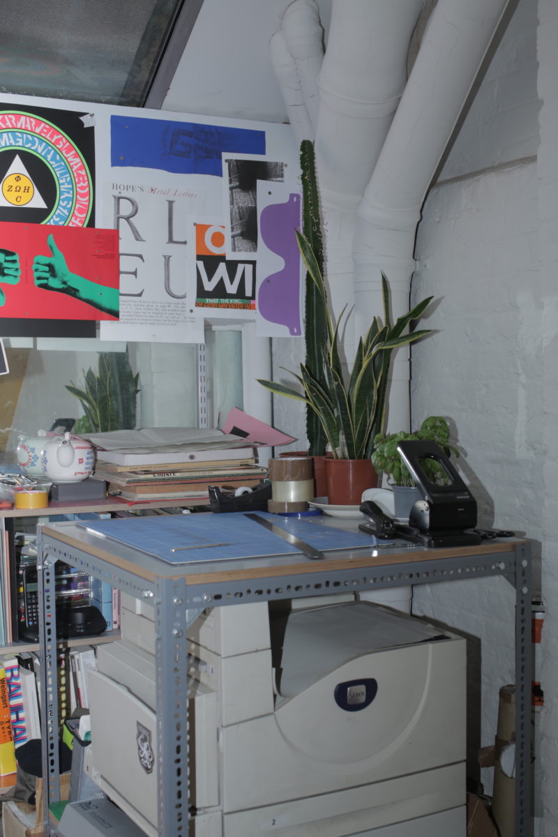
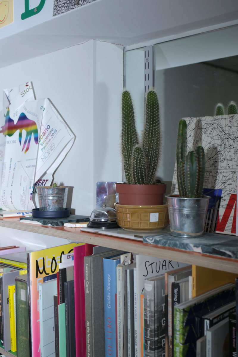
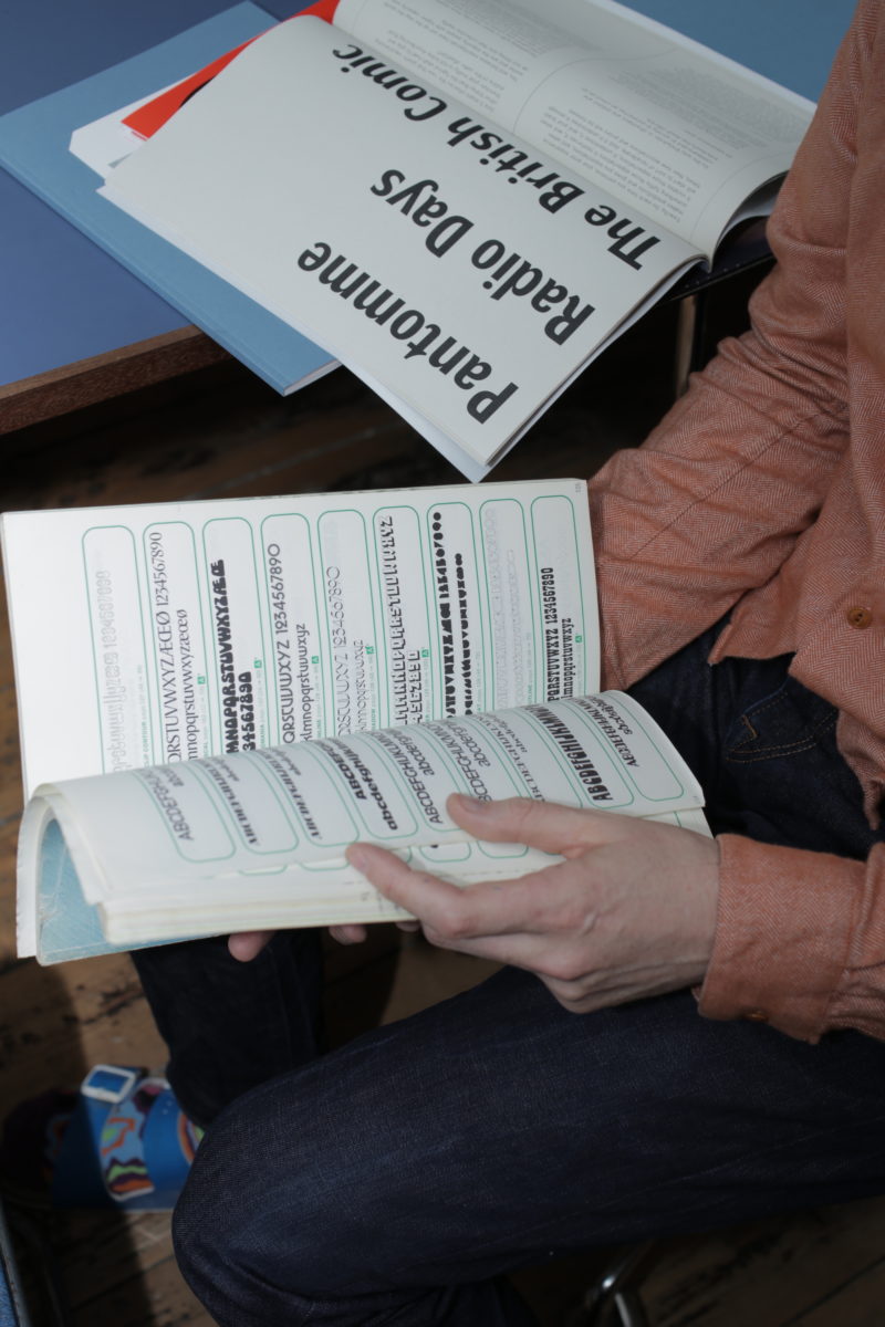
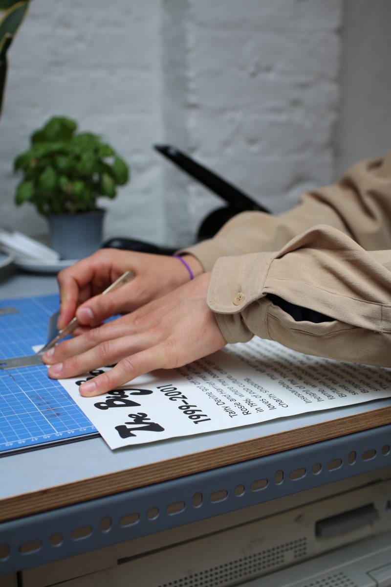
This deliberate problematizing often rumbles away in a process that’s doggedly devoted to the physical. Muggeridge’s studio is packed with prints, papers, experiments, files of drawings, old designs, inks and more. Nothing is just, as he points out, about iMacs and pixel-prodding. The studio was recently brought in by Deller to work with him on designs for the new Hot Chip Bath Full of Ecstasy Tour, which naturally meant a tonne of physical printing and manipulation of an existing typeface found in a dog-eared type specimen book, layers of type to the point of illegibility, letters haphazardly snaking off the lines “like when you’re writing a postcard and run out of space”.
In this sort of work, error and wonkiness are by no means deliberate, but they are celebrated—and while Muggeridge often works with historical type specimens, he always adds layers of trickery that make everything look a little off-kilter. The project to design the typeface, catalogue and exhibition graphics for the John Walter-curated touring exhibition Shonky, then, seems a perfect collaboration. “It was a great project for us,” says Muggeridge. “The subtitle was ‘The Aesthetics of Awkwardness’, and I’m obviously really into awkwardness. [John] was very much into the idea that the catalogue should be part of the exhibition, another element of it.”
“I’m obviously really into awkwardness”
As we’ve discussed before, it can be a tricky balancing act for a designer to create the design for group show catalogues; since you can’t be seen to use an image for one artist on the cover at risk of courting accusations of favouritism. “Group show catalogues can be really boring, because you can’t really do anything,” says Muggeridge. “You have respect the artists but everyone gets stumped. With this one, we wanted it to be on the border of legibility.”
The designs for Shonky, like much of Muggeridge’s work, were informed by limitations: there wasn’t much in the way of budget for the show graphics, so they used free vinyl offcuts that could haphazardly snake and zig zag across the walls. That way, rather than acting as dry, solely informative, separate entities; exhibition graphics can “infiltrate the work and kind of become part of the show,” as Muggeridge puts it. The captions, too, were created from cut-up type.
Again, this artist/designer collaboration works because both parties are on the same side, to paraphrase Muggeridge, “You can do it together.” With cultural institutions, the ones he reckons are best to work with as a designer are those who consider design as an investment: they take the time to not just commission design and, as the cliche goes, ask for a bigger logo; but to see the process, spend time with designers and teams, have informed discussions and genuinely trust in who they’re working with. “Even if [a client] doesn’t have a lot of cash, what’s interesting is how to get around that,” says Muggeridge. “You just have to be creative.”
“I don’t have a message to communicate to someone. I don’t really have anything I want to say”
Despite the studio’s ongoing, and frequently very involved collaborations with artists, Muggeridge sees a definite line between what it means to be a designer, and where that’s different to being an artist: “I can’t instigate a project,” he says. “If someone tells me that I could just do anything I like, I’d be really scared, but I’m more than happy to work with people and pitch in a few ideas.
“As a designer, you need to not have a massive ego: you’re being invisible; you’re providing a service and you need to be okay with that. I don’t have a message to communicate to someone. I don’t really have anything I want to say. “I think it’s a bit sad when you see architects or designers trying to be like artists. I’m a good designer, but I’m not a good artist, so I shouldn’t try and be one.”
Words by Emily Gosling
Photographs by Louise Benson