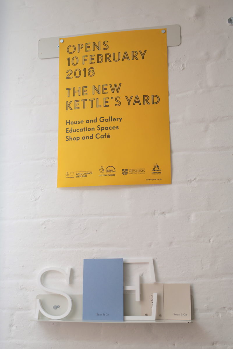
A Practice for Everyday Life, known to most as simply Apfel, seems to be both the designers’ design studio, and the artist’s design studio. Since its inception fifteen years ago, Apfel has worked with clients including Tate, the Barbican, the Labour party, Studio Voltaire, Lisson Gallery, Kettle’s Yard and The Whitechapel Gallery. Whether on projects like the rebrand of the Architect’s Journal, graphics for John Lobb shoes or its holistic identity system for the Hepworth Wakefield, Apfel’s work is united by a confident sense of minimalist intent, often favouring a considered typographic approach over more graphical or illustrative sensibilities, and frequently designing its own bespoke typefaces for projects.
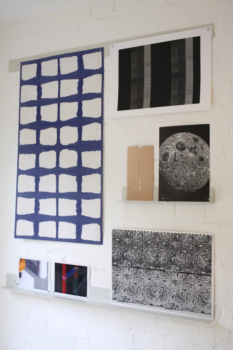
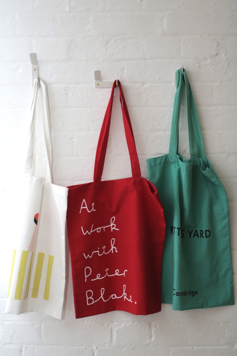
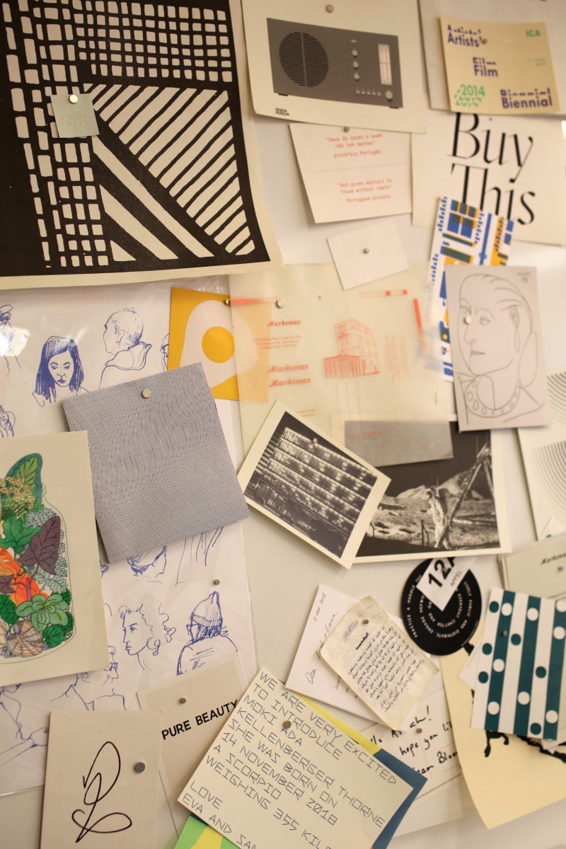
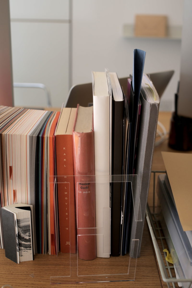
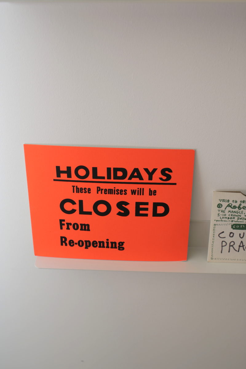
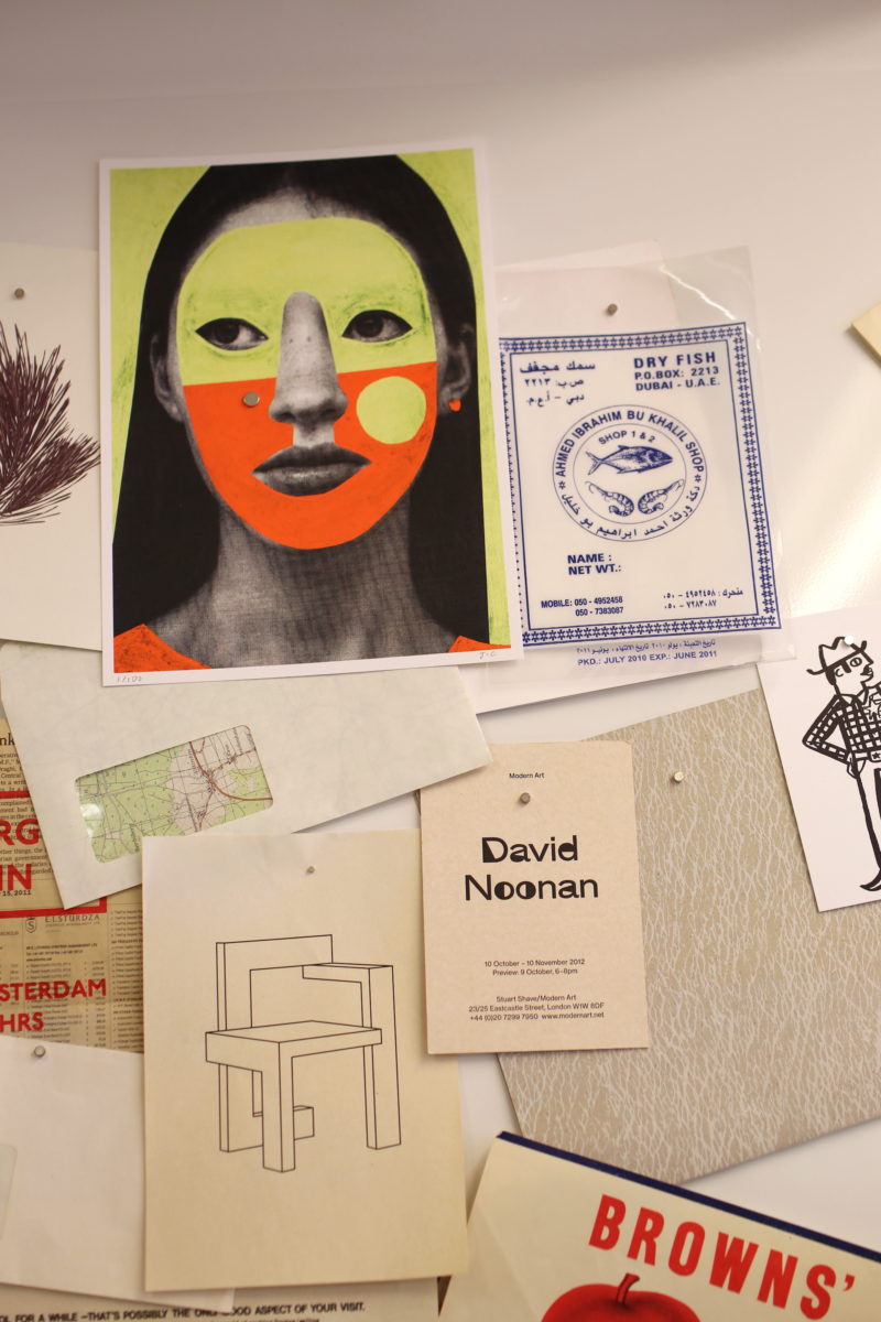
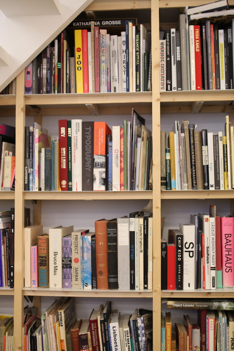
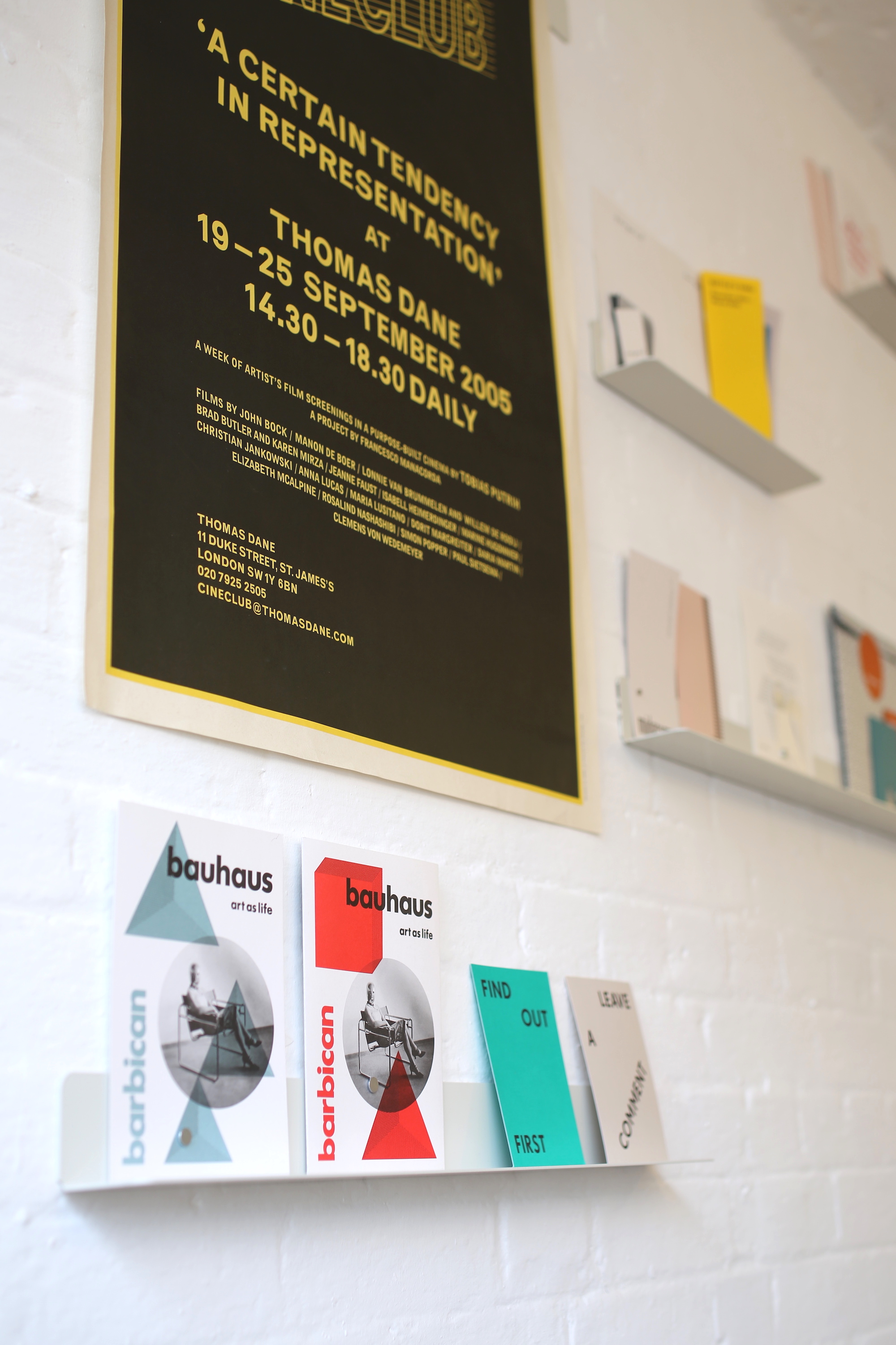
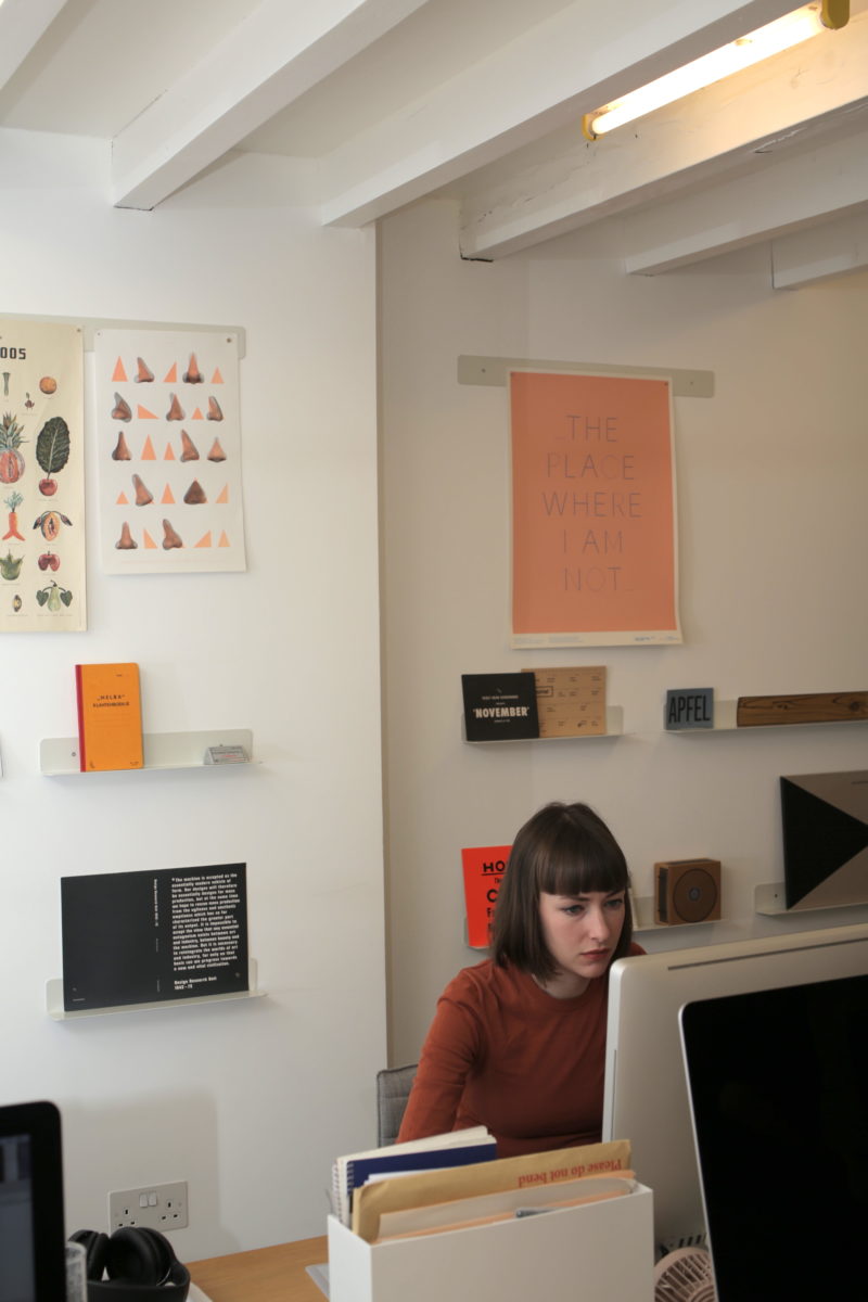
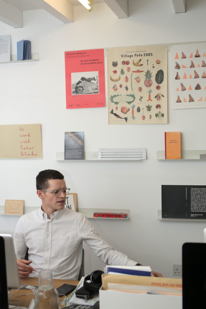
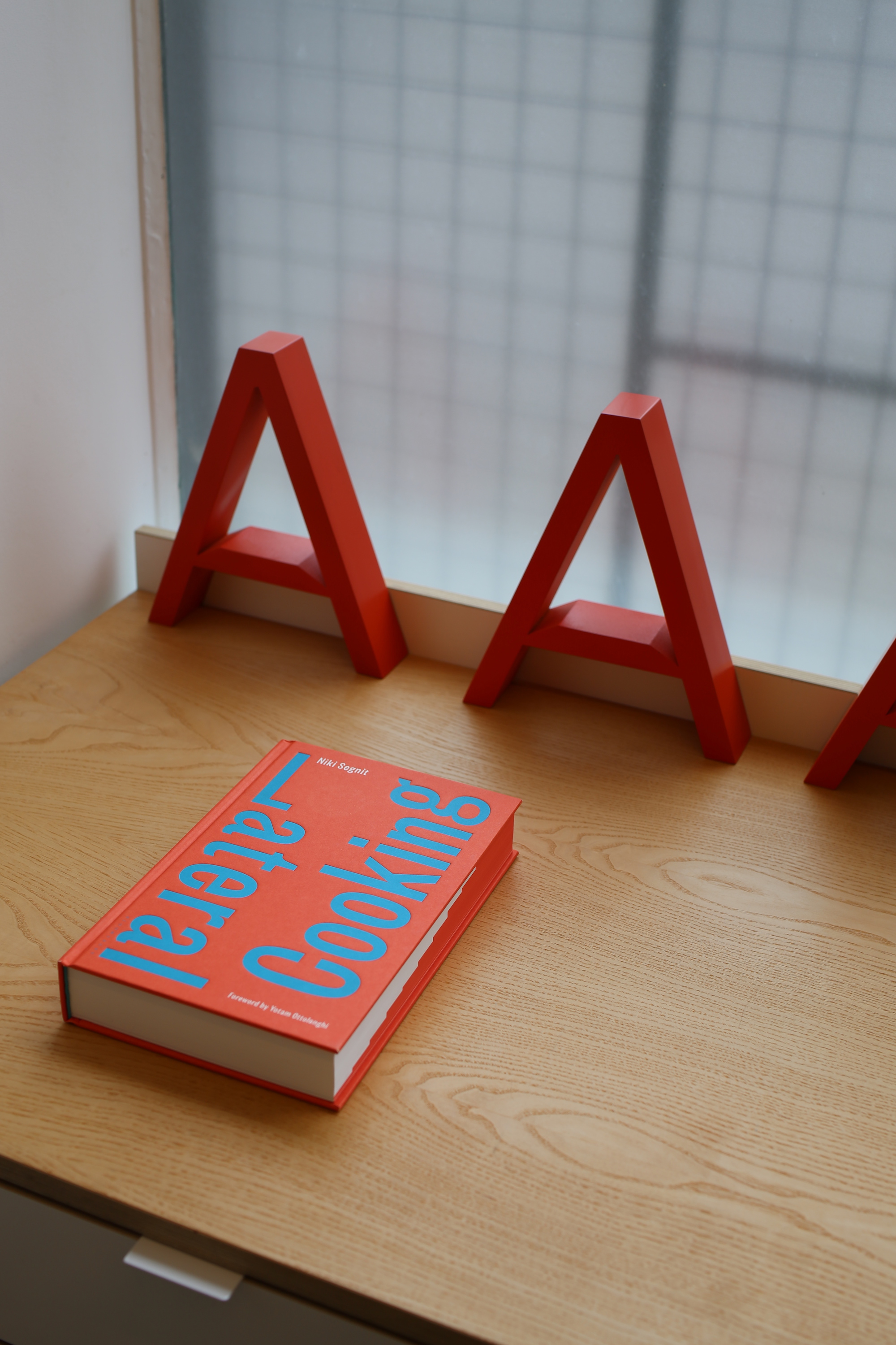
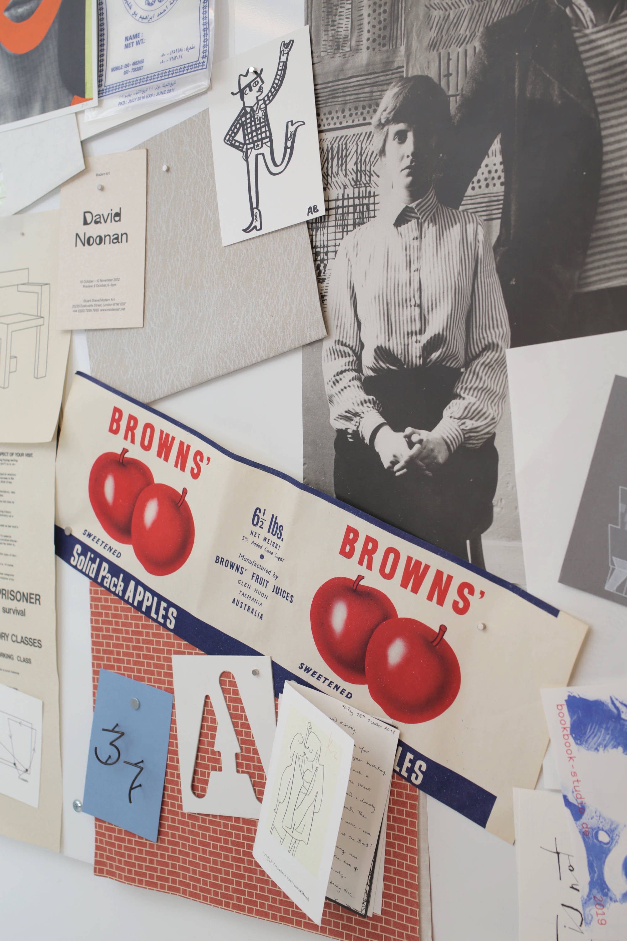
Managing to be simultaneously striking, fresh and functional; Apfel’s graphic output is a lot like its studio space. Tucked away on a pretty street just off Hackney Road in East London, the studio and its shelves are a testament to just how much beautiful design work Apfel’s made in terms of printed matter and publication design for the arts. It’s also a neatness nut’s dream: tote bags hang on an ordered, tidy peg board; each team member is assigned a tidy white draw for paper samples; and bespoke magnetic strips display Apfel’s own graphics alongside assorted ephemera that’s caught the team’s eye, including anything from local hairdresser flyers.
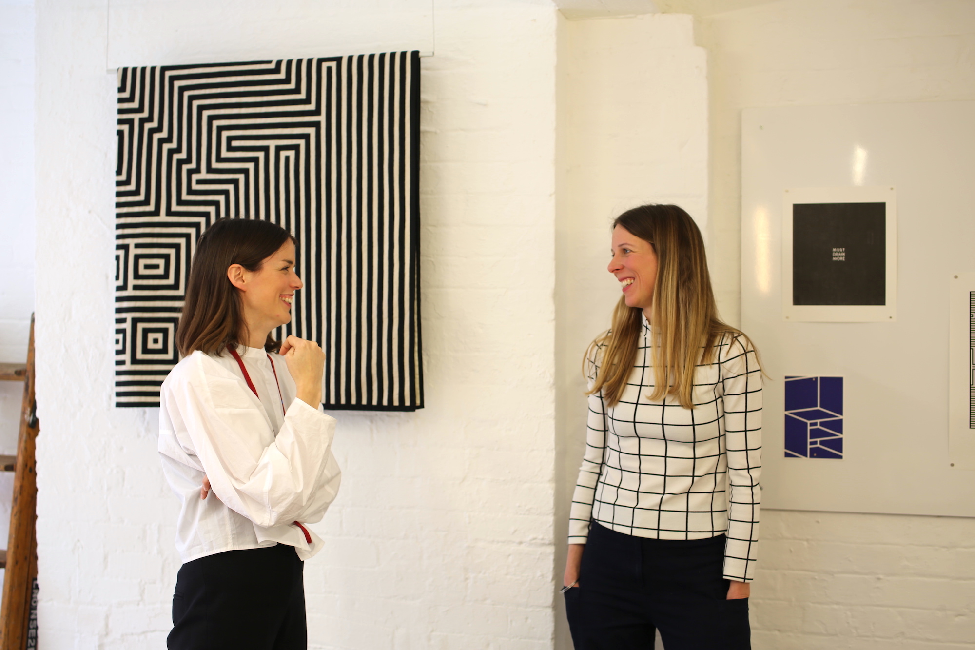
Kirsty Carter and Emma Thomas met while studying at the RCA, united by a love of conceptual art (they namecheck Sol Lewitt, Marcel Duchamp and Daniel Buren, who they’ve since worked with as designers); and hanging out in libraries. Apfel has always been based in East London, initially bedding down there since “most of the printers and people we worked with were east, and that’s where most of the cheaper studios were too”. The team of six has been in the current space for around a year, reworking it with architects OMMX from a “bit of a dump” into the serene little spot it is now. “It’s really nice that we can all sit round one table and have that dialogue and collaboration,” says Apfel of the downstairs basement area, which houses the team most of the time. For projects that require more space, things can move to the more open ground floor.
When we meet in late March, Apfel is gearing up to go to the Venice Biennale, where it’s designed the identities for the Irish and Portuguese pavilions. Here, we discuss working with arts clients, achieving boldness through subtlety, the big B (yes, Brexit) and more.
You both studied for MAs, how important do you think that was for your practice? Do you think designers today need to study postgrads, now that it’s becoming increasingly unaffordable?
Kirsty Carter: I think Emma and I have come from an era of design education which was becoming quite loose in the sense that it wasn’t focused on skills—it’s much more about concept and idea. Yeah. At that point the course, Communication in Art and Design, merged illustration, the film school and the art school together. It felt very appropriate that we just had two more years to mature because I think when we graduated we weren’t at all employable.
Emma Thomas: The briefs were so open ended, it was very rare for people to answer them with a poster, for example. I think we’ve noticed a change in students having that attitude. We’d never been asked to design a logo or anything like that, or a visual identity. When we started working together in college we shared a lot of that approach to working; which wasn’t so dictatorial, it was trying to challenge like what we can do within within a brief or questioning it.
KC: It depends on the course and the individual, but I think three years is quite a short time for graphic design. An extra year is amazing; it gives that extra time for thinking developing and going towards the working world.
 What do you look for when you’re hiring a younger designer?
KC: What we were! Sprightly young things with a million ideas in their heads. Sometimes it’s quite hard to see portfolio after portfolio with work from a specific brief; and you realize you’re seeing five or six students from one course answer it in repetitive ways. It just feels like an exercise in style.
ET: It’s really rare when you meet someone with a special mind—a student equally into content and message. It sounds really obvious but it’s not that often you see those things work well together.
What do you like about working with cultural clients? How did the studio come to be so focused on that sector?
KC: Now that we’ve been going fifteen years you go on this journey, but we constantly go back to the founding DNA of mine and Emma’s interests, which is contemporary art. We do other projects too, but they’re linked—we just rebranded John Lobb shoes, which was a departure. Way back in 2005, when we’d only graduated two years, we redesigned the Architect’s Journal.
It’s interesting how those are also stepping stones and often are linked to the art world, like David Chipperfield, who we worked on with the Hepworth Wakefield knew about our work through redesigning the Architect’s Journal; while the Hepworth director Simon Wallis knew our work for the art world. You realize that it’s a small world, and even if you move out of your kind of usual client base, somehow it’s all linked.
ET: A lot of our work does come out of those early interests and friendships with curators and artists. Even when we were at the RCA, and we were doing mainly personal projects that weren’t to a specific brief, we were working with curators and artists, and we realized what we could with design to bring those two worlds together. The possibilities at that time in working with contemporary art seemed super interesting to us, as a lot of our references and inspiration had been artists working in the sixties.
At the time we were graduating, in the early 2000s, it felt like there were so many opportunities with publications, materials, projects and exhibitions to work with artists and make extensions of their own practice as well. We were having dialogues with artists about understanding how their work could develop in print, or what we could do together with a book project for instance.
How far have things changed now?
KC: One thing that’s hugely different from fifteen years ago is that then, artists, galleries and museums weren’t so savvy in terms of the idea of a brand but today, places like Tate have established that there’s a certain sophistication expected from a gallery. With things like social media, today, everything’s Instagrammable. The books that are produced for galleries are measured in a different way now. We used to do design a lot of invitations and small booklets and more ephemeral print things—that doesn’t exist so much any more.
ET: In terms of print for galleries, they invest more into serious publications now. Our approach is always to totally understand how an artist works and create something very specific for that project, and that changes a lot with the context of where it’s going to live.
What are the main considerations as designers working with arts clients?
KC: We always try to take backward steps in terms of our aesthetic. I think that’s one of the things that we really pride ourselves on as a studio—the forefront is that artist’s work. We’re trying to communicate their aesthetic, their ideas; so that it leaves us with quite an eclectic mix of projects, which we love. Our approach is very subtle and very minimal, often, and I think that that’s sometimes underrated or under-appreciated.
ET: I think it’s also led us to a slightly more typographic approach, because if we’re doing an artist exhibition that’s a group show for example, you wouldn’t really want to put one artist’s work on the cover of a book or promotion. So we were coming up with something which wasn’t necessarily a visual or an image, but something typographic that would communicate some of the ideas in that show. We quite like the restrictions that gives us. We’ve also often had a small budget, so only being able to work with one or two colours has created some quite interesting work.
Now that people are perhaps more aware of things like branding and so on, are clients becoming more open to experimental or unusual approaches to design?
KC: I think in the publishing world they’ve realized that books have to be really special objects now to exist. So there’s investment in terms of production, paper stocks and so on to make it a bit more unique—more of a sculptural object. There’s obviously still budgetary constraints, but then at the same time, I think they realized that they can’t just churn out these kind things that feel quite chuckaway now that we can see so much on the web.
 Can you tell me a bit more about your work on the Barbican’s Modern Couples exhibition? It’s a lovely typeface.
ET: It was quite a challenge, because there was so much content in that show. In a the way, the book is the exhibition. The show was quite visually chaotic, so we had to be quite minimal but also slightly subversive. The graphics had to do a lot of the legwork but also not take up too much space, because there was just so much in it. We used GC16 for the type [by the foundry Bold Decisions].
KC: The type needed to disappear, because there was so much of it, but also still have a presence. We had to have a typefaces that was characterful.
ET: A lot of it was about the tactility of the book as an object as well. Some of the paper is a reference to the letters in the cases in the exhibition, so it’s about those little subtle things like threads or certain colours. All of those things help to make it an interesting object in the end.
KC: We really enjoy those sort of details or elements of playfulness of or quirks; but with something that still functions as a book—it’s not like everything’s all-singing all-dancing.
You’ve worked with the Barbican on a lot of different projects over the years, what makes a good collaboration or client?
ET: I guess the chemistry: just being able to actually have a dialogue and an understanding of where each other’s coming from, whether that’s an artist or a curator or a client in another field. A good example is Faye Toogood, who we’ve worked with for years on most of her graphics. We started working on her furniture brand around 2008 and on the fashion label she’s got with her sister Erica, that goes back to 2013.
 What projects have stood out for you over the years, or changed how you work as a studio?
KC: The Hepworth Wakefield was massive for us, it’s quite hard to get that sort of commission even for the biggest agencies. We did every aspect, the signage, way finding, brand identity, all the marketing materials. It was a very holistic approach from the beginning. When we started on the project [the gallery] was still in build and it was a very small team, and we were quite unknown at that point. It opened in 2011 and all these years later they’re still carrying on with the same identity—often there’s a temptation to change it, but I think it really works for them.
At that point in time, a brand of such delicateness didn’t really exist, but we were responding to this idea of what the architecture looked like and wanted it to be a sort of antidote to this quite hard concrete building. [Barbara Hepworth’s] work has that element in the scale and the materials she’s using, but there is also a certain delicateness to it.
ET: That elegance and the curves and the geometry came into typefaces we created: from a brand perspective, it wasn’t really hard and big and “out there”. It was very delicate, and the typeface is thin enough to mean we could be more bold in using it over the top of artists’ work or images, and that came from an understanding of the art world as well.
Last year you created your We Remain Europe Brexit tote bags. As designers, what do you think the impact of Brexit could potentially be?
KC: We commission a lot of printing outside of the UK, and with publications, they’ll often outsource the binding too—there just aren’t many existing bindaries left in the UK. It’s going to cost us and our clients a lot. We can already see the problems with attracting talent to the studio, people don’t want to make the commitment to move here. We’re already seeing far less Erasmus applications.
ET: For the [design] industry too and how we work in London, we’re surrounded by creatives—that’s the reason why we’re all here. The majority of our friends are all from different countries. One of the reasons people want to be in London is because of that mix; for music and art, if movement isn’t so free, how interesting is it going to be in future? It’s depressing to talk about. I guess [Brexit] is embarrassing, as well horrible.
Words: Emily Gosling
Photography: Louise Benson