“Every new beginning comes from some other beginning’s end”
—Seneca
A few years ago, I saw a film about Milton Glaser at a small New York City
theatre. The image quality was terrible. But despite the pixellation, it proved interesting, even though I discovered little that I didn’t already know, except about his personality. He exudes a self-confidence that borders on being obnoxious.
Glaser studied graphic design at the Cooper Union for the Advancement of Science and Art, a private school that was founded in 1859. From the beginning, it was highly progressive. Until 2014, tuition was free. That’s when the shit hit the fan. Due to a financial crisis, the Board of Trustees voted to charge for studying there. The students staged massive protests. Fortunately, the New York State government has helped move the school back towards the restoration of free tuition.
Others who studied there concurrently were Edward Sorel
, Seymour Chwast (pronounced Kwast) and Reynold Ruffins. They likewise came from families of little means. Modestly, Glaser continued to live in the same apartment for decades on St Mark’s Place, very near the Cooper Union. I remember seeing him sometimes in the street there as I strolled around shopping for used clothing, including over-sized workers’ coveralls and T-shirts that I wore everywhere.
“I have never been a Dylan fan. And, ironically, the black-and-white album sleeve design, which is not by Glaser, is ugly”
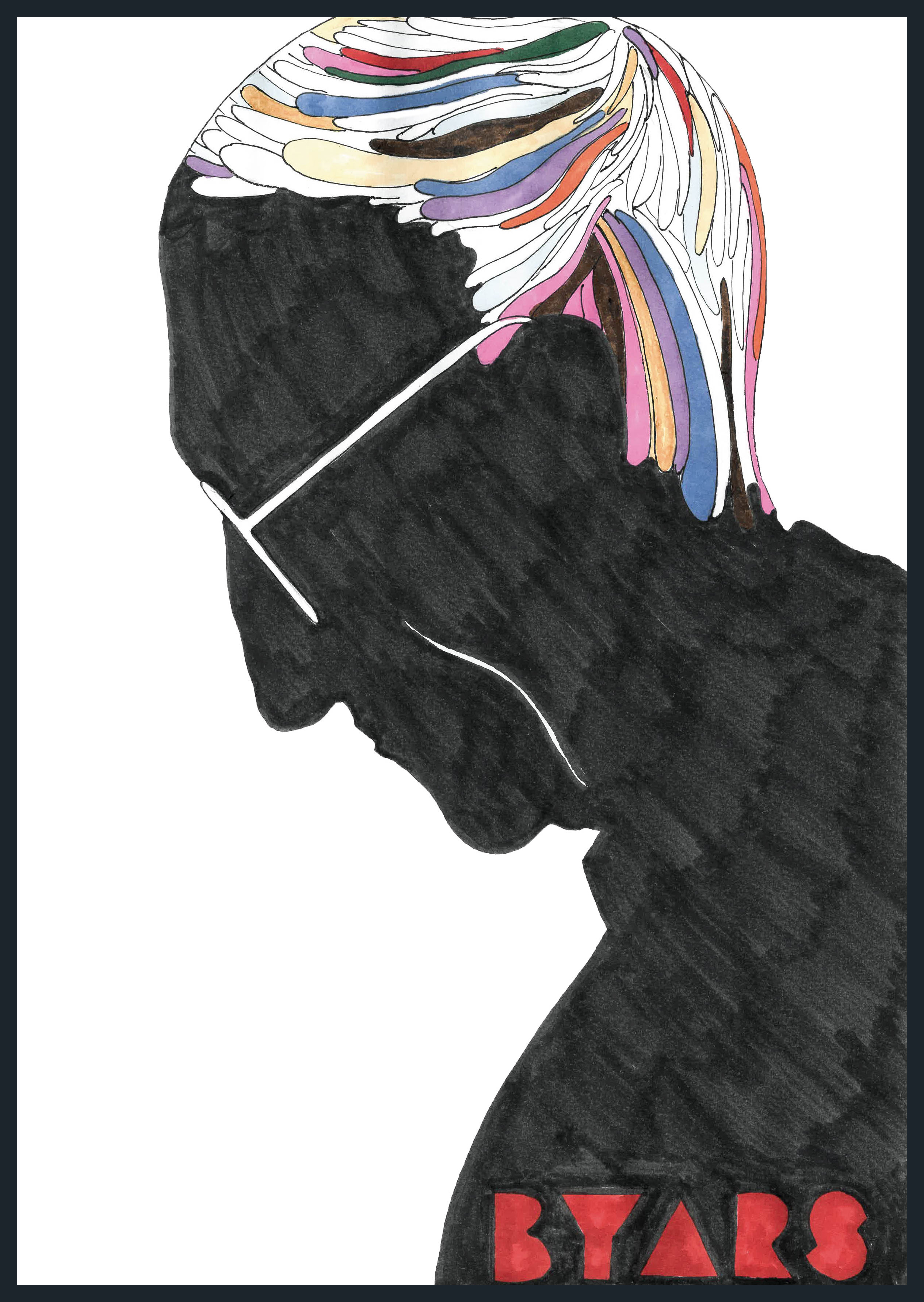
Glaser is well known for his Dylan-silhouette poster, which hangs on a wall facing me as I now write about him. It was an insert in the sleeve of a Dylan 33 1/3 phonograph record, folded twice horizontally and once down the middle. I mention this for two reasons: (1) the folds made the large size able to fit into the sleeve; and (2) if you see one that shows no folds, it’s a reproduction, not an original. If you acquire a copy, do not smooth out the folds and never dry-mount paper art of any kind. I acquired mine long after its 1966 creation. By the way, I have never been a Dylan fan. And, ironically, the black-and-white album sleeve design, which is not by Glaser, is ugly.
An even more famous Glaser work is his “I❤NY” logo, which he designed pro bono. It has been copyrighted by New York State, for which it was intended as a promotional gimmick to foster tourism. Glaser said that he might have been subliminally influenced by the “LOVE” art of the late Robert Indiana. The phrase was created at the Wells Rich Greene agency by its founding president, Mary Wells Lawrence, and the creative director, Charlie Moss. I remember the group well because it produced some of the most creative, groundbreaking American TV advertising during the creative explosion of the 1960s. (At the time, larger salaries began to be paid to Madison Avenue creatives. The quest, according to scuttlebutt then, was “30 by 30”—to have a salary of $30,000 by the time you became 30 years old. Today the sum equates to about $250,000. I then made the equivalent of about $50,000.)
“The ultimate sin in the original font has been: ‘I ❤TY’ with ‘POGRAPHY’ in a diminished size below”
Lore suggests that Glaser sketched the logo on a napkin on his way to the agency. Its subsequently being copyrighted has been for naught because it has been purloined for everything imaginable, including “I❤POODLES” and others with a change of the red colour. Who would use a green heart? And a number of the derivatives and counterfeits exclude the 1974 American Typewriter font by Joel Kaden and Tony Stan. That oversight might be because some borrowers don’t know much about typography. The ultimate sin in the original font has been “I❤TY” with “POGRAPHY” in a diminished size below—no, I’m not making this up.
Sorel, Chwast and Ruffins established Push Pin Studios in 1954. Glaser joined them in 1957, when he returned from a Fulbright scholarship in Bologna. I hadn’t realized until now that the founding took place so long ago. Some met at high school and all were together at the Cooper Union.
Glaser left the group in 1975 and went on to design and illustrate more than 300 posters and became active in branding, exhibitions, packaging, architecture. He has received a number of accolades, the most distinguished being the US National Medal of Arts awarded to him personally by President Obama in 2009. The award was the first to a graphic designer.
Chwast’s graphic design has also combined social commentary with a distinctive style. For a very short time after Push Pin, he partnered with Herb Lubalin, “the king of typography”, and Alan Peckolick, also a typography maven. Chwast married graphic designer Paula Scher in 1973. (They divorced in 1978 and remarried in 1989.) She became a partner in the New York City office of Pentagram and has been profiled in a Nexflix documentary, Abstract: The Art of Design.
A partner until 1963, Ruffins has become known for illustrating a large number of children’s books. He was granted the Augustus Saint-Gaudens Award by the Cooper Union as well as a number of other accolades. In case you don’t know, Saint-Gaudens was a prolific nineteenth-century sculptor and creator of the 1907 $20 gold coin, considered the most beautifully produced by the US Mint.
The New York Times has called Sorel, like Glaser a graduate of the High School of Music & Art, “one of America’s foremost political satirists”.
If the founders’ work has or had a common aesthetic, it was a revision of historical surrealism, frequently calling on anatomical synecdoche, a fancy word for the use of a partial image to insinuate a whole idea, such as Chwast’s 1980 rendering of a leg and an untied shoe in a forward motion for a change-of-address announcement.
“I am afraid that the era has ended, and just as well”
The Push Pin staff, which expanded greatly over the years, included Paul Davis, Jim McMullan and John Alcorn. Davis’s plethora of posters for theatre and TV is unparalleled. I still have a copy, unfortunately rolled up because it is very tall, of Davis’s 1976 poster for Raul Julia’s production of The Threepenny Opera for the Vivian Beaumont Theater. His posters caused Glaser to muse: “They create a very special excitement.” The 2014 defining profile of Davis in The New Yorker magazine, titled “Poster Boy”, suggested: “In Davis’s hands, the posters themselves become an event.”
Graphic-design historian Steven Heller contributed to the Push Pin Graphic, the self-published periodical that existed from 1955 to 1981. It was initially sent to the staff’s friends and clients. It greatly elevated Push Pin’s fame because, even though it was in a sense propaganda, no issue ever seemed self-aggrandizing.
I am afraid that the era has ended, and just as well. Winston Churchill knew: “Now is not the end. It is not even the beginning of the end. But it is, perhaps, the end of the beginning.”


