I first meet Ian Davenport on a frenzied, albeit invigorating preview day for the 2017 Venice Biennale. We speak initially for four minutes, one of many four-minute interviews the resolutely upbeat British artist gives that day to an apparently never-ending line of press. His presence in Venice marks the culmination of a project for Swatch, for which he created an original watch and an expansive 14m-wide painting, Giardini Colourfall, comprising over a thousand poured lines of paint and situated in the open air—in stark contrast with the many national pavilions, where the big names sit behind the odd, characterful walls of each country’s structure.
“What I am interested in is visibility,” he tells me later, when we meet again at his South London studio. “I enjoyed putting work out into the public realm at Venice. I know it’s within the Giardini but it is a wide audience and there are a lot of families going there. In a gallery context, we’re trained to react to something in a particular way and it’s quite a conservative reaction. Out in the open space people were jumping in front of it and having their photograph taken and it was really nice. I think artists in general are very drawn to that and don’t want to just reach a rarefied audience. Having said that, I think it’s doing it in a way that doesn’t dumb down the work. I don’t make a distinction between what I do for Swatch or a work that is going to be shown at Tate.”
Davenport has always had a decidedly irreverent approach to art making—one that is shared by many of his art-school peers (he graduated in 1988 from the YBA-spawning Goldsmiths and participated in the era-defining Freeze show)—although his practice isn’t derisive: rather than taking the piss, he simply offers a direct engagement with the work. “When I was at college that was something that came out of that whole art education process,” he tells me, “and growing up in the seventies and eighties with punk, seeing art and culture and wondering who it’s for. There is no big didactic message.”
He’s used cooking analogies numerous times to describe his process, comparing it at points to making pancakes or a stir-fry. “I made paintings where I was turning them upside down and making these big circle shapes,” he tells me of the pancake analogy. “It was a way of describing how these paintings were made to a person who might not be too familiar with it, and it’s kind of funny as well. Sometimes the dialogue around art can become so convoluted and wordy and verbose that it puts people off. The jargon of it can be a bit heavy. You can still convey pretty difficult ideas to people, it’s just about making it approachable.
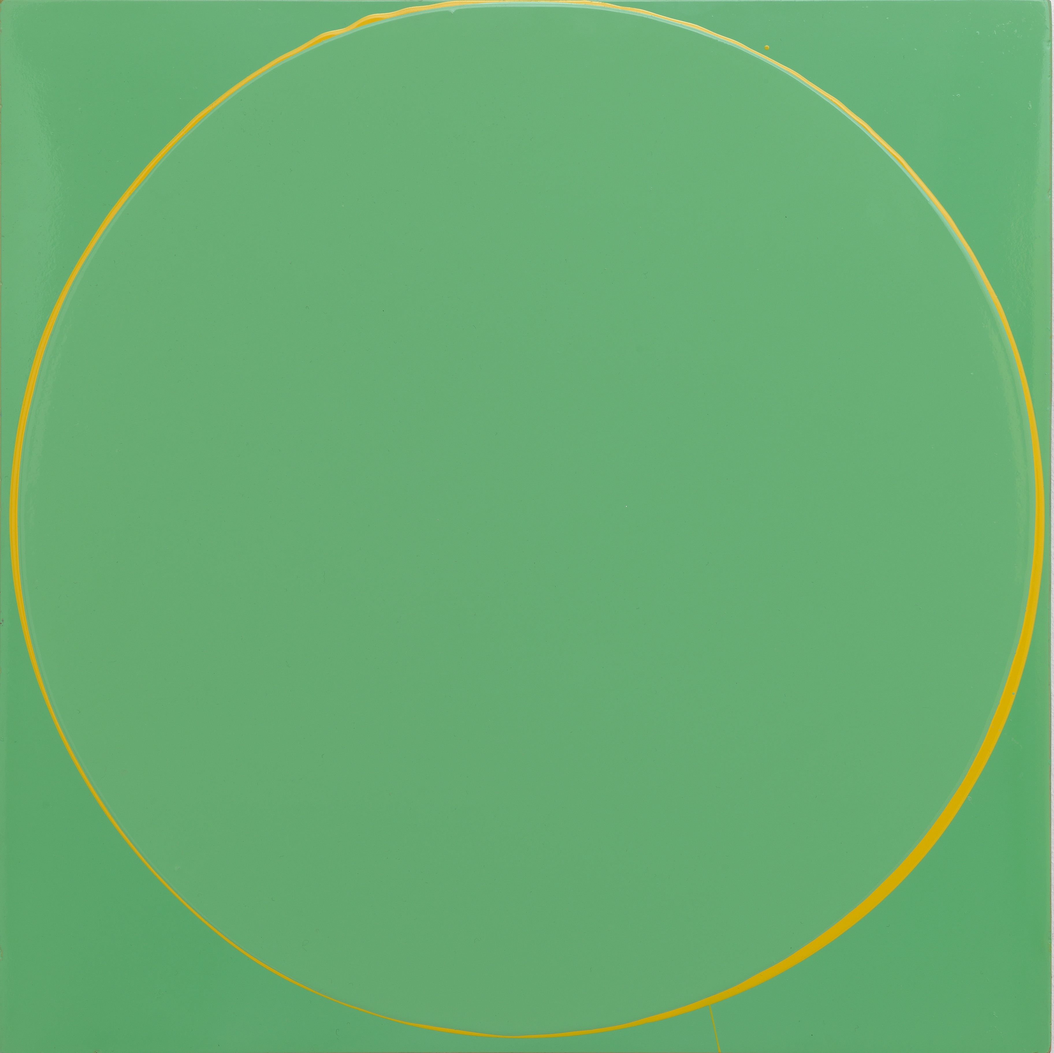
“[The Circle Paintings] were probably the most technically difficult things I’ve ever tried to do and I think that interest in architecture came from those big dripped arch shapes, and then I started thinking what I really wanted to do was painting on buildings and walls. I went on a research trip to Florence to look at frescoes. I love the directness of them, it feels really honest and straightforward.”
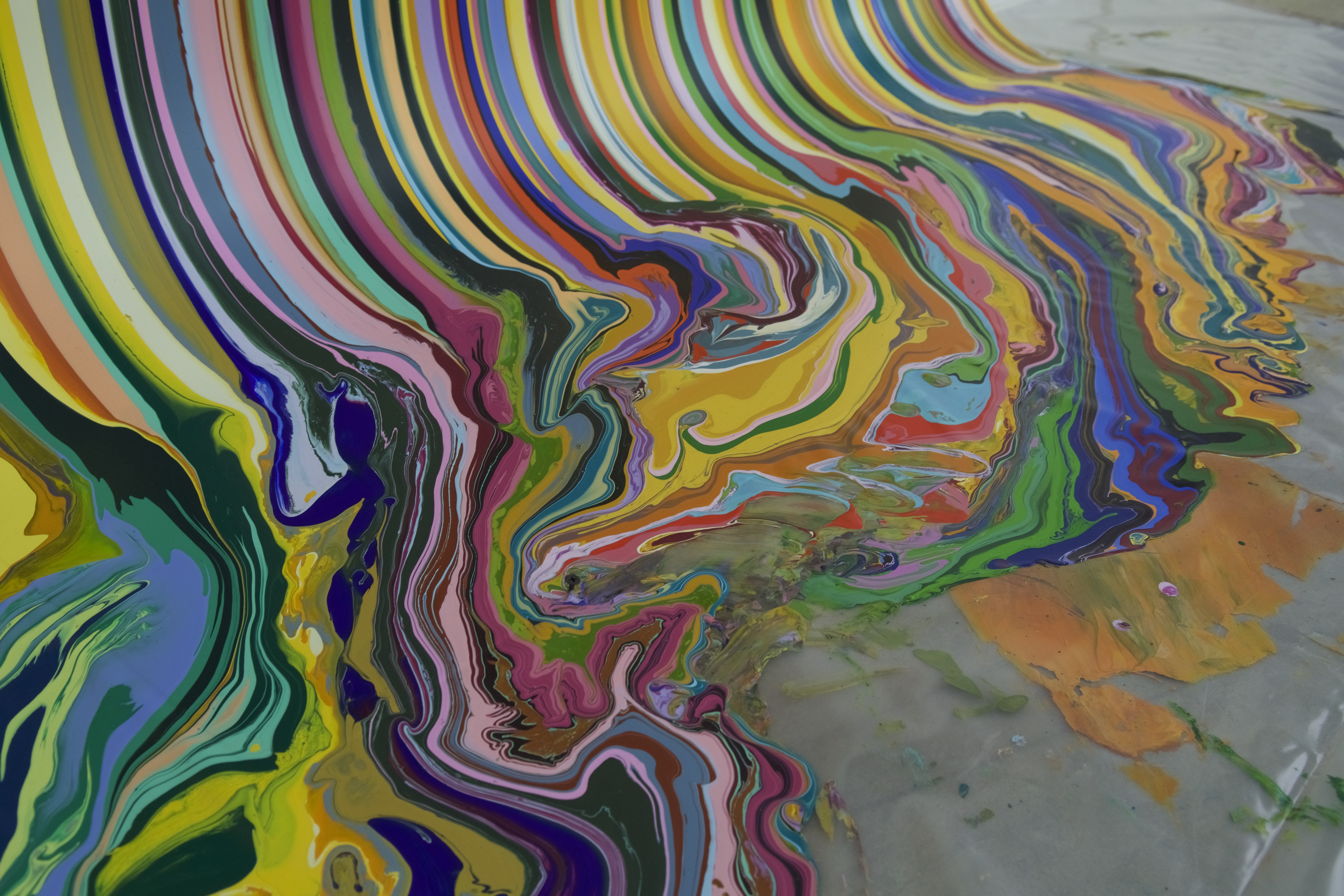
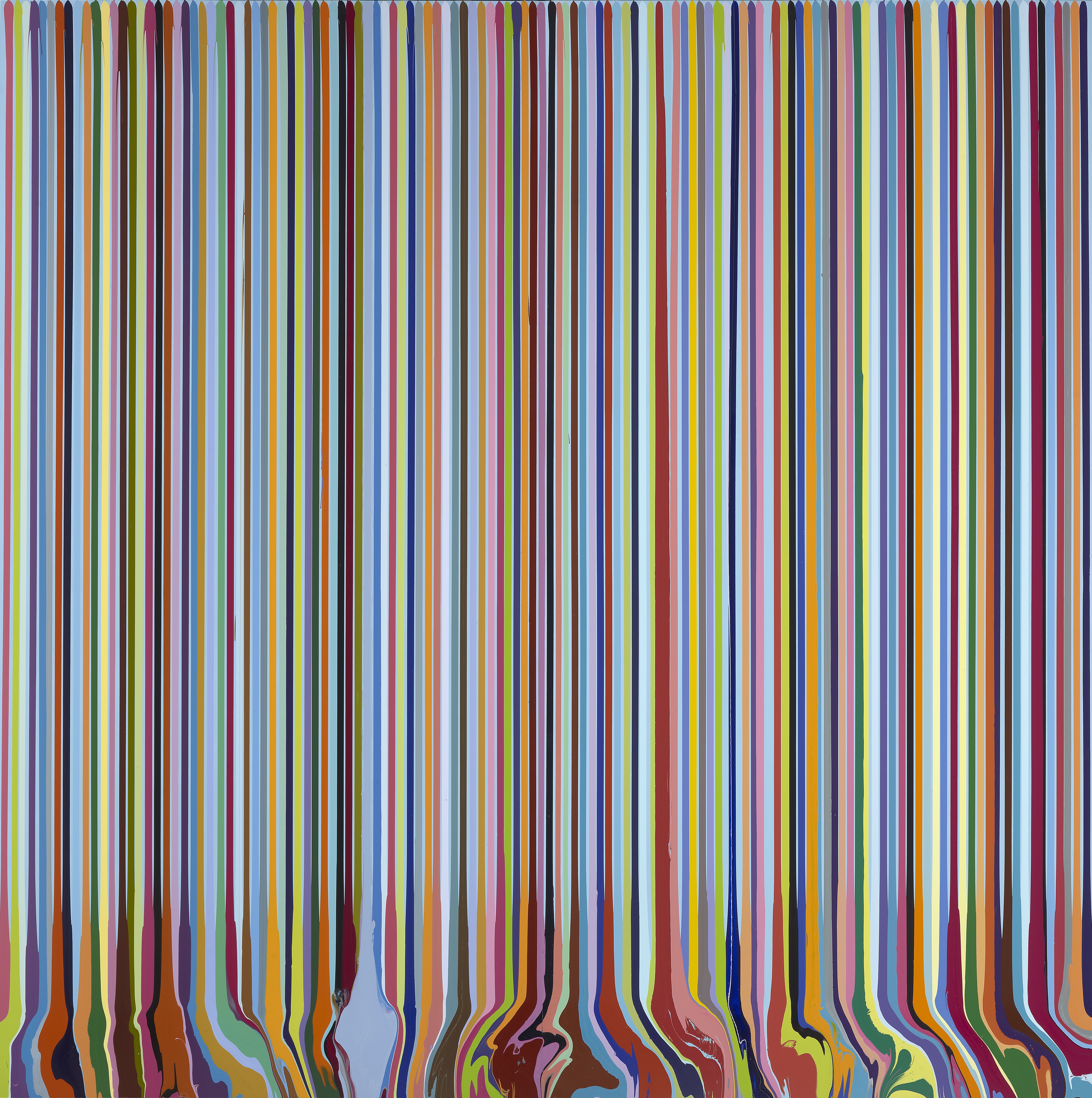
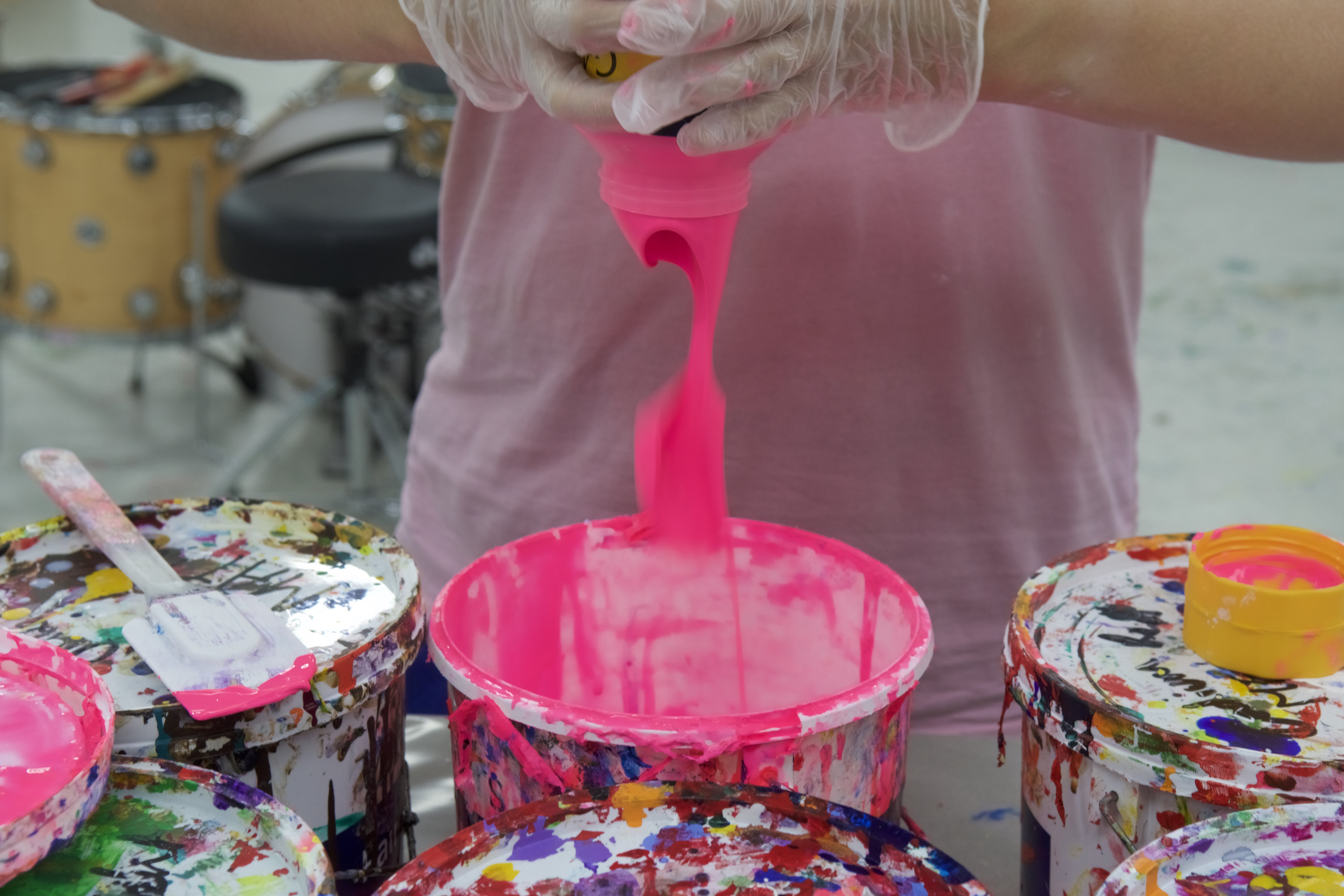
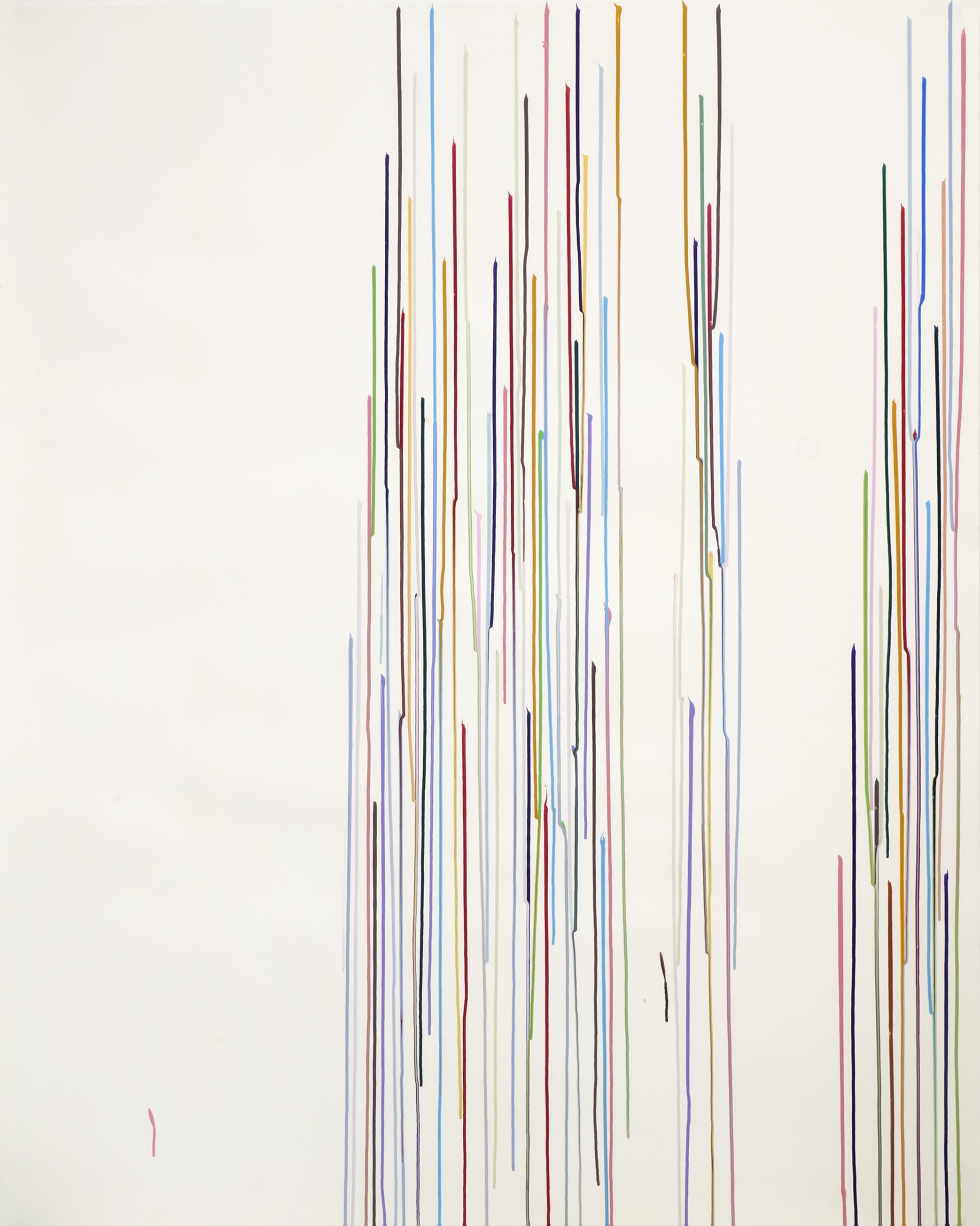
His recent Poured Line and Puddle Paintings are the result of long-perfected but simple techniques. In these works, often hundreds of lines of paint are precisely poured from top to bottom, sometimes diverging from their deeply satisfying regimentation to form an equally pleasing pool at the foot of the canvas. His Staggered Line works of 2010–12 have a notably human irregularity when viewed even from far back but his more recent pieces are almost flawless in pattern, creating a moment of tension as you approach the work when the lines begin to give way and reveal drips, crossovers and tiny sections where the paint may not have quite hit the canvas on its roll downwards. I wonder how many of these elements are strictly controlled by the artist.
“With the painters I really like, like Velázquez—and I’m not trying to compare myself to Velázquez—there’s something lovely about the magicianship when he paints a collar and you look at it from far back and your brain understands it as lace, but when you get close you understand the marks. There’s something so vital and assertive that is just amazing. It’s a fine line between controlling it and making sure it doesn’t become too contrived.”
Once Davenport hits on a new process he works with it for a while (there are clearly defined chapters in his work) but this happening upon different processes—whether pouring, dripping or puddling—is often the work of chance. Walking around the studio, he highlights the tiny, delicate coloured splats of paint that have been left behind on the walls from a much larger work. Everyone in the studio loves them, he says, and they could spark a new way of working. Similarly, the luscious puddle of paint that sits at the bottom of many of his paintings took shape after he noticed the way this happened naturally when he was making poured line works. “I think it’s having the confidence to allow that to happen and thinking ‘that could be a great piece of art’ rather than having to have a theoretical reason there,” he says. “I think my generation of artists weren’t worried about that so much and made work that was very visually dynamic.”
“I trust my eyes. I don’t really buy into the theory of colour”
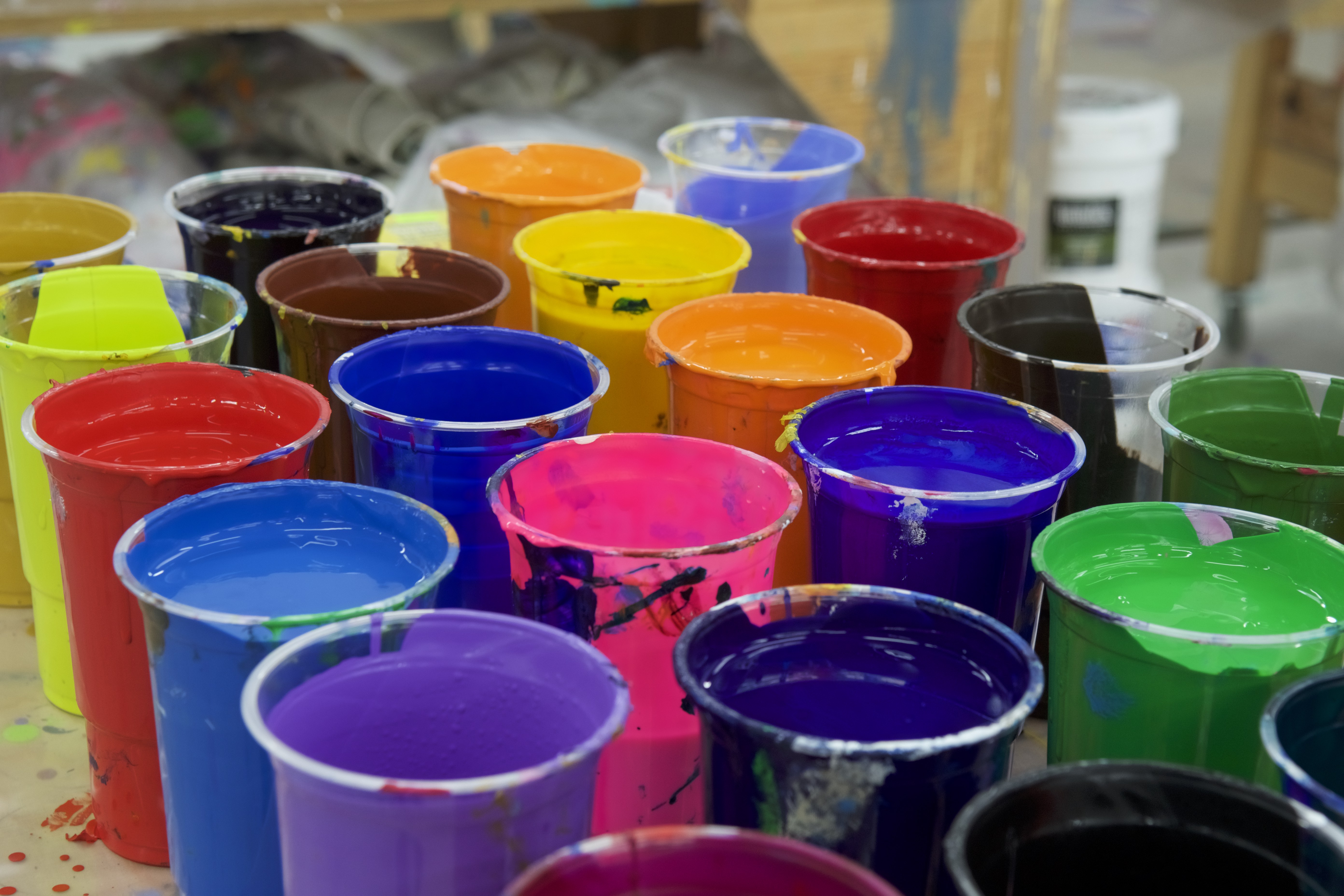
Similarly, Davenport’s colour palette is led by the eye rather than theory and has, in the past, taken inspiration from sources as diverse and culture-clashing as Tintin, The Simpsons, Hans Holbein and Vincent van Gogh. “It’s not at all scientific,” he tells me as we stand in front of one painting with a particularly complex-looking colour combination. “I trust my eyes. I don’t really buy into the theory of colour. It’s not what I want to look at in a painting. When I was younger my mum bought me a book on Cézanne that said when you looked at the set-up of a still life in one of his paintings there was a pyramid and a cone and a triangle, and there were all these lines connecting it up. I thought he must be a scientific genius. I was talking to one of my tutors at college about it and he said, ‘No, Ian, he didn’t do that. He will have been looking at all the objects on a table and will have thought: I’ll tip up the bottle, I’ll angle the banana over here, actually the drapes need to be there…” Of course that’s how he did it! It wasn’t to do with triangles and lines. Things are much more obvious.
“I started reading a lot of discourse around it but I was trying to talk about kebab shops as well”
“When I was at college I wanted to learn about Pollock and Morris Louis and people like that,” he says. “I looked into a lot of American painters like Brice Marden and other people I admired and I started reading a lot of discourse around it but I was trying to talk about kebab shops as well. There would be a conversation about rhythm and music and melody and anti-melody, and I’d say: ‘Yeah, but there’s this great kebab shop at the end of the street with these fantastic stripy curtains and they were blowing in the wind. That’s why I realized that the stripes could become a bit more irregular.'”
Davenport’s works are eventful; often large-scale, always impactful and undeniably enjoyable on the eye. He started out at Goldsmiths planning to be a sculptor but, in an unusual move for the art school that notoriously guides its students away from brushes and canvases, was encouraged to start painting. One tutor in particular noticed that he handled paint in a natural and unique way. “I put that together with just feeling more comfortable in the sculpture studios,” he says, “and looking at how sculptors handle materials and question approaches to making art. It’s a sculptural approach to painting but it’s still painting.”
It’s common to see an artist’s work gradually expand as their means do, but Davenport began working large-scale straight off the bat. “I was really lucky when I left Goldsmiths,” he tells me. “There was someone who worked there and her partner had a massive warehouse on the river. I worked in this old dog biscuit factory, right by the Thames, and parts of it were completely abandoned, so if I wanted to make a really big painting I could. You have to remember I was in shows where people were cutting up dead animals and projecting naked ladies onto walls, so I had to deal with that. It was one way of literally creating space for myself, having presence, making something dynamic and me feeling I had a language that could compete in that kind of environment.”
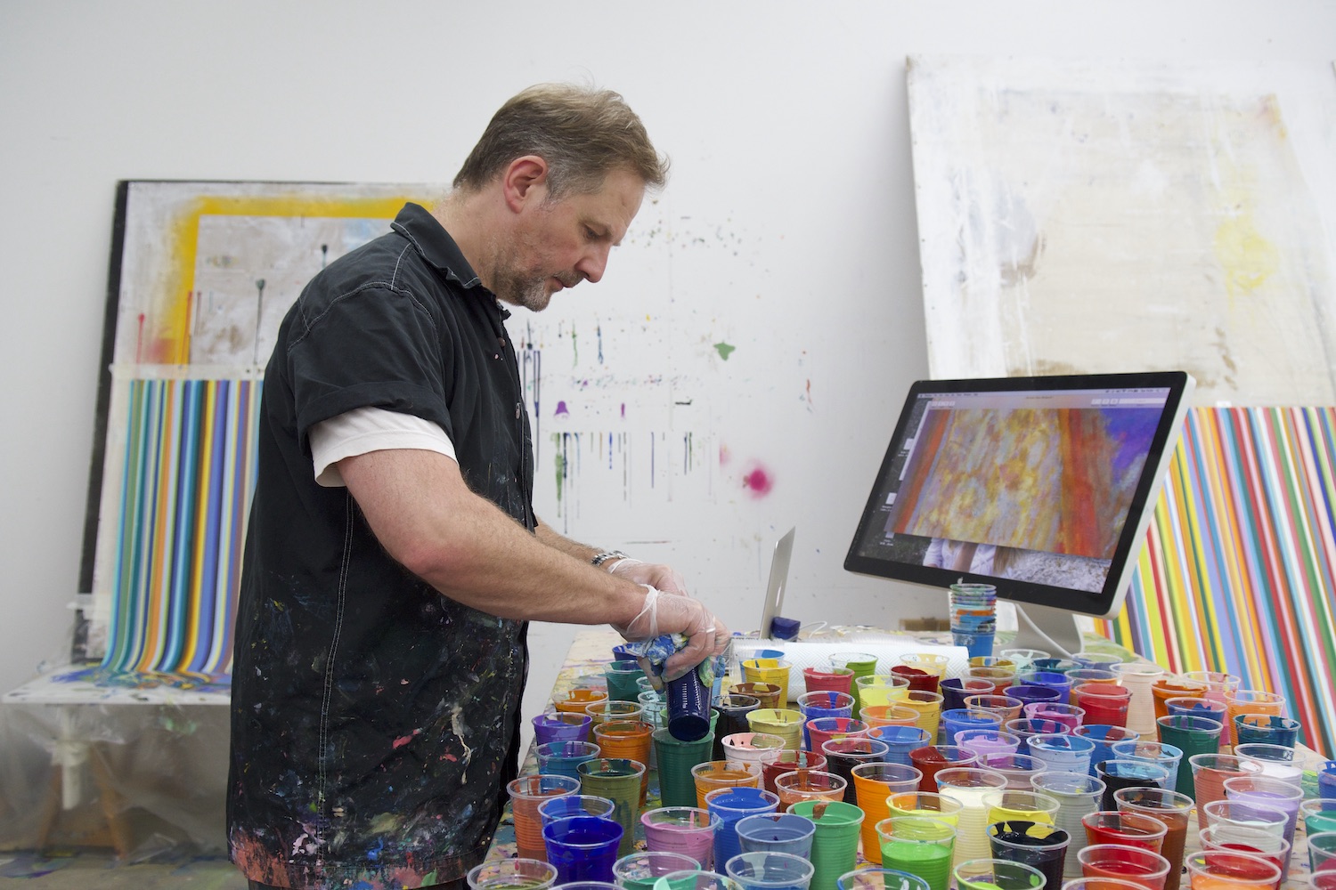
His studio space now is unexpectedly pristine and feels like a suitable mirroring of the controlled chaos suggested by his paintings, ordered and cleanly designed but also vivid and rhythmic. Towards the back of the studio, a cleanly gleaming silver drum kit sits ready for bashing. Rows and rows of coloured paint sit neatly ordered on tables. There’s something a bit sci-fi about it, the way an advert on TV might suggest a car factory looks. “I actually had a very, very messy painting studio and got bored with it,” he tells me. “I really enjoyed the fact it was so mentally messy. After about twenty years of that I thought: you know what, this is really uncomfortable.
The studio consists of Davenport and a few long-term gallery assistants who seem to fit into slightly different roles—often supporting with commercial projects, planning painting mock-ups in Photoshop and mixing colours. “It opens up more possibilities and it’s a balance of using that in a fruitful way so it feels like you’re being inventive with it,” he says of his expanded team. “There are a lot of large projects. Physically mixing paint can be very time-consuming. It’s fun but the results are hard won.”
“We have the crazy Bee Gees falsetto choir in the studio,” he tells me later. “When you’ve got other people around, it’s a way that we can bond and it doesn’t become too serious. I’ve always played music, drums and guitar, and now I look at the paintings and I realize there is a sort of parallel between musical rhythm and the pulsing lines and striping beats. A lot of abstract painters are interested in the discourse between music and visual art. Kandinsky was talking about it in the early twentieth century. The fact that I play music a lot makes it feel quite natural to me.”
This feature originally appeared in issue 33
BUY ISSUE 33