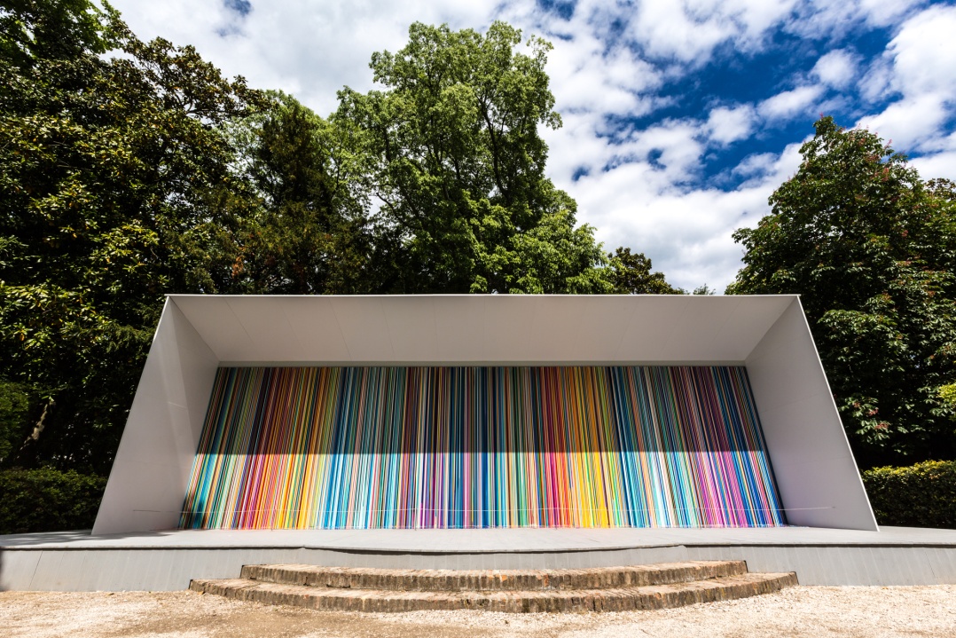
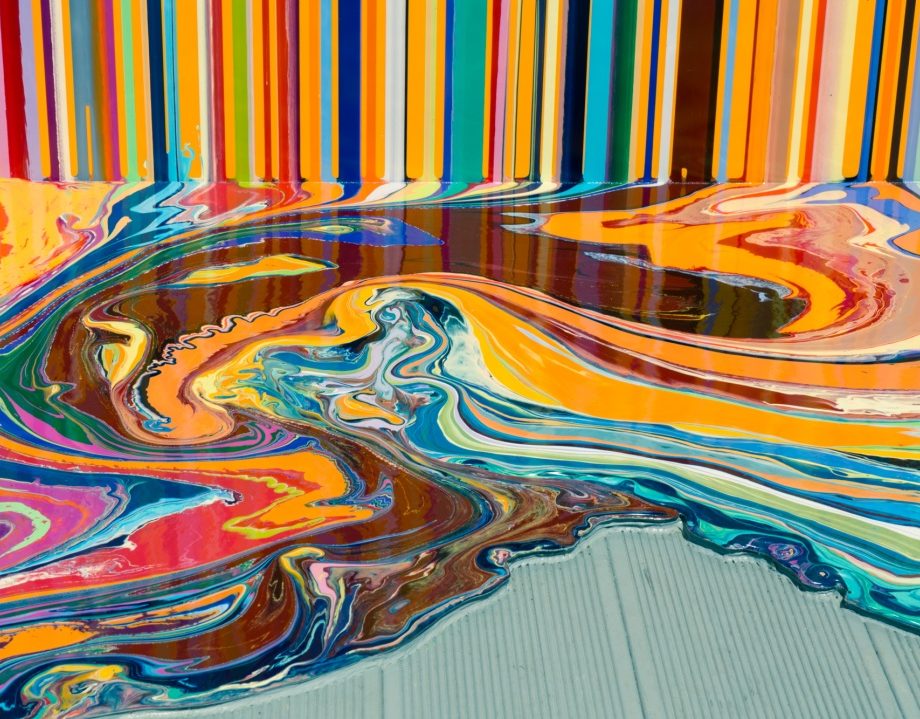
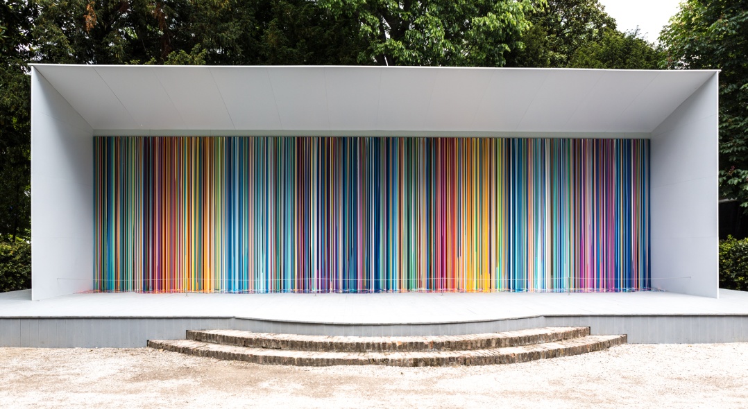
Davenport created the work specifically for the Venice Biennale’s sun-soaked Giardini. While the majority of the works on show at the Biennale sit indoors, encased by the walls of the many national pavilions that increase in number year on year, Giardini Colourfall inhabits the city’s leafy outdoors. It’s a vast painting, stretching lengthways for fourteen metres. At first, it almost defies belief, each line created by hand by Davenport and his team with scrupulous precision. But on closer inspection, the various bleeds between the colours reveal themselves: there’s room for the imperfect in his rigour. Many of the British artist’s previous paintings reference a specific colour palette, culled from sources as diverse as Hans Holbein’s 15th-century masterpieces and The Simpsons. For this particular painting, as he explains, Davenport took inspiration from a number of different works at once, but you might not figure out the histories the colours connect to, as they mutate into something unknown in the work. I spoke with the British artist in Venice as the painting was unveiled to a bustling crowd.
Your paintings’ colour palettes often come from a specific external source. What was the inspiration for Giardini Colourfall?
We wanted to have quite a worked out colour scheme for the painting. On a painting of this size, it’s just too big to change your mind. There are too many things at risk. You have to have an idea of what the composition is and how it’s going to fit. I took some pictures of the space in the Giardini and we were looking at how it might sit there. The colour scheme, in particular, was worked out from a number of different paintings and we almost did a club mix mash-up and took sections of them together and modulated the colour so that it would work. From blues into magenta and yellow and red… so it went from hot to cold. And then we repeated the sequence. It creates a sort of mirror, it gives it an echo.
So, it’s an exact repetition, line for line?
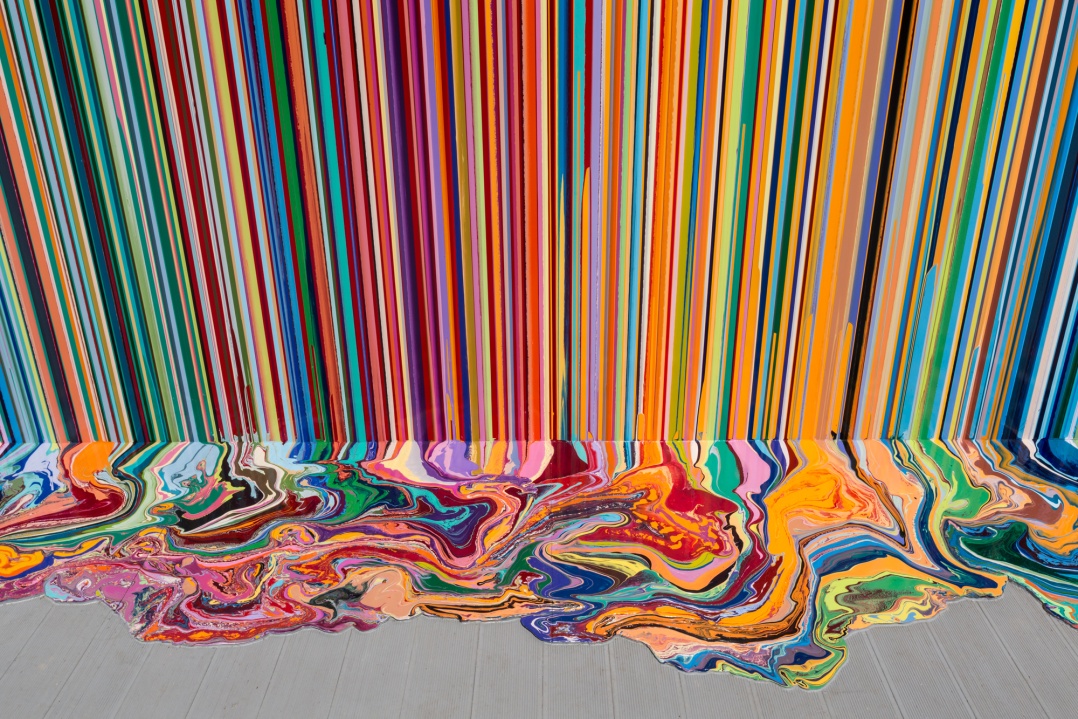
It is an exact repetition of the colours, but the way the paint is poured means that the bands of colour are different. So, actually, your impression is that they are not the same, as our eye reads colour values next to each other. If you put orange next to red and the band of red is much bigger than the band of orange in one, it will feel different to if it was the other way around.
Are you usually so regimented in the way that colour is applied, or are some works more spontaneous while in the making?
It’s a bit of both actually. I tend to make machetes and studies that are quite intuitive, and then start to take the bits of those which I feel work and put them together in a bigger painting. So there is quite a lot of detail that goes into it, and those are the ones that tend to work the best. There is a bit of research that goes into each machete, but it also surprises me. I don’t know quite how they’re going to work out and there’s no pressure. Sometimes they, in themselves, are really beautiful things but often there’ll be a section that really works and one that doesn’t. As we’ve begun to get a bit more sophisticated with stuff and are working with Photoshop and computers you can begin to take these sections around. Almost collage them together.
You’ve been working with this technique for a few years now. As you understand the process more and more, does it become harder to break your own patterns?
It’s important to change certain things, and it could be something very small but it might open up a whole different language. I started looking at other artists’ colours, for example, and it pushed me. The Simpsons was interesting because it allowed me to look at different colour, I also used Tintin[‘s palette]. I went into a bluebell wood the other day and took a lot of photos of bluebells. It’s just such a spectacular colour arrangement, and with these little flowers you notice there are all these tonalities, subtleties. I would like to try that, but then it could be hopeless! You can have these ideas and then it doesn’t work out. Sometimes the really basic ideas work really well and they can be so simple that people ignore them because they think there should be something more.
Is it important to you that viewers pick up on some of the reference sources for your works if they have been inspired directly in this way?
It’s not important straight away if people can see that, but if people want to learn a bit more about me I like to make that information available for them. Maybe even have pictures of the historical works they might be referring to. I don’t want to hide anything. It’s interesting for me how a painting might reflect the source but be its own things as well.
‘Giardini Colourfall’ is a special commission at the Swatch Pavilion for the 57th Venice Biennale. The work is displayed as part of Swatch Faces 2017 and the artist has designed a limited edition watch, ‘Wide Acres of Time’ in line with the exhibition. swatch.com