Reeves, Rowney and Winsor & Newton have each been producing artist supplies for almost three centuries. You might not be able to judge a book by its cover, but the evolving packaging of these products tells a story of changing tastes and markets. Their graphic design, logos and colour schemes reveal much about their times, as well as the enduring power of making.
All photographs taken by Louise Benson at the Winsor & Newton Archive in West London in 2019
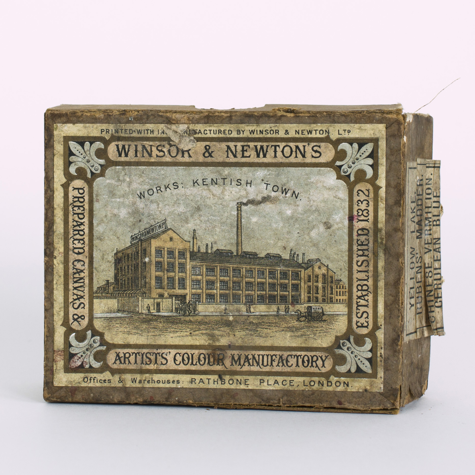
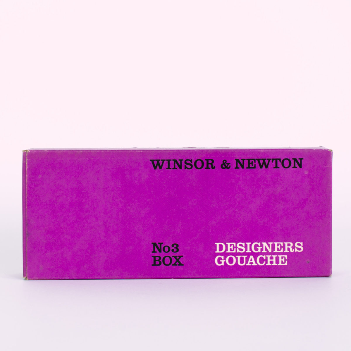
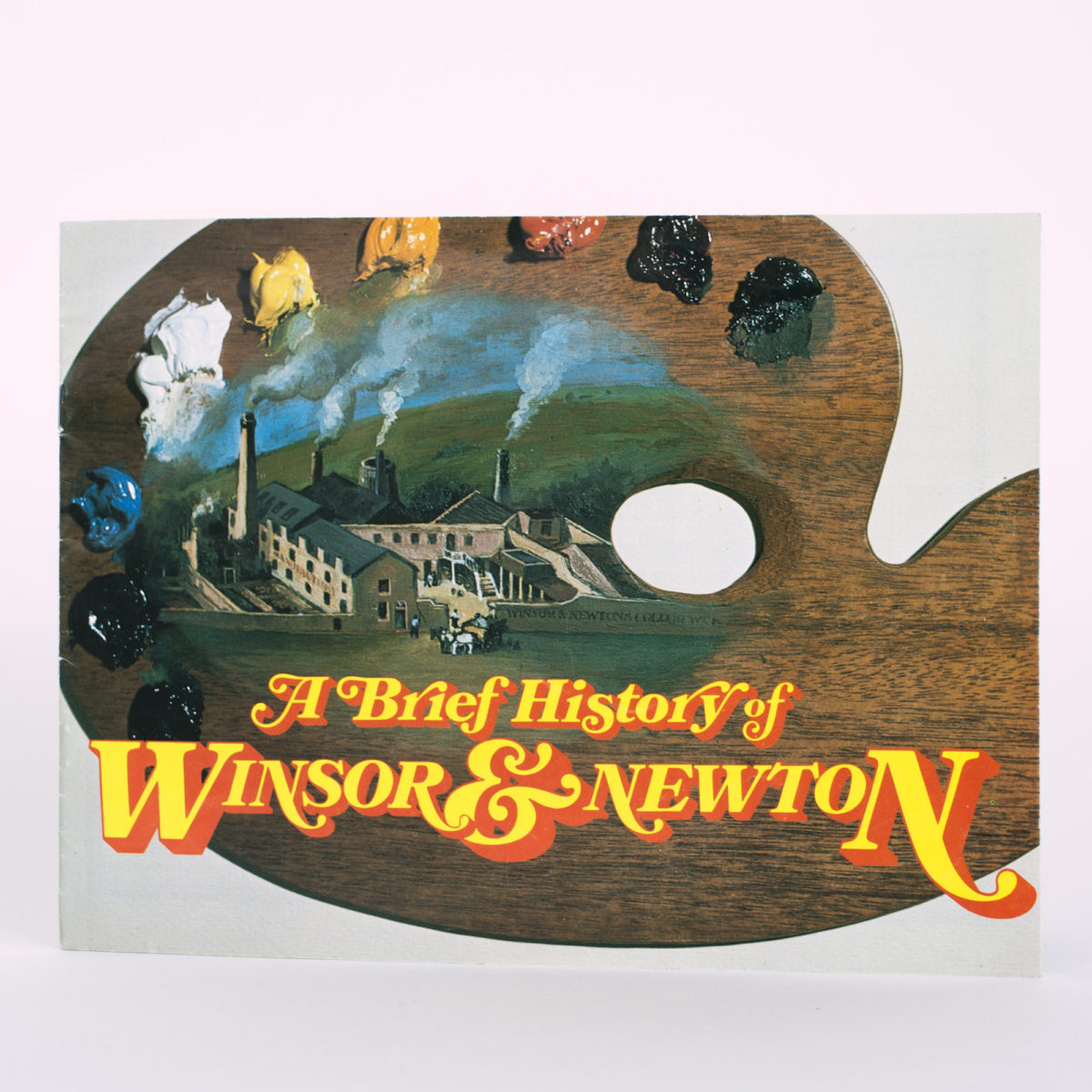
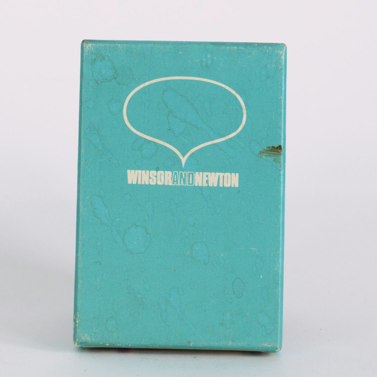
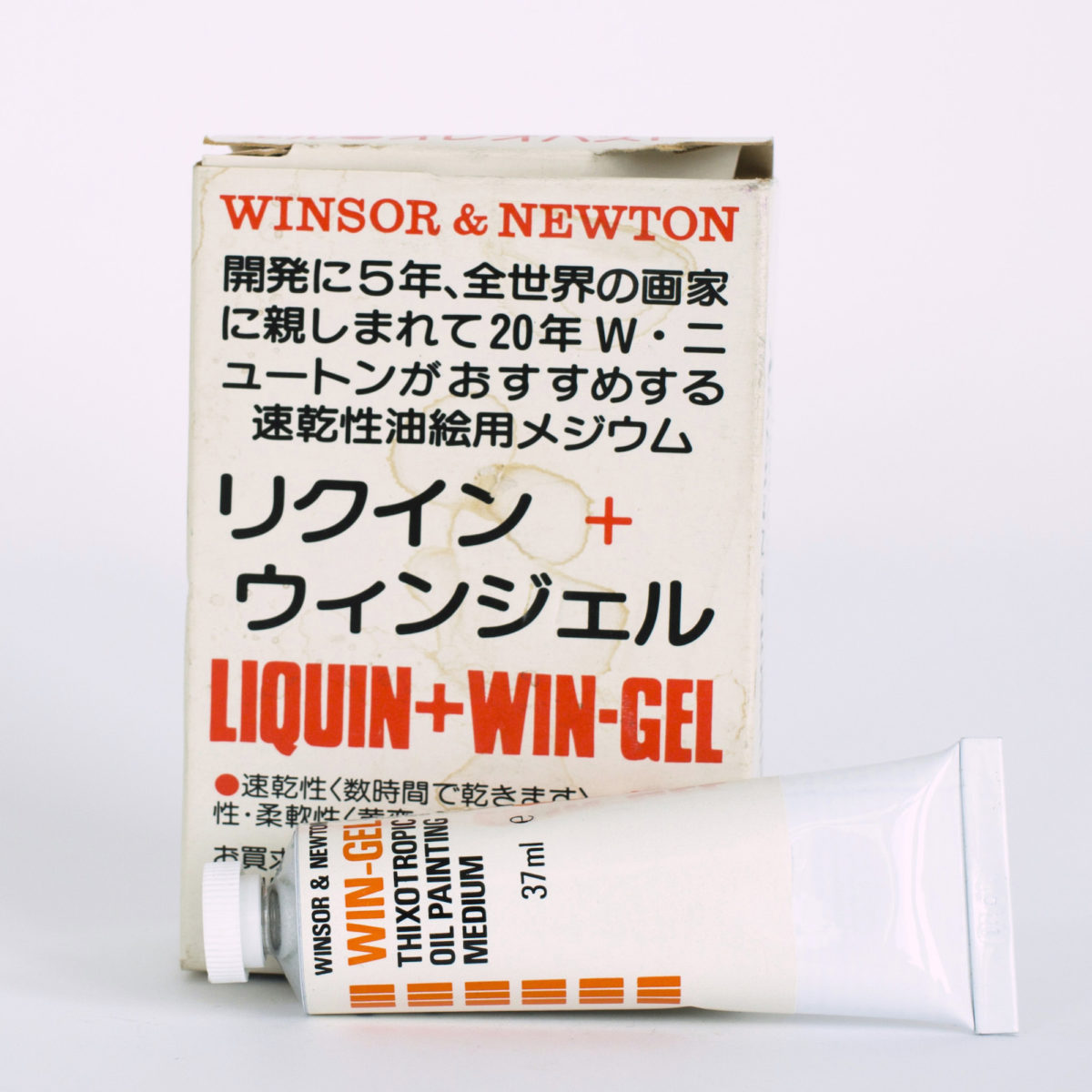
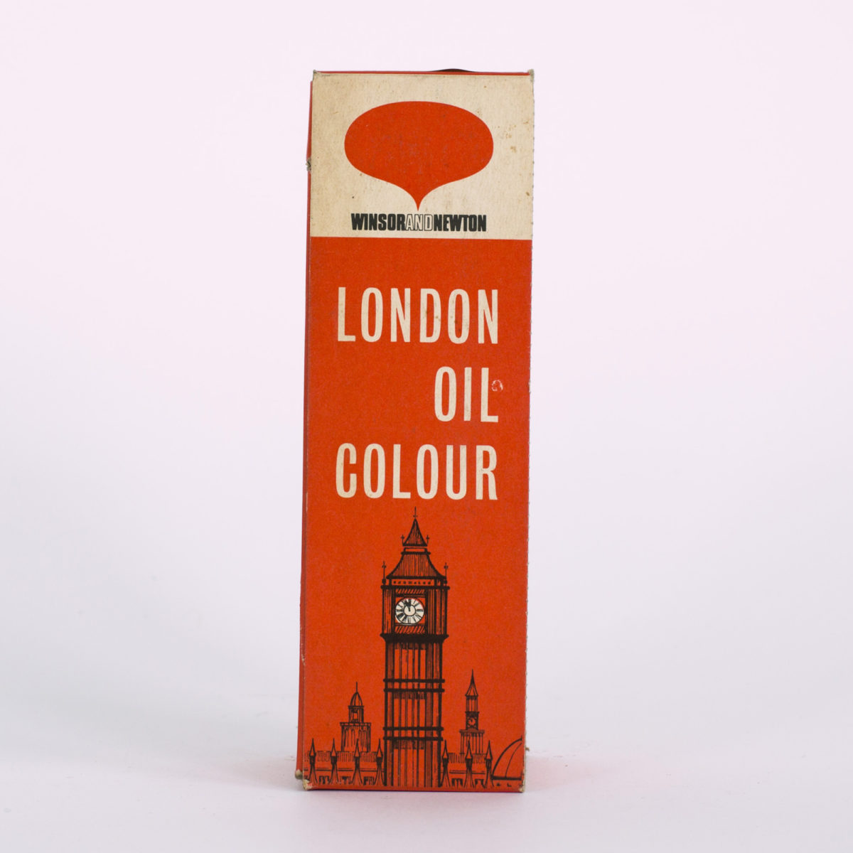
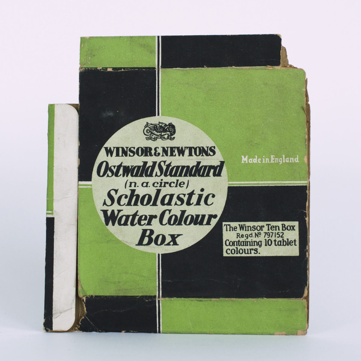
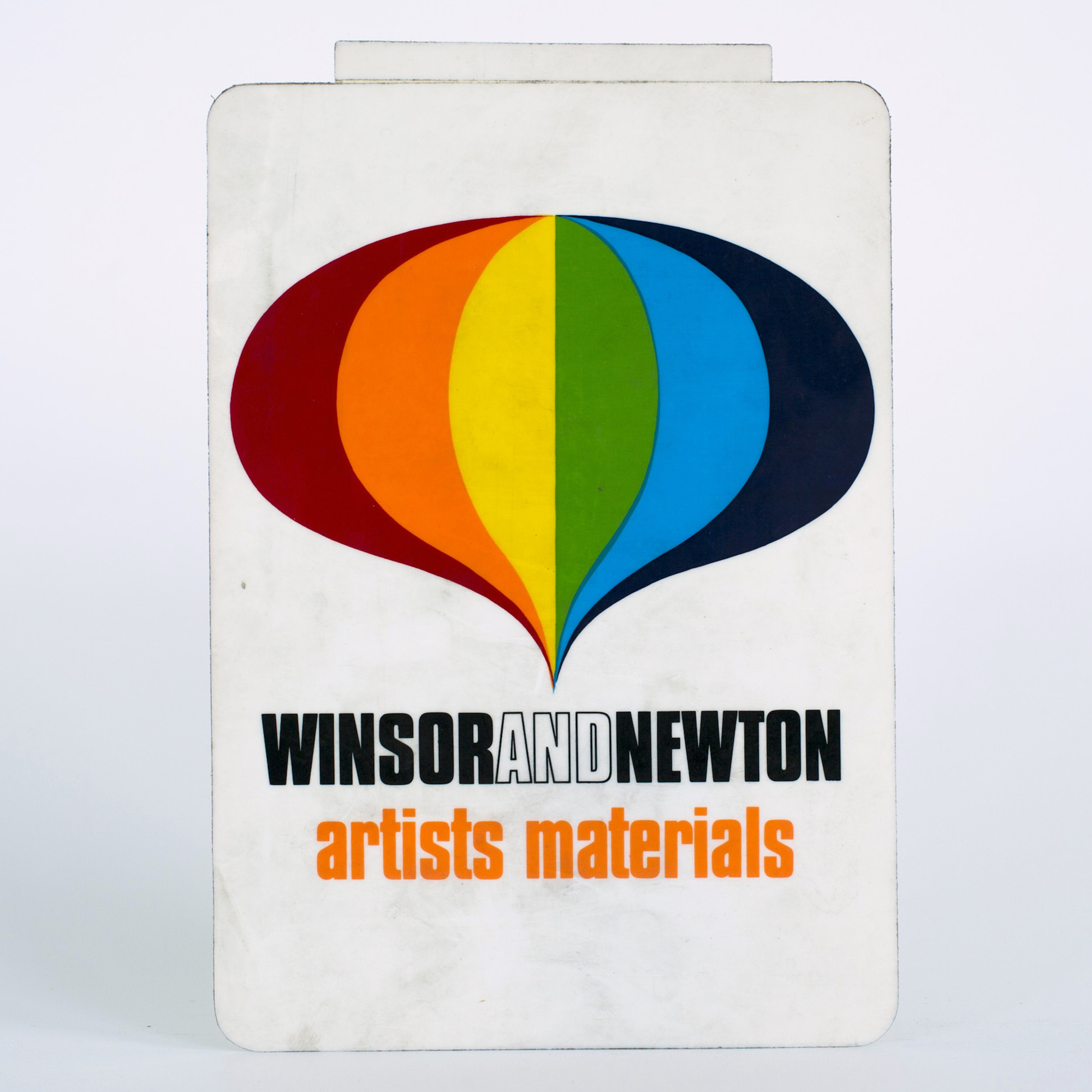
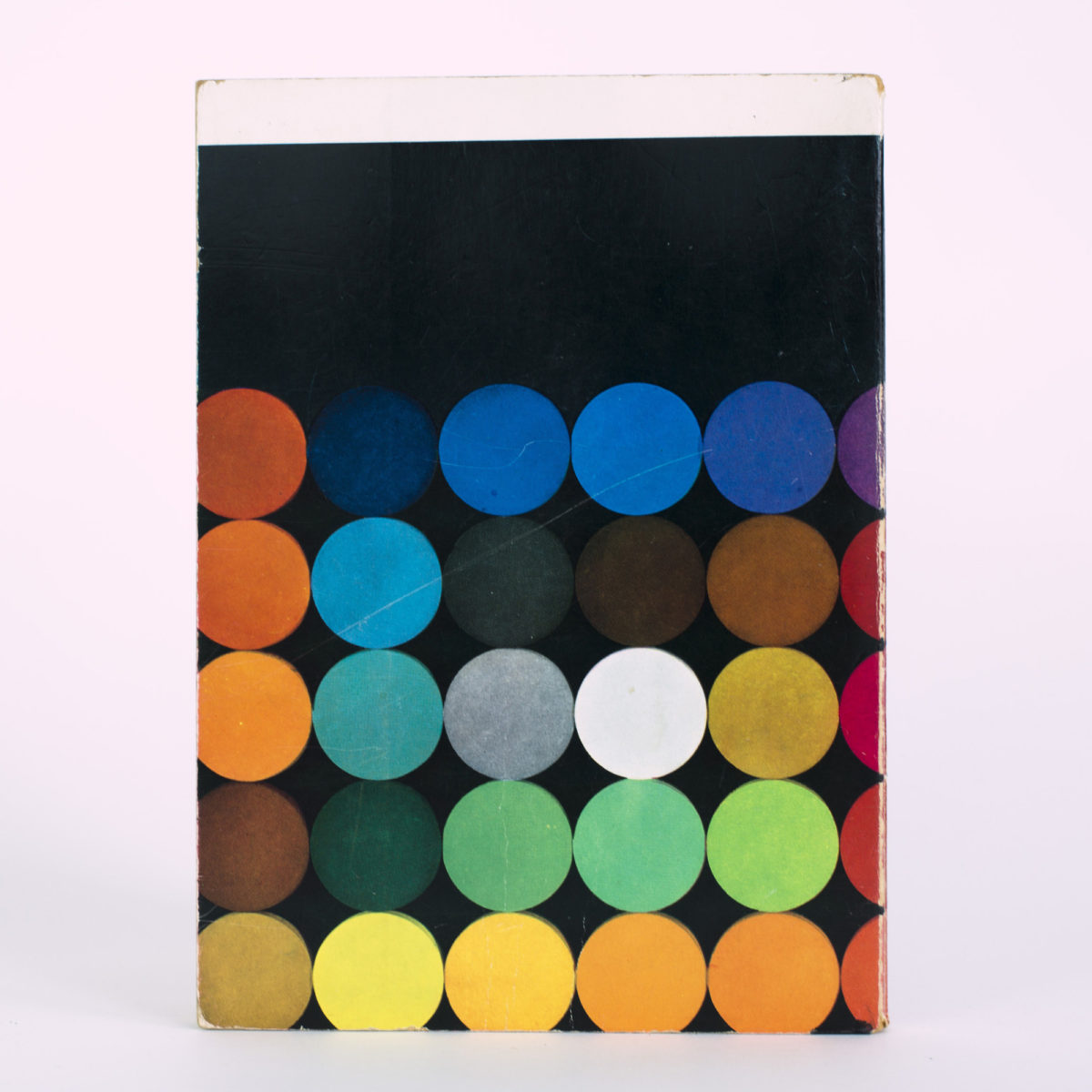
Winsor & Newton
The Winsor & Newton brand, created in 1832, is synonymous with the British art scene of the age, when artists from JMW Turner to John Constable were busy making a name for themselves. The company’s cutting-edge watercolours, oils, brushes and pastels were all used by them, as well as many of the other pre-eminent artists of the nineteenth century. However, a rich art-historical legacy can make it difficult to move with the times, even for a company that has long been at the forefront of scientific, alchemical innovation.
The solution? Packaging that reflects the whims and trends of its age, from wild rainbow spots to text rendered in bright orange, yellow and pink. The Winsor & Newton logo, too, has changed over time, with even the ampersand coming and going through the years. Together, these snippets of its past reveal as much about the brand as they do about our ever-changing idea of modernity.
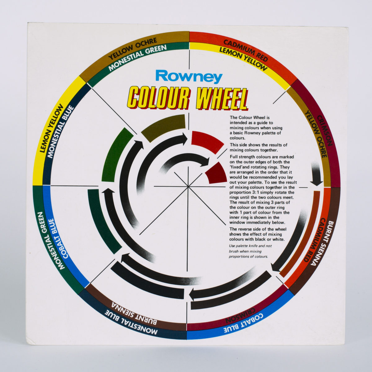
Rowney
The Rowney brand’s origins can be traced to Georgian London, to a wig shop and perfume maker started in Holborn Hill in 1783. Named T. & R. Rowney after the two brothers who ran it, one of their sons—following an apprenticeship in the fast-expanding business—went on to establish the artist supplies outlet known as George Rowney & Company.
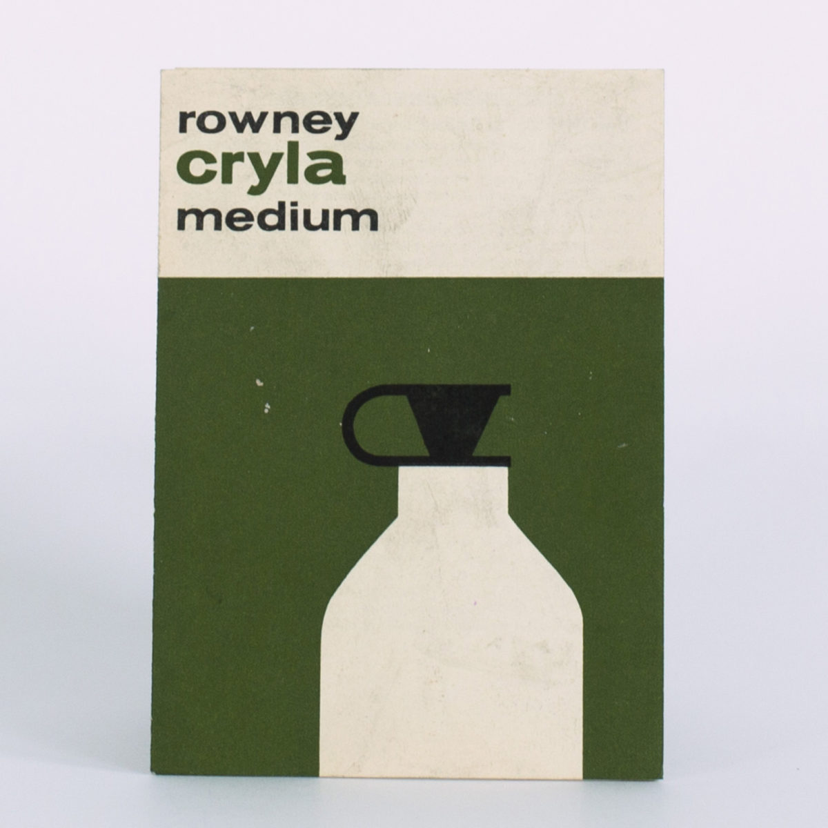
Into the twentieth century, Rowney & Co made a name for themselves with advanced artist’s acrylics, sold under the name “Cryla” from 1963. The Swinging Sixties were just getting underway, and the mid-century packaging of the early days of the Cryla label reflect this transition. The colours of choice on the boxing and presentation of Cryla are muted, while the graphics are striking and minimalistic. In the 1980s, Rowney merged with makers of artist canvases Daler to become Daler-Rowney, incorporating a new logo with a diamond symbol between the two names, as the company faced the future.
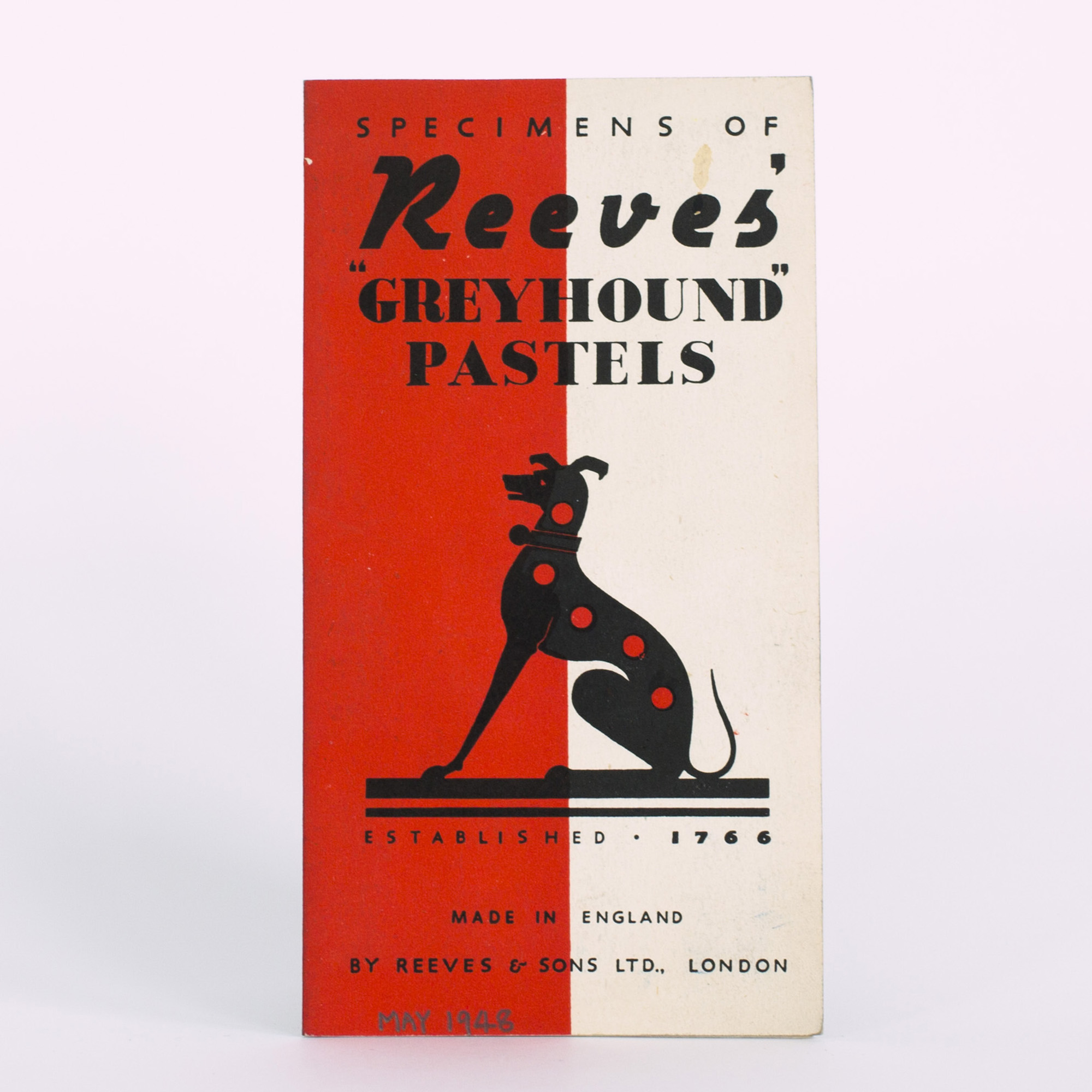
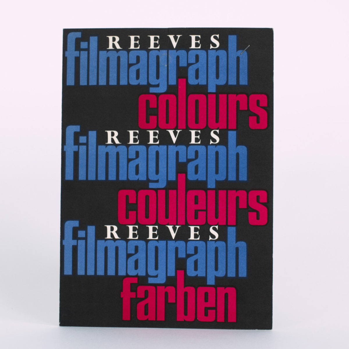
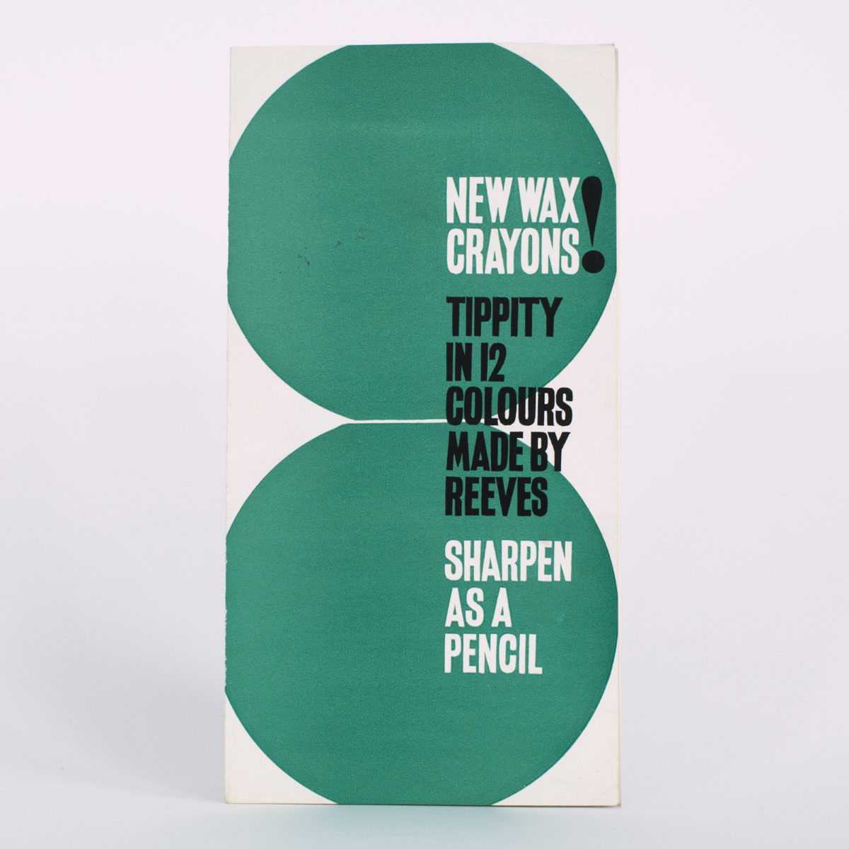
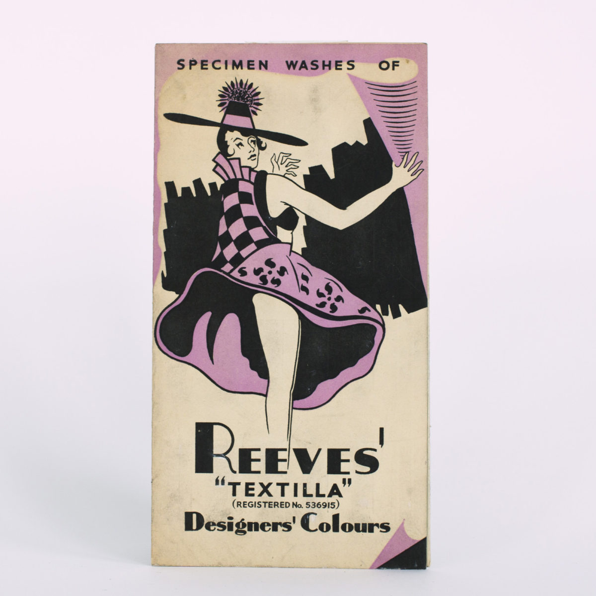
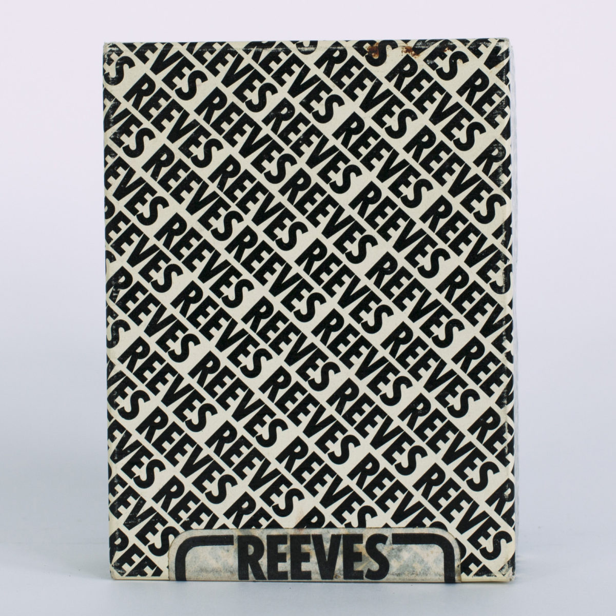
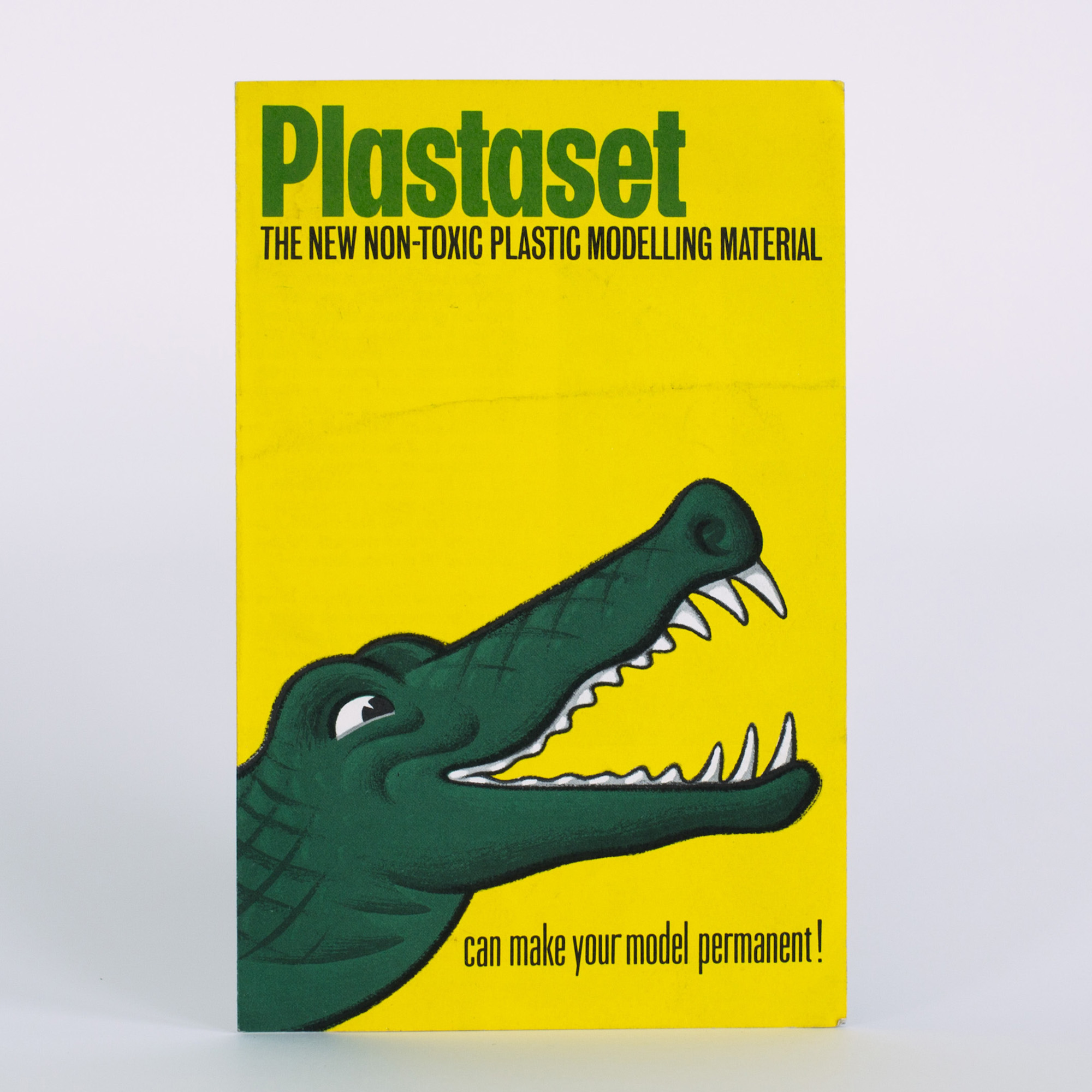
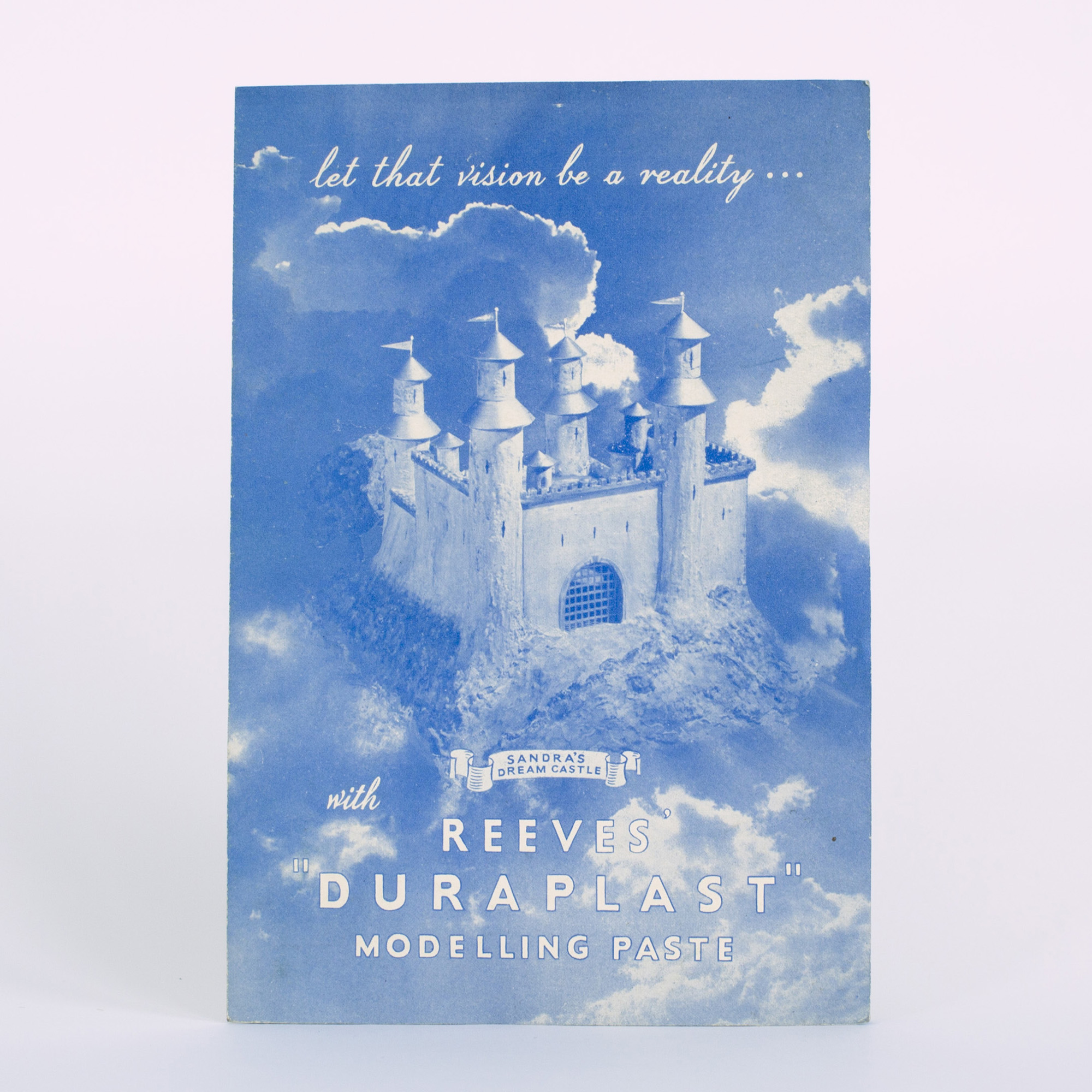
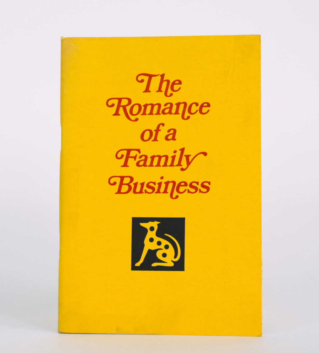
Reeves
William Reeves opened his first shop near St. Paul’s Cathedral, London, in 1766. Resins, pigments and oils were all on offer, as part of a burgeoning commercial paint industry, but it was his invention of soluble watercolour cakes that presented a major breakthrough for the company. Reeves paint cakes were able to preserve moisture through the use of honey, offering a more durable finish to artworks upon completion.
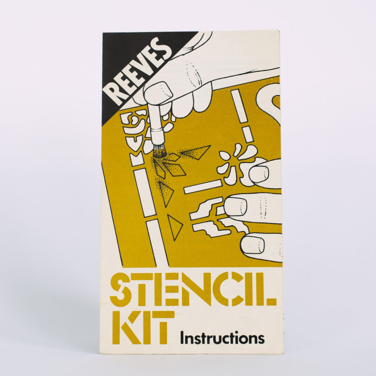
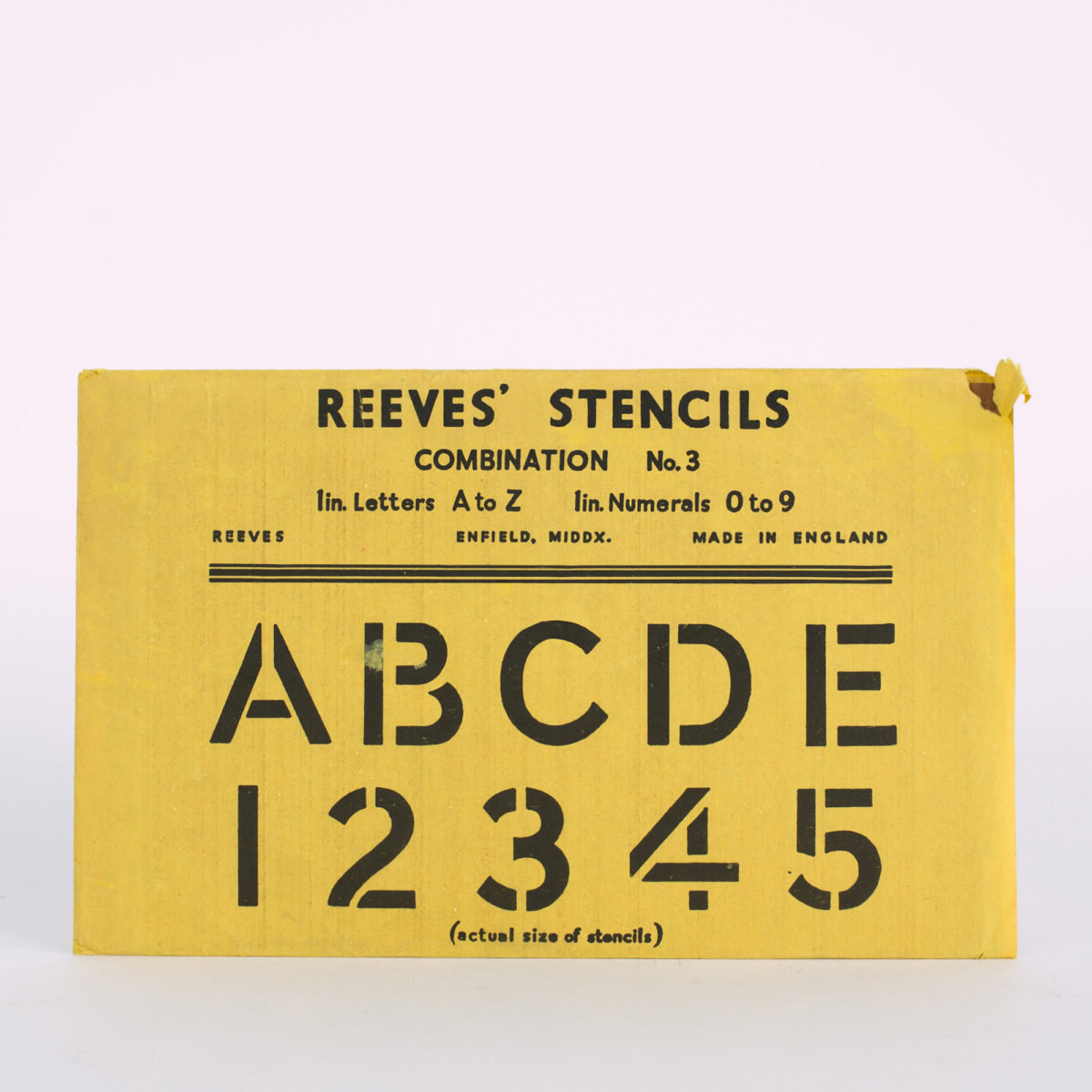
From the 1860s onwards, the brand began to focus increasingly on cheaper paints for children and beginners, tapping into a blossoming amateur market. This undoubtedly influenced the direction of its packaging, featuring instructions or inspirational one-liners, and illustrations of busy hands or tools at work or play. With the rise of popular print publishing in the 1950s and sixties (Letraset was launched in 1959), stencils also became part of the Reeves offering. Long celebrated as a family-owned company, Reeves captures the frivolous, more whimsical side of artistic production; it evokes our very earliest encounters with painting and drawing, and the simple pleasure of making.
All photographs taken by Louise Benson at the Winsor & Newton Archive in West London in 2019