One could be forgiven for thinking of text in purely two dimensions. For the most part, we tap on our phones, click on our keyboards, and consume words through screens that render everything with a virtual flatness. Even when reading on the physical page, it is easy to forget that the “thicks and thins” of each letterform have their root in the angled cut of chisel on stone, or the carefully scribed action of calligraphy.
- Offset printing, December 1988
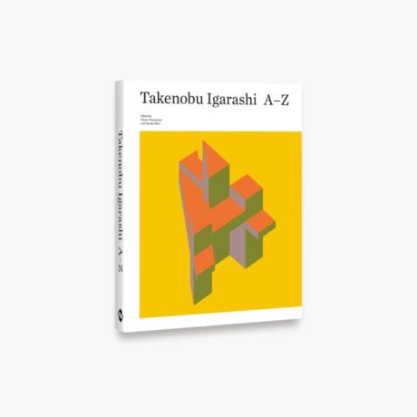
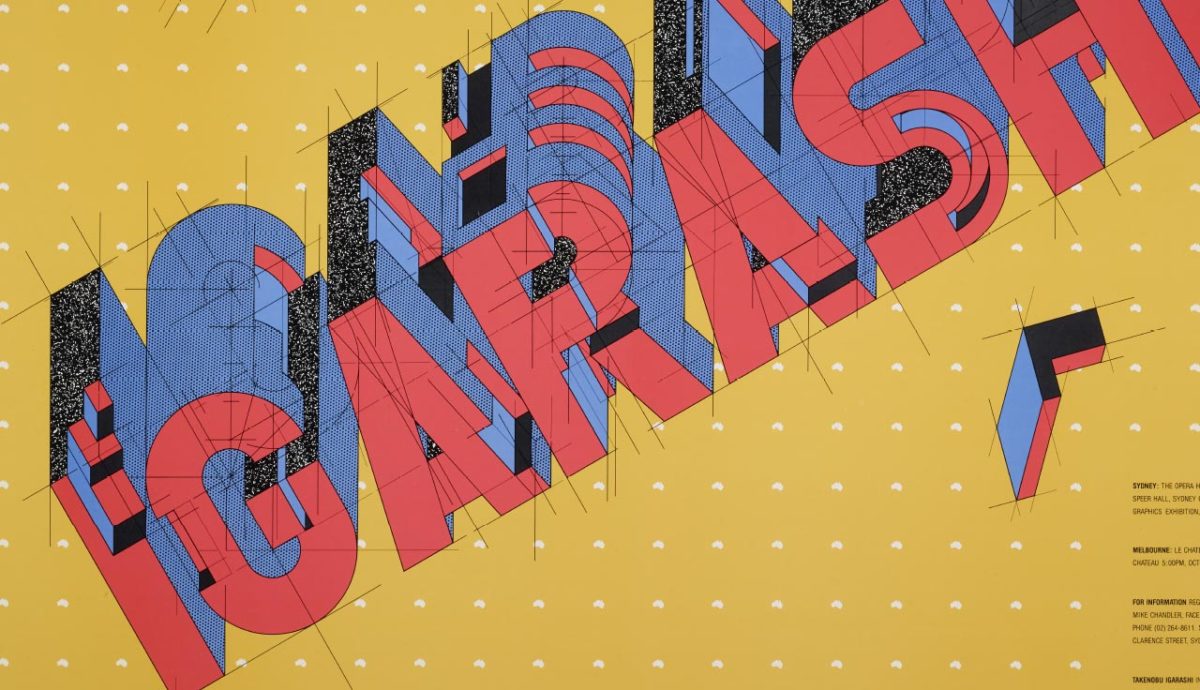
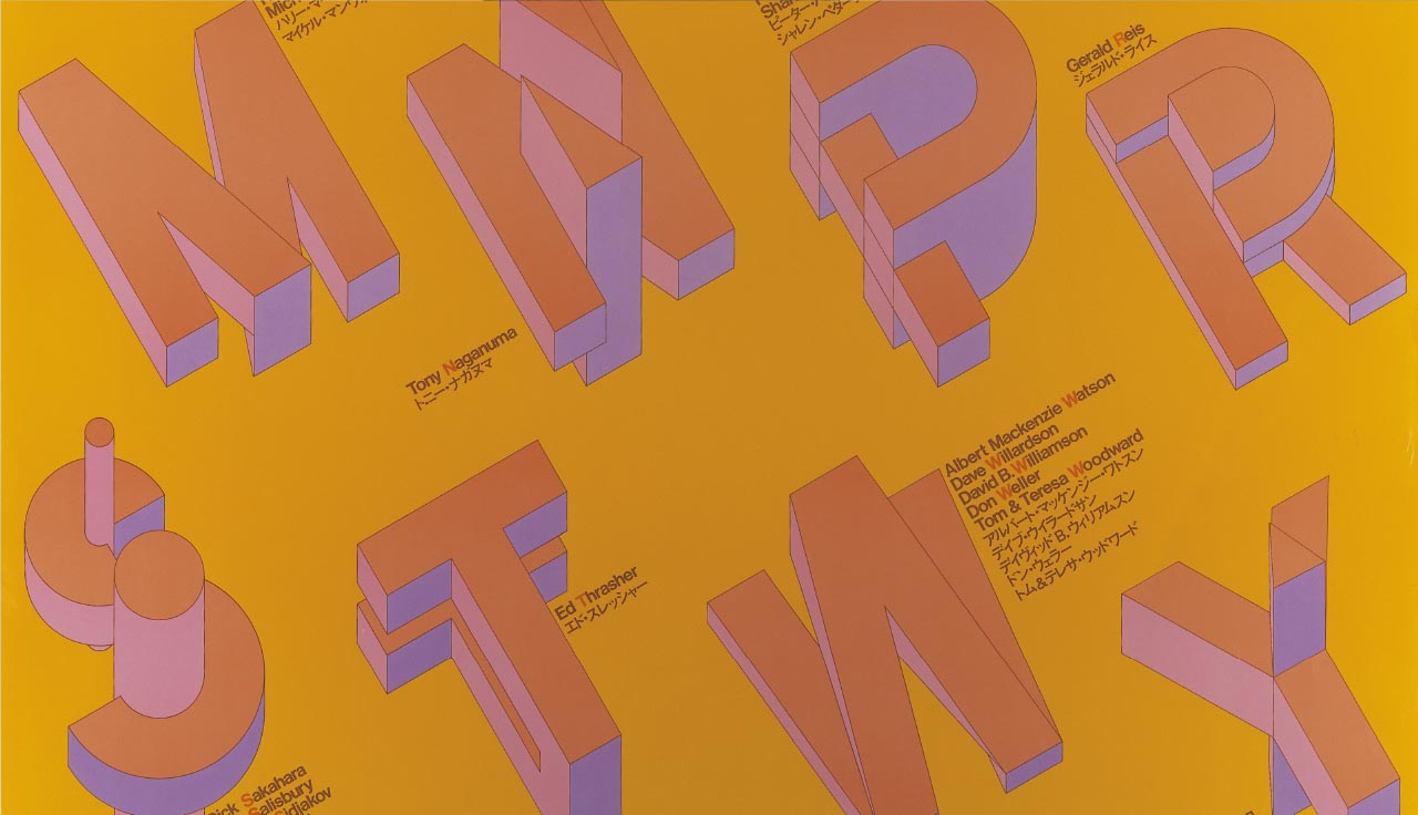
- Poster, Type Directors Club, Australia © Takenobu Igarashi
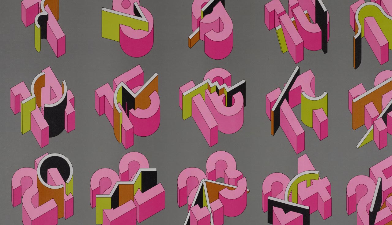
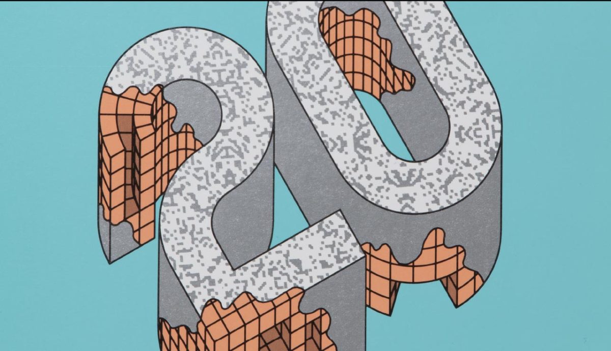
This is certainly not the case for Takenobu Igarashi. The Japanese designer has been exploding the limits of typography since the 1970s, using axonometric drawing to pull apart every element of the alphabet, both on paper and in joyful sculptures carved from steel, wood, resin and more. Each iteration considers every conceivable side of the letter—even when it doesn’t exist—and reimagines it as an autonomous object brimming with possibility.
“The Roman alphabet has a fascinatingly simple structure which makes even the most complex expression possible”—Takenobu Igarashi
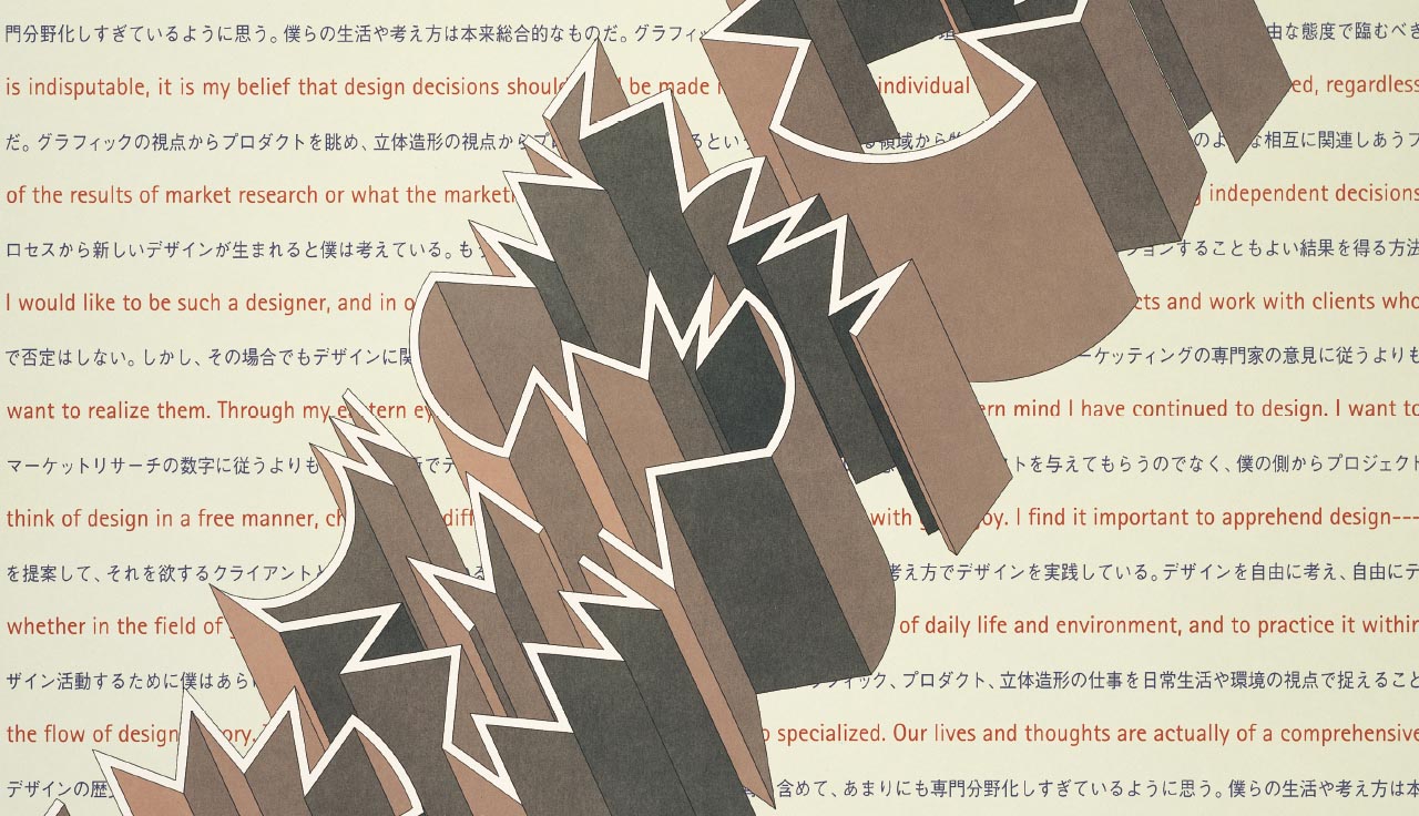
The full extent of his practice, which spans commercial work for department stores and music labels, as well as museum commissions and experimental passion projects, is chronicled in a new book Takenobu Igarashi: A-Z. Here, he unpicks the conceptual methodologies behind his work, alongside a barrage of exceptional imagery.
Igarashi attests that the reason he could so easily dismantle and reimagine the Roman alphabet was due to his distance from it. Born and raised in Japan, his experience with the written word was first and foremost engaged with the strokes of Hiragana and Katakana, and the pictorial language of Kanji. He explains that, “The Roman alphabet, composed of basic geometric figures, has a fascinatingly simple structure which makes even the most complex expression possible.”
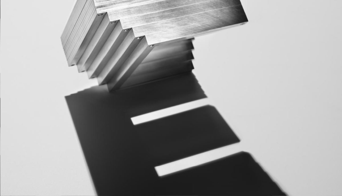
It is certainly hard to argue with him when leafing through these densely packed pages. While the hugely colourful grid-like structures that he conceived in the 1980s came to define a global language of technological futurism (while remaining legible for the most part), his three-dimensional and occasionally interactive type still bends the mind. In one instance, for example, a dense block of aluminium casts a shadow to reveal the letter “E”. Meanwhile the Ori or “folded” alphabet pushes the limits of recognition through simple creases. He even takes his type out into the real world, dumping a “W” on a pebbled shoreline, or a gold-plated “F” beneath a semi-frozen waterfall.
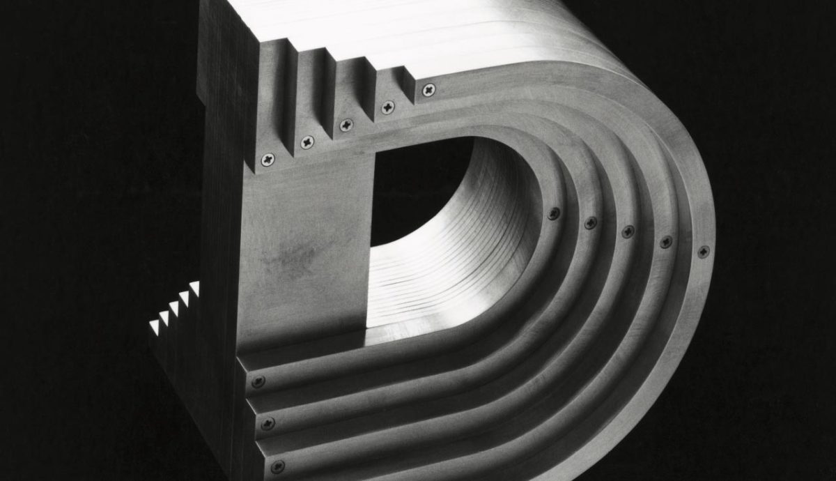
- Aluminium Alphabet, D
- Aluminium Alphabet, E © Takenobu Igarashi
These poetic images are infused with a joyful sensibility that Igarashi has maintained through decades of design. It is an attitude that can be sadly lacking in the all-too-serious world of typography, which probably goes some way to explain why his work still appears so fresh. As he explains in the book’s preface, “Day after day, I continue my adventure of creating three-dimensional alphabets and numerals never seen before […] my head full of ideas and my hands never stopping. The driving force behind my indulgence was ‘play’, not work.”