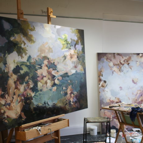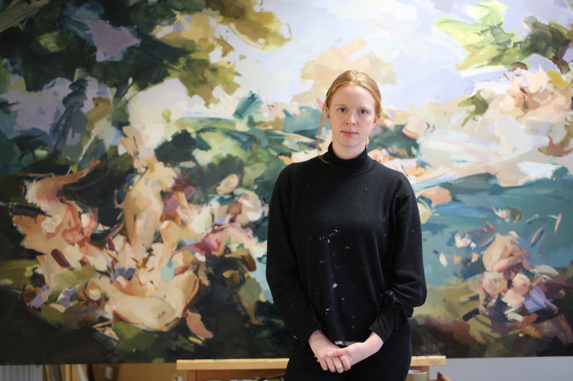
Flora Yukhnovich’s glorious paintings are coded with art history. They offer glimpses of figuration in an otherwise abstract assemblage of brushstrokes, recalling the light, palette and formal considerations favoured by Rococo giants such as Jean-Honoré Fragonard and François Boucher. This strange sense of familiarity—conceived on a grand scale—asks questions about how and why we read a painting, as well as exploring the expressive materiality of paint itself.
We caught up with Yukhnovich in her south London studio, following her recent residency in Venice courtesy of Victoria Miro, where the famed eighteenth-century Venetian artist Giovanni Battista Tiepolo served as inspiration.
Your latest paintings were made during a residency in Venice, where your focus was on the work of Tiepolo. What made you study his oeuvre in particular?
I began looking at Tiepolo’s work as soon as I graduated. Until then I had focussed on French Rococo artists such as Fragonard and Boucher, and I was encouraged to look at him because there’s a connection between them with their sense of space.
When I saw his paintings in the flesh, while I was on the Palazzo Monti residency organized by Katy Hessel, I became very excited by the work, and I knew that I wanted to focus on it during the Victoria Miro residency in Venice. I’m interested in what it meant for the city to be such an eighteenth-century hotspot. I’m trying to understand the context of his work, and why these Italian works of the same period feel different to the French style. There are very strong similarities, but they are executed in a totally different way.
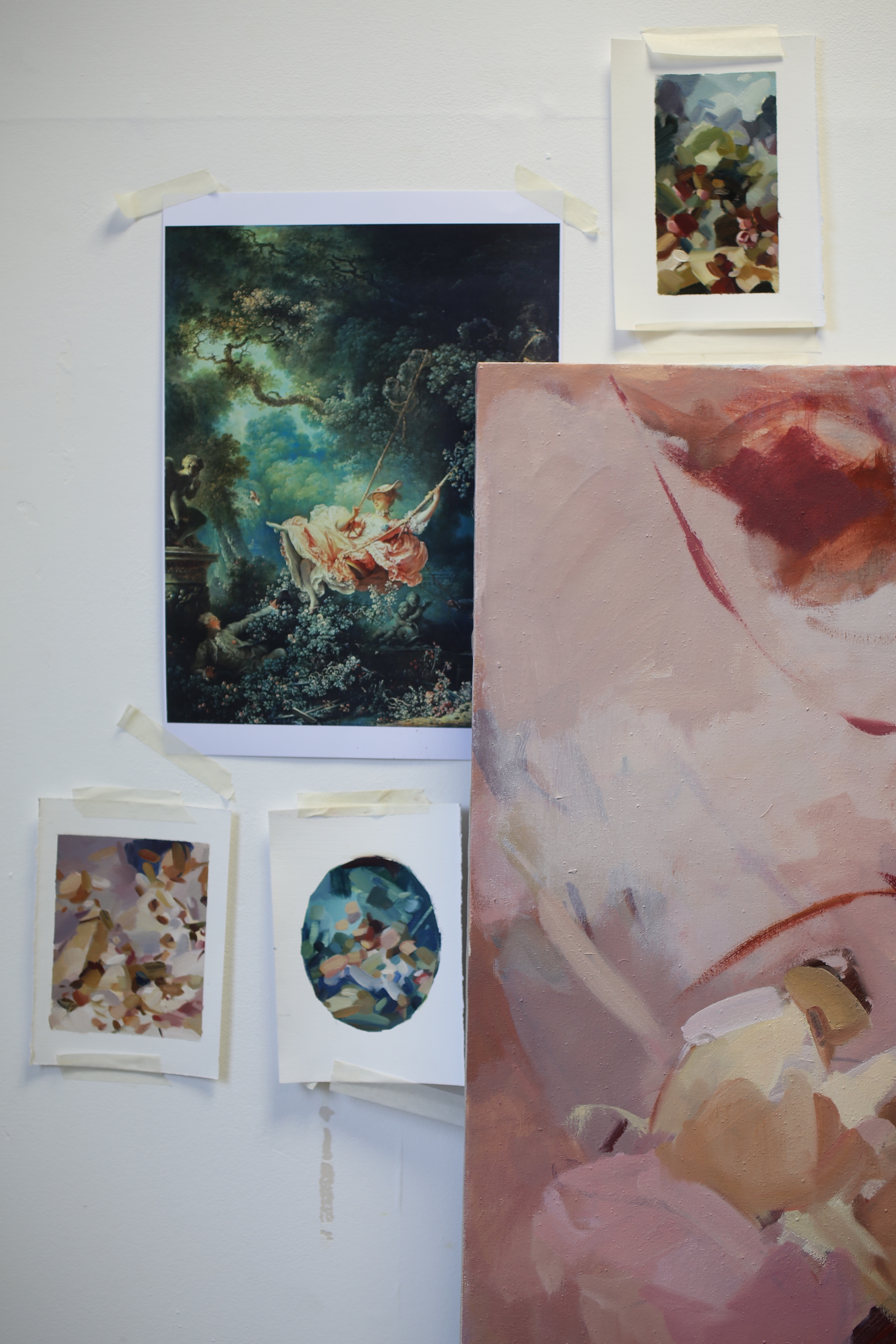
You can really see the imprints of these artists in your work. There’s something so recognisable about the composition, colour and style, which allows you to recall these famous pieces.
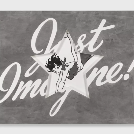
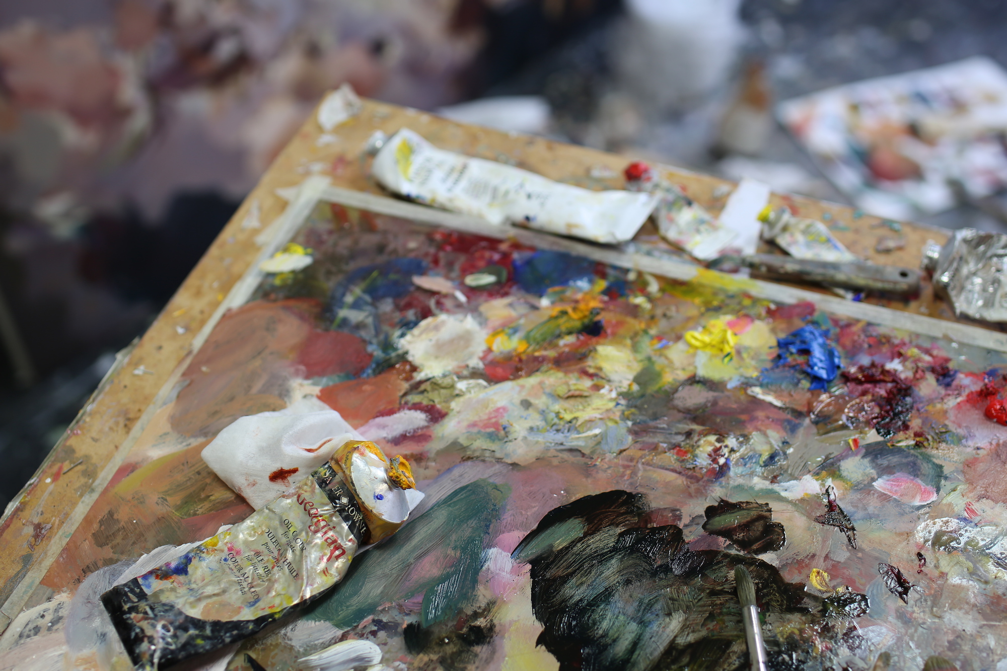
I always want people to have an “a-ha” moment, where you recognise something, but you can’t quite place it. A familiarity that offers you access to the work. Also, I just love paint! In my opinion there isn’t any time in art history that gets into the presence of paint like Rococo. It is very indulgent.
Rococo is a very flamboyant, sugary style, dominated by pastel shades, particularly pink…
I have researched the colour pink, which didn’t have a name in Europe until the late seventeenth century. In fact, it wasn’t as prevalent because there were no light safe dyes. It was referred to by lots of other names, which riffed off of light red, but it didn’t come into its own until much later. The gendered associations are also quite contemporary, because red was associated with fire and strength and masculinity, whereas blue was connected to femininity, via the Madonna.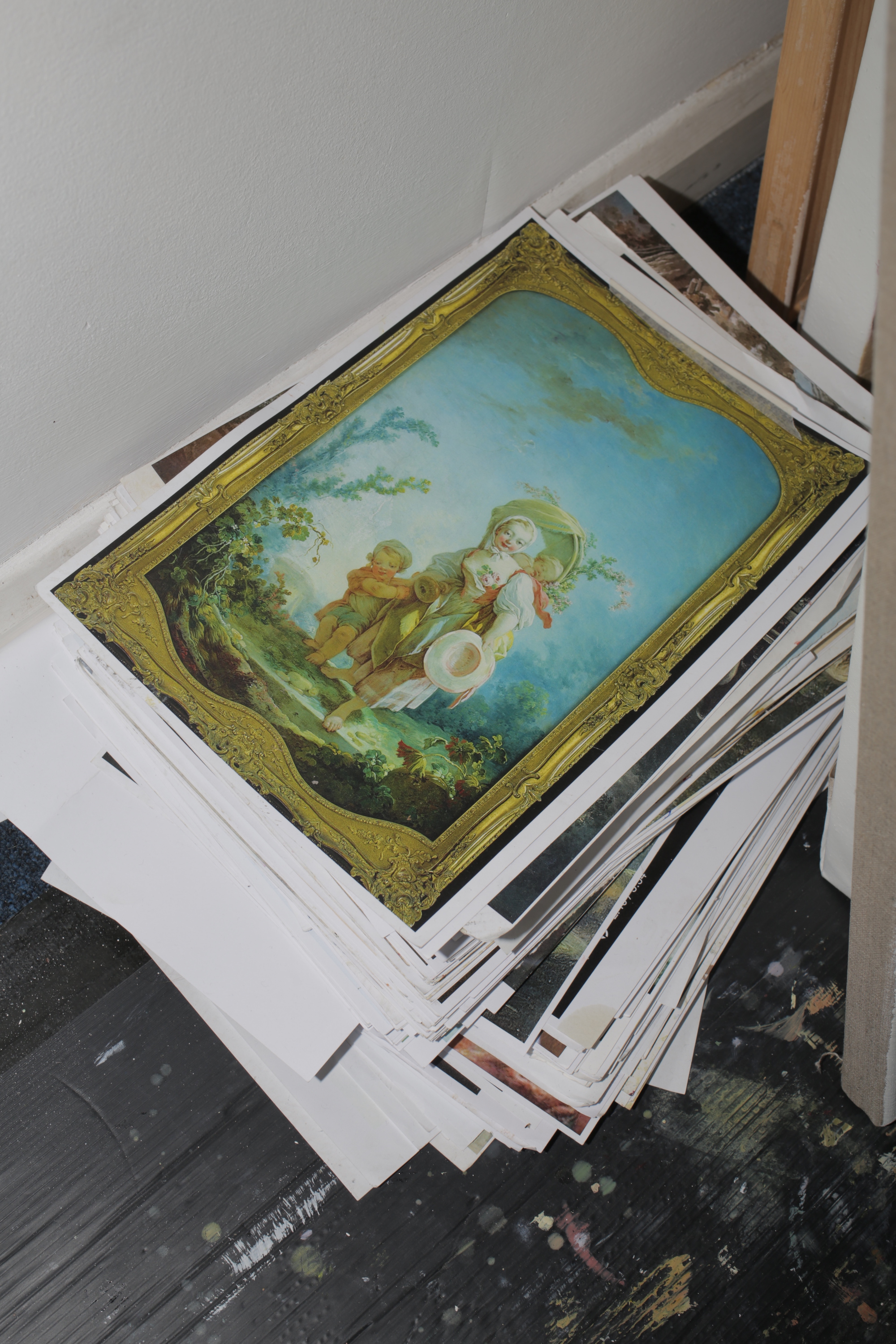
Did your studies inform this painterly interest in art history?
Well, I did a very traditional portrait painting course at Heatherley School of Fine Art, then City and Guilds for my master’s degree, which was pretty much the best year of my life! It felt like working backwards, because before my master’s I hadn’t really done any academic study or any art theory. It was just all about why I’m painting and what painting is now, in this context. The meaning that happens just from putting paint on canvas—trying to work out what to do with that. It was a strange system of connecting the dots, as opposed to a linear progression.
“I actually don’t feel comfortable on a big scale, but that’s why I do it”
What about scale? These works are pretty massive. Is working large something you’ve always felt comfortable with?
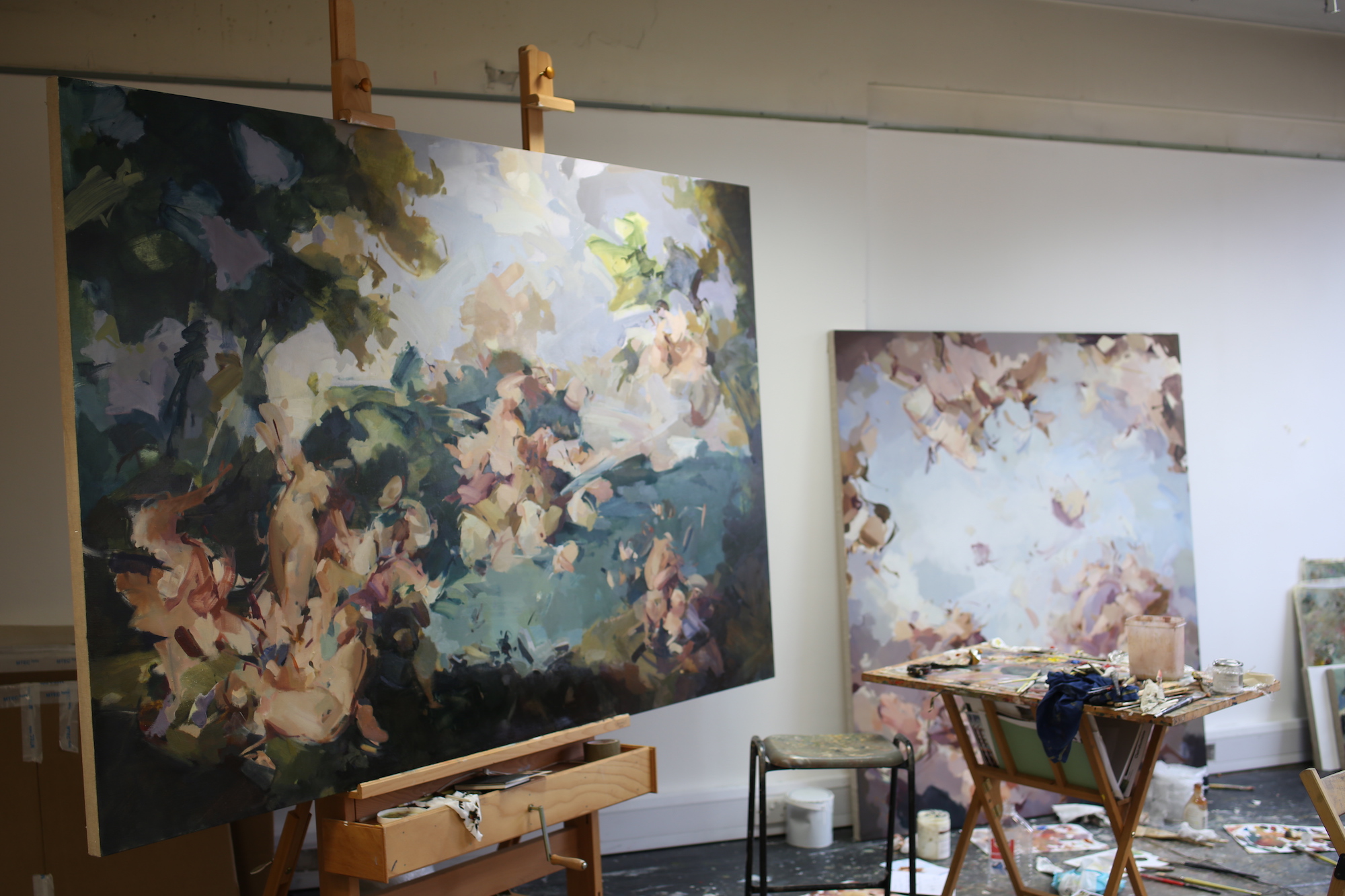
City and Guilds was great because it was very big. I actually had a problem because I spent so much time reading and researching that I didn’t make anything for a long time. Then I made a big piece on the wall, because I felt that making something that performative would force me to execute something. I actually don’t feel comfortable on a big scale, but that’s why I do it. I have to attack the emptiness and use my whole body. You really have to commit to it.
You also have some wonderful oval canvases here, which have strong historical references to portraiture, in my opinion. You don’t see them much nowadays, or in fact any major departure from formal rectangular canvases.
I have always wanted to work with oval canvases, but it is hard to do in the UK, mostly because there’s no demand and the shape doesn’t expand very well. In Venice there are people who could make them by hand, which was very exciting. I hadn’t really thought about the lack of variation when it comes to contemporary painting, which is a shame, because I love it in places like The Wallace Collection, when the paintings are designed to fit around mouldings and doorways!
One of my works is based on the Ca’Rezzonico ceiling painted by Tiepolo. I’ve been struggling with this piece for ages, which is very annoying because he smashed out his masterpiece in only eight days.
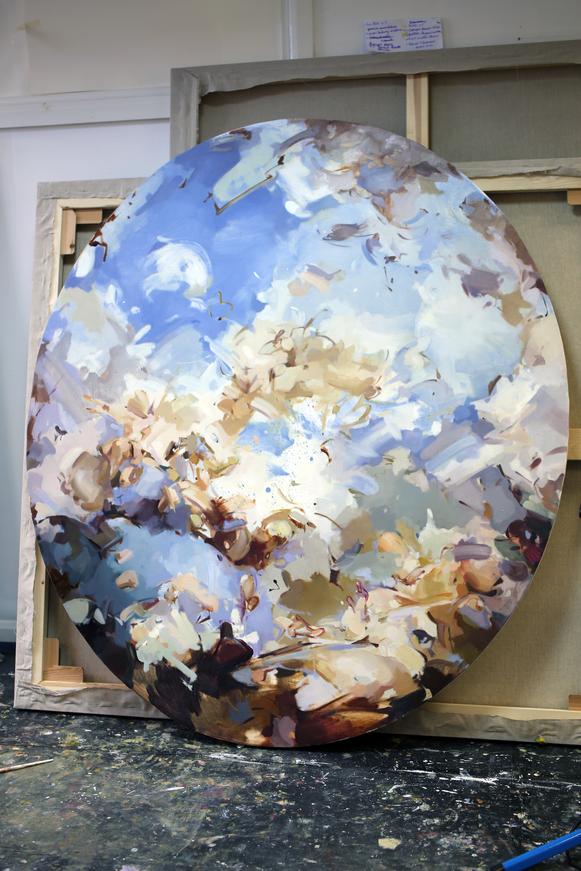
What is fascinating about ceiling works is the exceptional rendering of perspective. Was that something you were considering in the piece?
I think so, but also the gesture of movement. Being underneath his work, walking around and feeling how different the relationship is, really relocated the idea of actively moving through a painting with the viewer’s eye, as opposed to the idea of gesture solely relating to the extension of my own arms.
When you begin a work, are you using strong visual reference points? Or do they just exist in preliminary research?
My visual references are probably too strong, if anything. I use them to anchor stuff in the work, and then I depart from that. I use them to get a sense of the direction of light, or tonal values and colour palette. I have an idea of what I want when I start, but it’s usually about a particular feeling or concept as opposed to purely visual. Then it’s just a matter of putting things in and taking them out, in a constant process of revision.
Because I trained as a portrait painter I’m driven by very formal considerations, whereas Tiepolo’s work is all about planes of space, with clusters of form. It’s an incredible balancing act, and studying his work allowed me to stop myself from getting too bogged down in the intense, juicy, sculptural qualities of paint, and enjoy the spatial possibilities too.
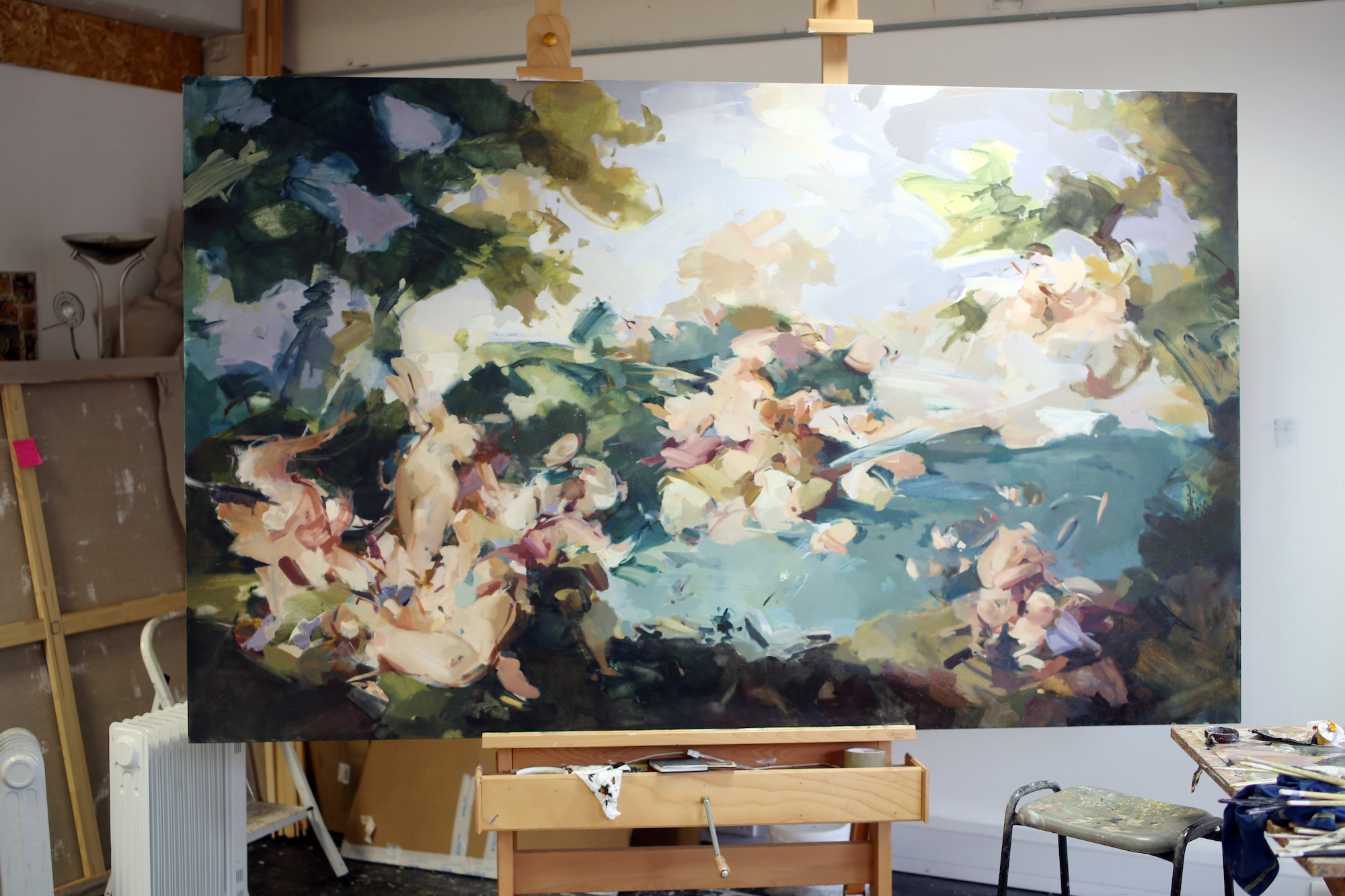
It is true that painters who treat the medium almost like sculpture can create very dense, dark almost constrictive work. That of course has its own merits, but it can feel oppressive at times.
Also, the moment you have a solid piece of paint it creates a stillness. So, if you have a balance you create punctuation points that allow your eye to travel and land and go off in different directions. If you’re too obsessed with form you can become really stuck.
You’re also letting people use their imagination. Painting is probably one of the most accessible form of contemporary art, because viewers feel more comfortable interpreting what they see on their own terms, and you have centuries of references to recall.
That’s how I look at art. I always feel very rewarded when a work sparks off lots of different associations, which encourage me to considers all the hows and whys of it all. I like it when people view my paintings and see things that I did not put in there!
“I really like the idea of Venice being this slippery, unfixed place. After all it’s a city of water and ebbing tides”
You also have elements that skirt on the edge of figuration, there’s a suggestion of a cherub or a nude body. Are those deliberate entry points?
I actually intended for most of these works to stay “unfigurative” because I really like the idea of Venice being this slippery, unfixed place. After all it’s a city of water and ebbing tides. But I felt like I needed at least one figure to activate the work, and it allows your mind to enter this fleshy space, and then you pick up on that idea more and more throughout the paintings.
I have also heard that you have a particular interest in Fête Galante, the eighteenth-century French trend for depicting the aristocracy in bucolic settings. What is this rooted in?
That was such a groundbreaking moment for portraiture. People had been producing portraits for hundreds of years, and they had always stayed within the confines of either a history painting or a traditional interior setting. The idea to put the two together blew people’s minds! I think quite a lot of people want to create portraits when they paint, it’s quite a natural urge.
There’s also high level of intimacy. Is that something you enjoyed when you were making traditional portraits?
Actually, that’s what put me off! When you are in a class with a tutor and a model everything is taken care of, but when it is just you and one other person you have to work on the painting, but also make sure the sitter is comfortable and at ease, it’s a big responsibility. You need to maintain empathy, while having that high level of concentration.
I began disassociating from the act of making a portrait, and became more interested in the paint itself, as opposed to creating a likeness. I did take on some commissions, but people were rarely happy because I tend to make everyone look very old—even children! You are always walking a tightrope, because you want to make a great painting, but you have to flatter the sitter. It turns out its really not my thing, but I’m glad I studied portraiture as it gave me so much time to think solely about paint and its application.
Photographs by Louise Benson
Flora Yukhnovich: The Venice Paintings
Showing from 19 May to 20 June at Victoria Miro on Vortic
VISIT WEBSITE