2000
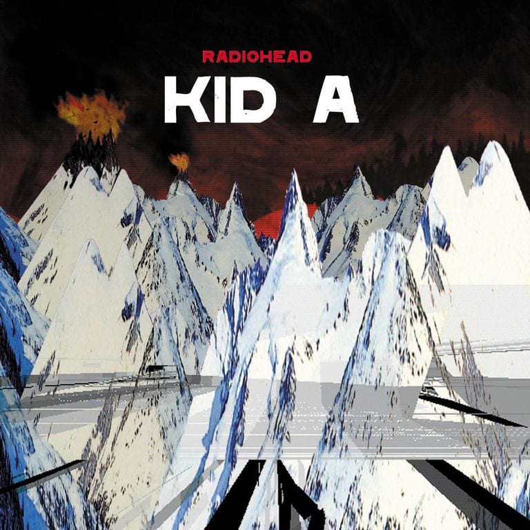
Stanley Donwood’s Album Artwork for Kid A
We kick things off with not just the end of a century, but of a millennium; in 2000 Radiohead and their artwork by Stanley Donwood brought us all a jarring reflection on the past and an eerie foretelling of the future.
Emily Gosling wrote: “The overall effect of the artwork is that pitch perfect mix of the eerie and the familiar; a bedtime story told in the cold, without a happy ending. It’s almost nonchalantly apocalyptic; somehow grandiose but whispered, like we’re all trying to make sense of something that will never truly make sense.”

2001
In 2001, Michael Landy decided to destroy every single one of his possessions in a vacant department store on Oxford Street, London’s busiest shopping thoroughfare, in an almost sacrilegious act of anti-consumerism that is entirely of its time.
Louise Benson wrote: “It is intriguing to consider Landy’s position on consumerism at a time when the internet has made it possible to live without the stuff that we once surrounded ourselves with. What do we have to lose when our love letters are contained in emails and our photographs uploaded automatically to the Cloud?”
2002
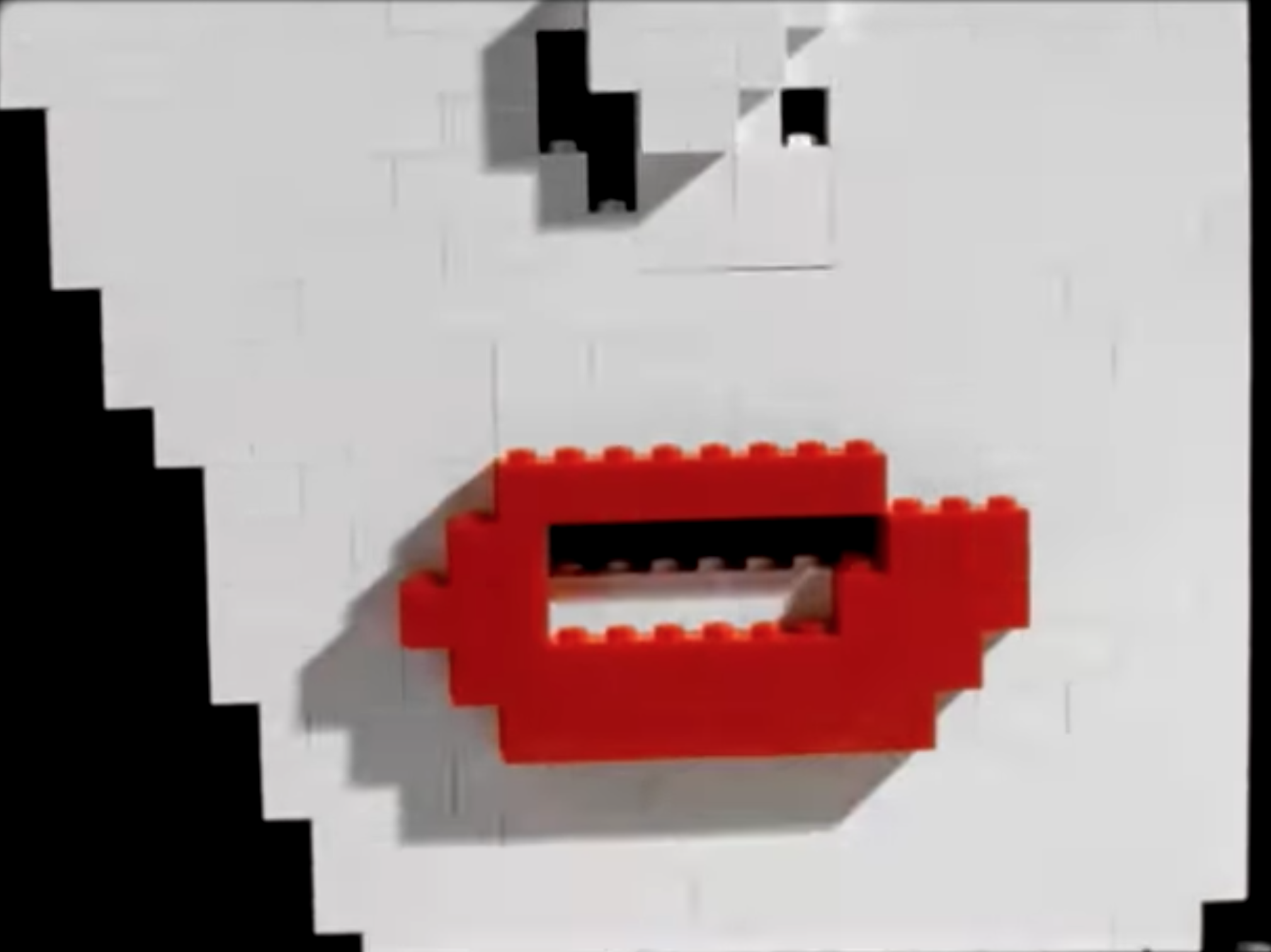
Michel Gondry’s music video for the White Stripes
In 2002, the Eternal Sunshine of the Spotless Mind director created a video that was so superbly simple in concept it shot through the usual MTV bombast and into a multitude of “best music video ever” lists.
Emily Gosling wrote: “Since its release, Gondry and the band have revealed that half the video was created using digital post-production techniques, though this doesn’t detract in the slightest from the woozy, magical toyshop feel that dominates in the faux-naivety of the aesthetic.”
2003
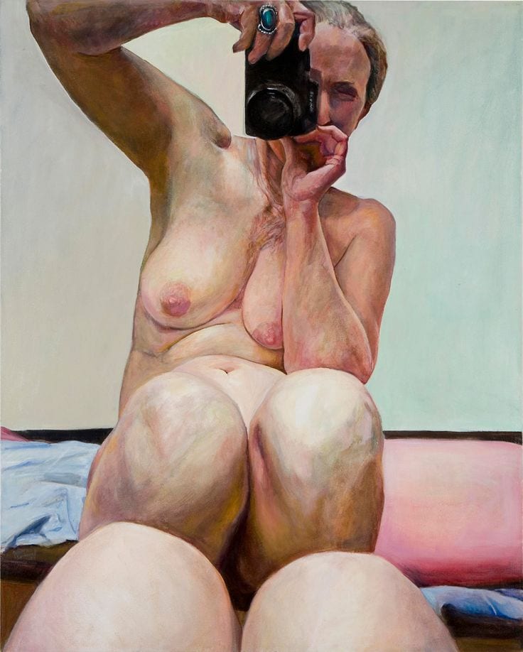
From swingers’ clubs in New York to her own naked body, in 2003 Joan Semmel put forth an intimate view of human relations and self-governed female sexuality with this candid self-portrait.
Emily Steer wrote: “Although nudity is prevalent in art, it feels unusual to encounter depictions of the naked aging body. It’s even less usual to see the nude, older body portrayed in a manner that is vital and truly alive. Semmel’s self-portraits are open and unflinching, but they can also be alluring and pleasurable.”
2004
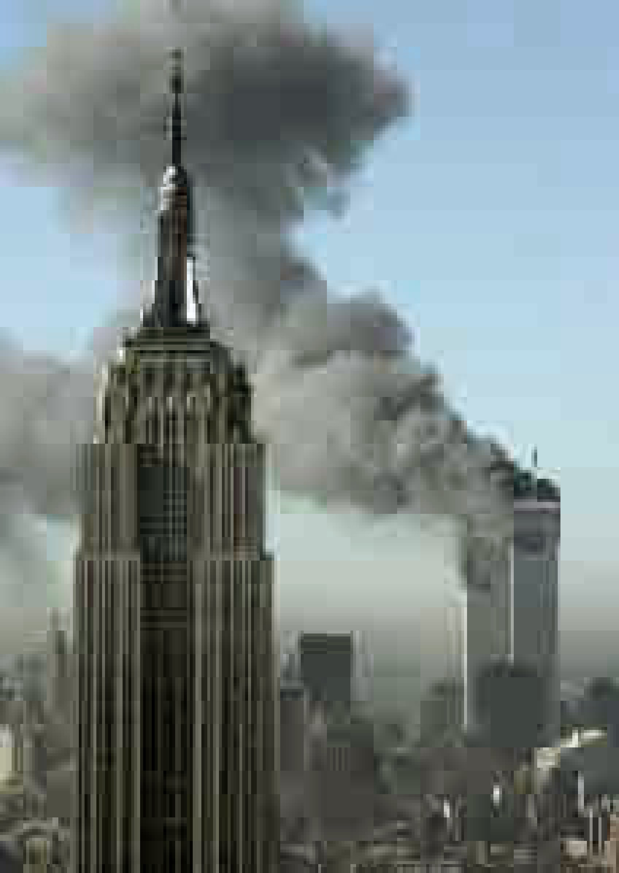
Digital images of the world—natural and political—were enlarged and warped in Thomas Ruff’s poignant Jpeg series from 2004.
Emily Steer wrote: “Thomas Ruff’s Jpeg series is firmly rooted in the twenty-first century. One of the most iconic works from the series takes a famous photograph from 9/11 as its starting point. This image, taken from the web, is enlarged to the point of distortion, each pixel becoming a fuzzy block of colour, creating an image that appears to be half loaded, containing highly recognizable imagery from an event that is deeply rooted in the contemporary conscious and throwing a semi-opaque veil over it.”
2005
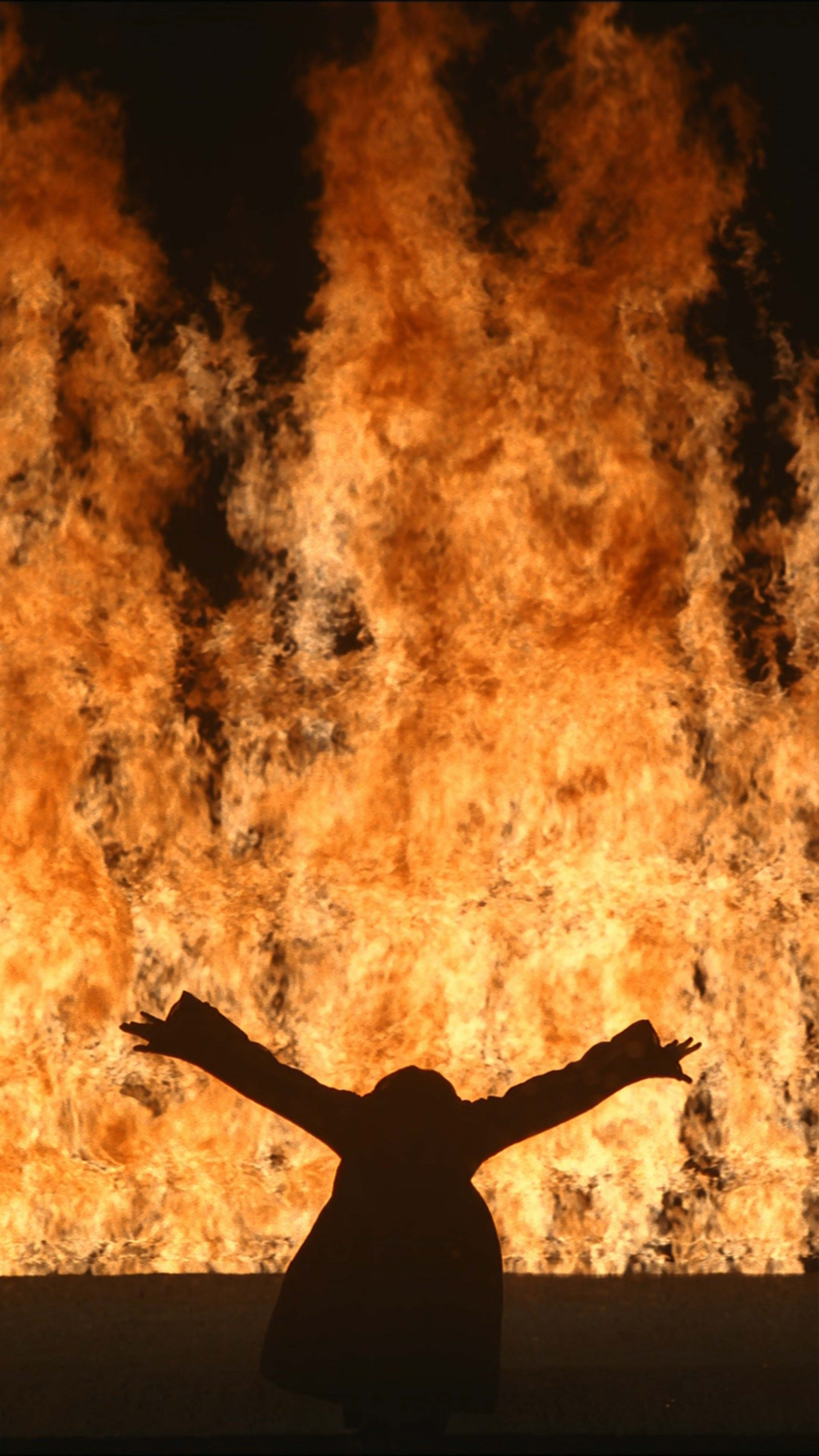
The renowned video artist’s vertigo-inducing Fire Woman from 2005 flung its viewer into the elements, stirring an instinctive, emotional response from the guts.
Emily Steer wrote: “The viewer is privy to both sides of the element, as watching the giant flames moving up the long and thin screen—a favoured format of Viola’s—becomes incredibly calming and meditative, yet fire’s true force is also shown to full effect. It seems to be alive, with a will of its own.”
2006
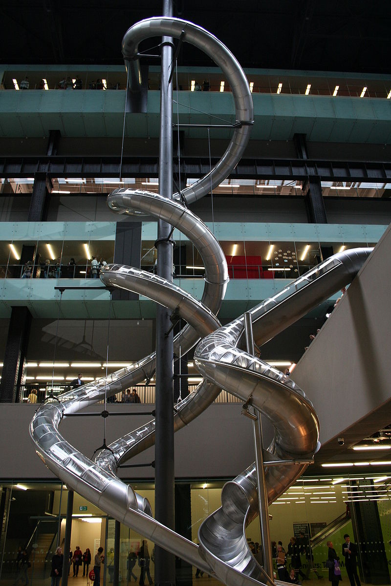
The five-slide 2006 installation at Tate Modern’s Turbine Hall showed that art could be a playground; and that performer, visitor and viewer needn’t be labels we leave behind when we leave the gallery.
Emily Gosling wrote: Höller has spoken of delighting in the combination of the visual spectacle of watching others use the slides, and the “inner spectacle” experienced by the sliders—a jolt of fear and pleasure in one rapid descent. His choice to use slides as medium is of course no accident: that mixture of panic and joy reflects their usual appearance in amusement parks, playgrounds or emergency exits.
2007
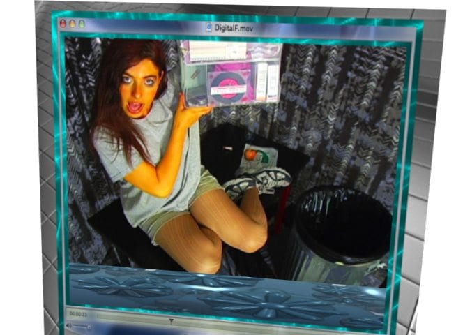
Sarcasm, hyperbole and metaphor were non-stop in Ryan Trecartin’s frenetic, chaotic video, I-Be Area, from 2007.
Rosalind Duguid wrote: “There are moments when the organized chaos of what seems like an endless stream of completely profound one-liners does break down into actual chaos: the set is smashed to pieces, everyone is screaming. The cast look like they’re having a really great time. As the viewer you dip in and out of comprehension of the story.”
2008
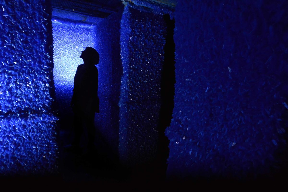
This remarkable, immersive work saw a derelict council flat transformed into a crystal wonderland, in an Artangel commission that drew huge crowds in 2008 willing to queue for hours for a glimpse of this blue miracle.
Holly Black wrote: “The absolute nature with which the minerals permeated the flat was both awe-inspiring and strangely sinister, as if an alien being had suddenly colonized the space and eradicated any evidence of the former inhabitants.”
2009
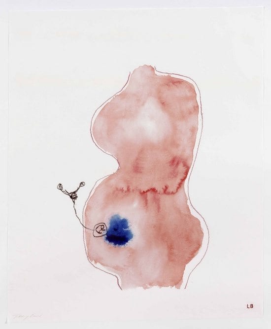
Louise Bourgeois and Tracey Emin’s Do Not Abandon Me
This powerful work came from two artists who have made it their life’s mission to viscerally examine and share the female experience, in a 2009 collaboration that was to be one of Bourgeois’s final works.
Emily Steer wrote: “The collaboration between Tracey Emin and Louise Bourgeois is both characteristic and surprising, pairing two artists who have taken an unflinching and at times searingly raw look at female pain. There’s something equally soft and robust in the works, from two artists who celebrate the aspects of the female experience that set us apart, and that make us feel both vulnerable and powerful in moments.”
2010
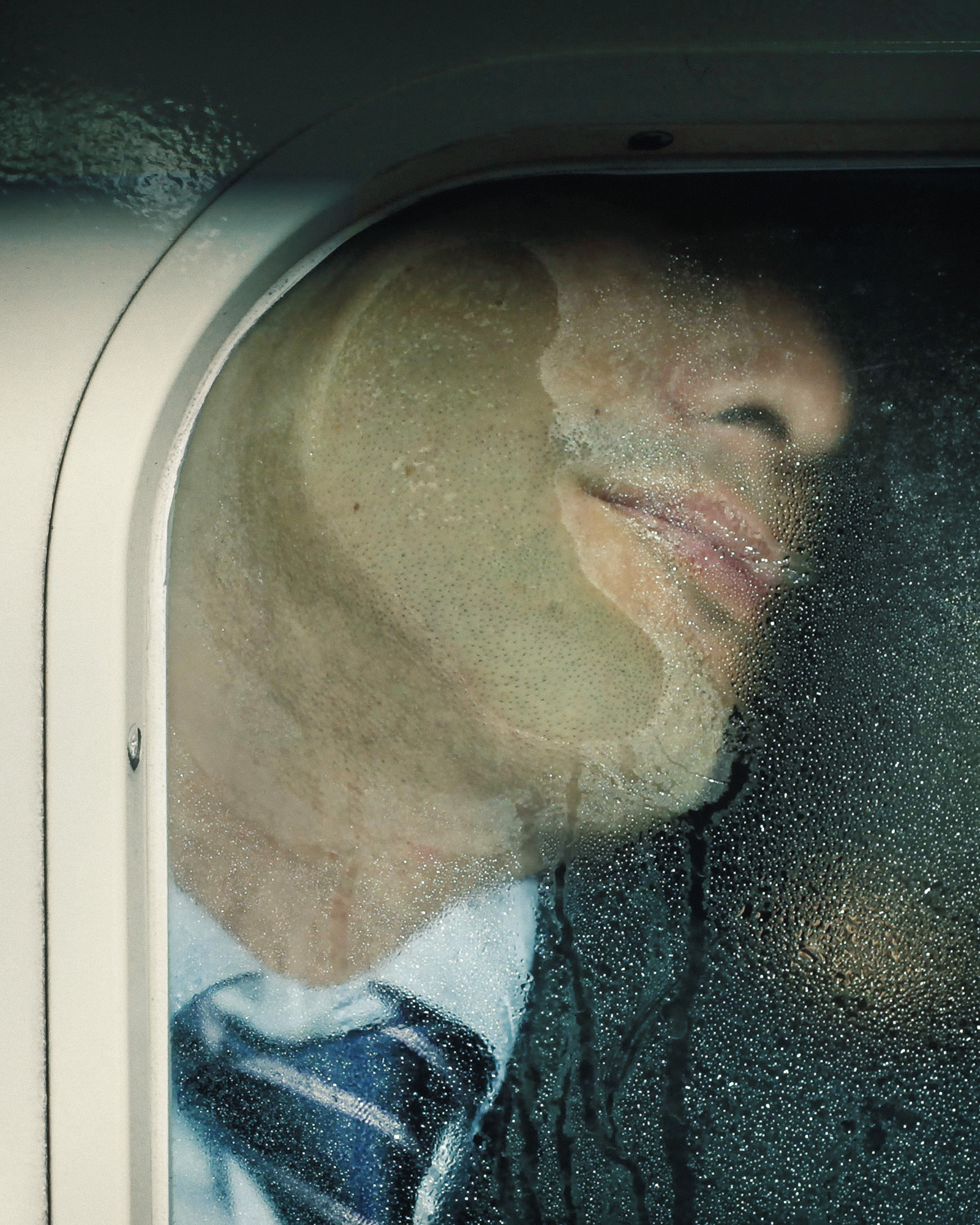
Michael Wolf’s Tokyo Compression
Well-known for his ongoing documentation of Hong Kong and other major metropolises, the German photographer captured the daily crush of bodies caught in Tokyo’s infamously-congested subway cars in 2010, portraying an inhuman discomfort as alienating as it is confronting.
“With city-dwellers framed in states of claustrophobic torment, their anguished faces crushed against the glass pane, the dividing window acts as a literal reinforcement of the commuters’ ‘otherness, an ever-present reminder that we are free and they—albeit temporarily—are not.”
2011
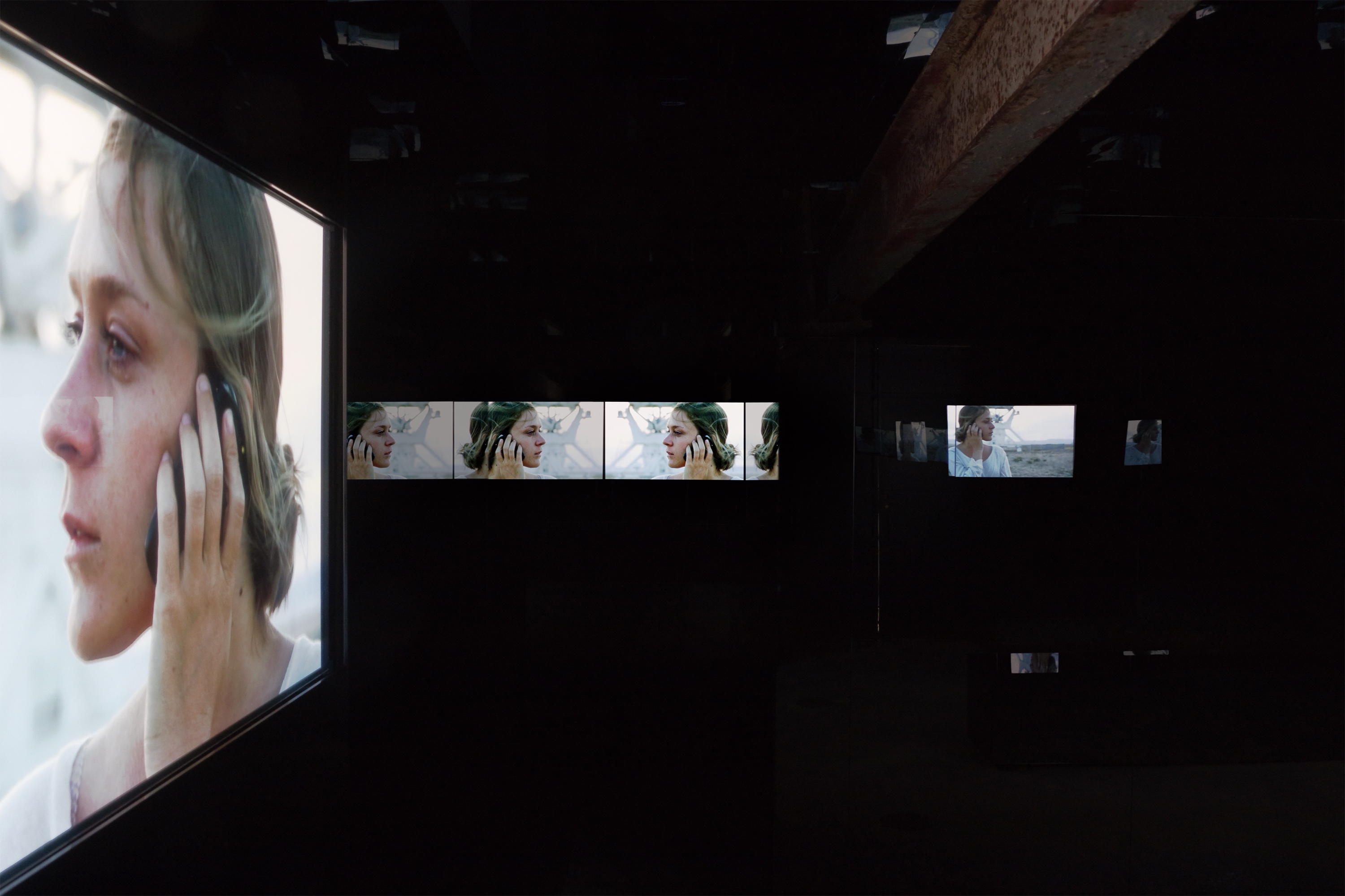
Chloë Sevigny starred in Black Mirror, Doug Aitken’s 2011 depiction of international travel as both romantic and ultimately unattainable. Seductive and foreboding, it spoke of a world full of limitless possibility, but which ultimately threatens to alienate us even further from ourselves and each other.
Martha Horn wrote: “The anonymous hotel rooms, open roads and airports are non-places, not destinations in themselves, they are there to facilitate travel. The focus on such scenes seems indicative of a contemporary demand for fluidity in the way we work, from unreliable freelance jobs to zero hours contracts; or at least a perception that to deal with the uncertain present you must always be willing to adapt and be constantly ready to perform.”
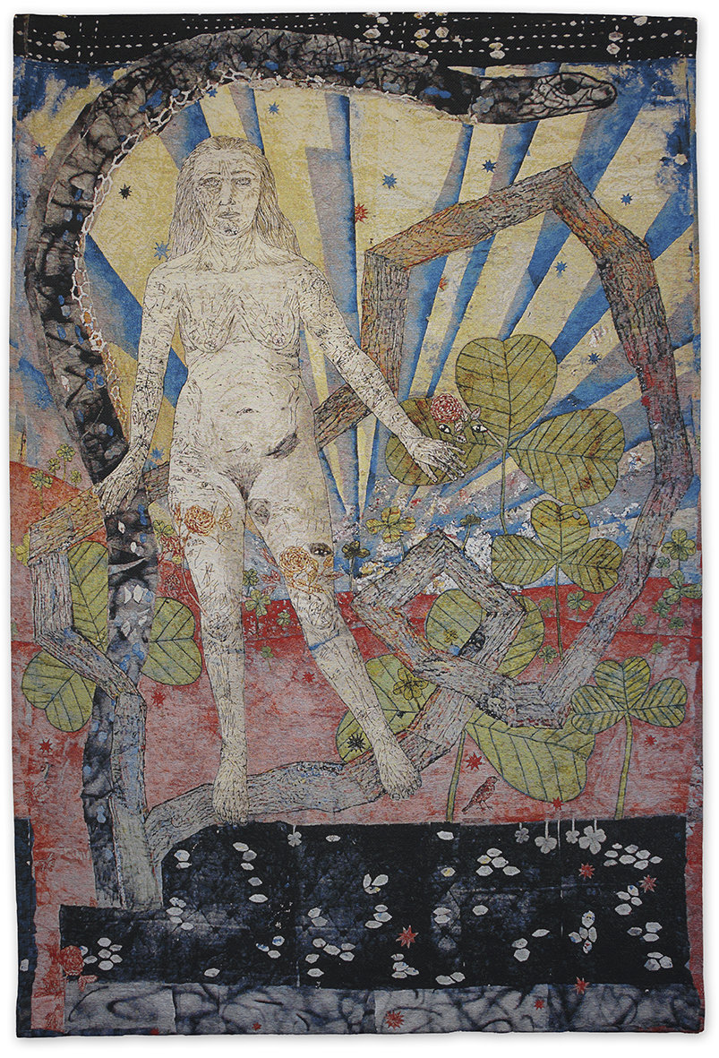
2012
A series of 2012 tapestries by the American artist focused on “hippie iconography” and the wonders of nature, making it impossible not to get lost in the fantasy.
Holly Black wrote: “These woven palettes not only build up incredible colour density, but wonderful textures, with the odd bit of alluring shimmer achieved with metallic thread. Interacting with these pieces offers multiple experiences, because you encounter them first from afar as flat, cohesive images, before drawing closer and investigating diverse surfaces, line thicknesses and individual vignettes within the wider whole.”
2013
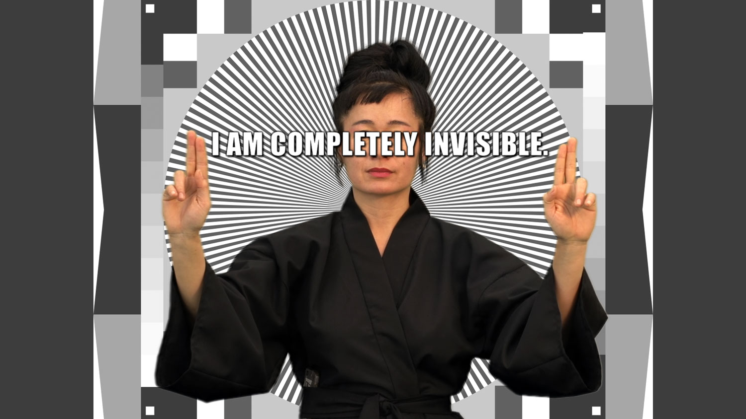
Hito Steyerl’s How Not to Be Seen: A Fucking Didactic Educational .MOV File
The German artist schooled her viewers in the art of camouflage in her famous 2013 video work—in stark contrast to the contemporary world, in which hyper-visibility is becoming more and more normal for the majority of us.
Alice Bucknell wrote: “In fourteen short minutes, the German artist Hito Steyerl will teach you how to be invisible. Mimicking the aesthetics of a “How to…” YouTube instructional video, the tips in How Not To Be Seen come straight from the masters of camouflage: the US government, with their clandestine nuclear testing operations in the desert; modern surveillance agencies; cunning architectural rendering companies; and social media (of course).”
2014
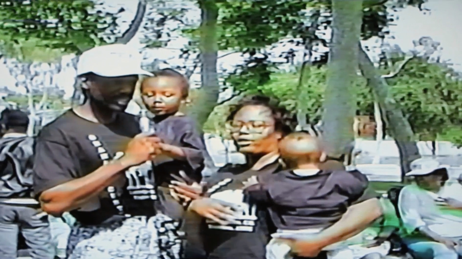
This visual poem, which took four years to complete, was a groundbreaking contribution to conceptual filmmaking by Martine Syms in 2014.
Charlotte Jansen wrote: “Syms’s fodder is the internet and her material is uncertainty; as such her Lessons are not straightforwardly didactic but told as “troofs”, myths that amplify reality. They are aphoristic flashes, quickfire ruminations and gestures that capture the quintessence of the black radical tradition, but also speak of how we process and mediate information, how recent history is passed down, and the impossibility of comprehending.”
2015
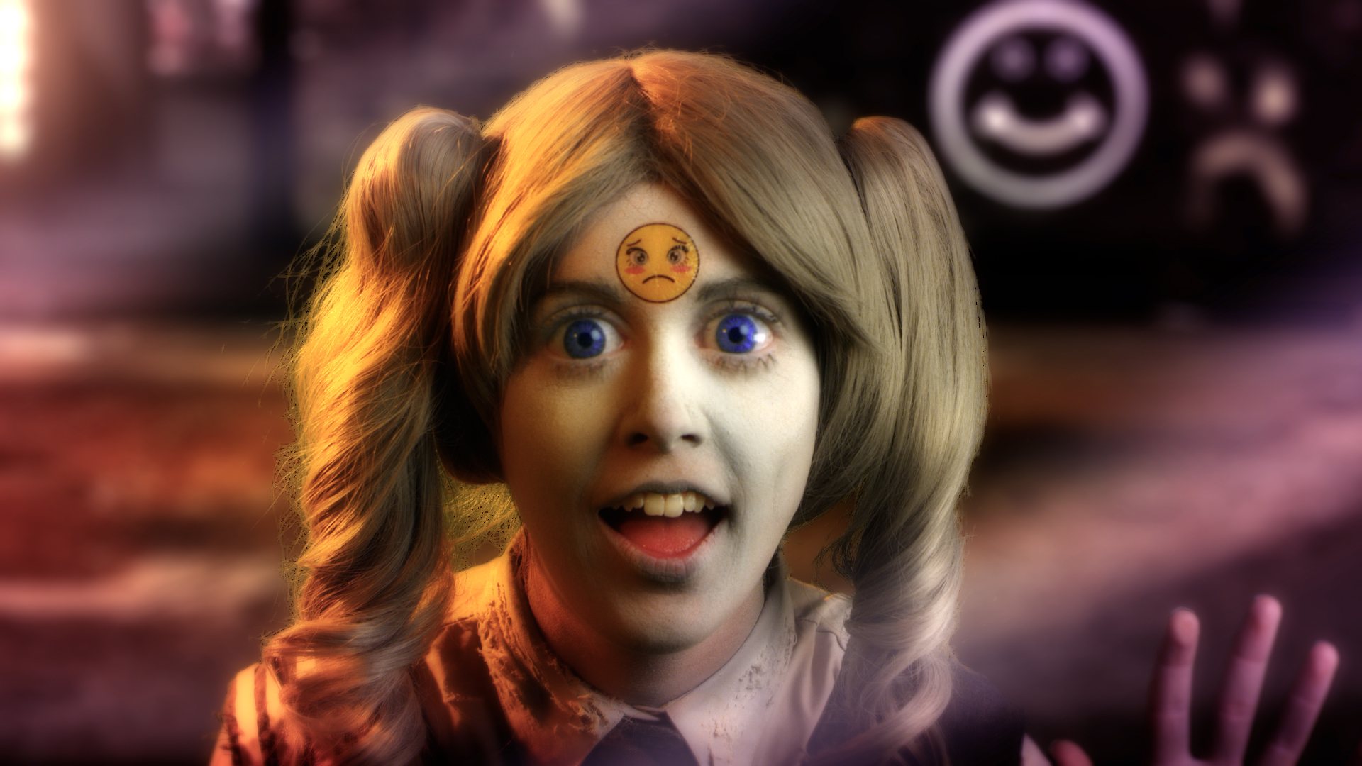
In 2015’s Feed Me, Rachel Maclean’s many self-depicted characters populated a terrifying consumerist world full of candy colours, eerie emojis and simmering menace, contrived by the all-powerful corporation Smile Inc.
Izabella Scott wrote: “Maclean has developed a very particular phantasmagoric palette, both bingey and mesmerizing at once, made up of Polly Pocket pinks and Barbie blues. It’s a hardcore toonland in which perverse businessmen stomp through synthetic palaces, accompanied by digital sparkles, honks and chimes.”
2016
Arthur Jafa’s Love Is the Message, The Message Is Death
In his seven-minute montage of music video clips, historical recordings and police brutality footage, Arthur Jafa painted a picture of black experience in modern-day America.
Izabella Scott wrote: “Jafa’s conceptual art practice explores the difficulty of black representation in the afterlife of slavery. The legacy of the Middle Passage (the era of the trans-Atlantic slave trade) is immateriality, because turning humans into commodities involves the loss of all possessions, including self-possession.”
2017
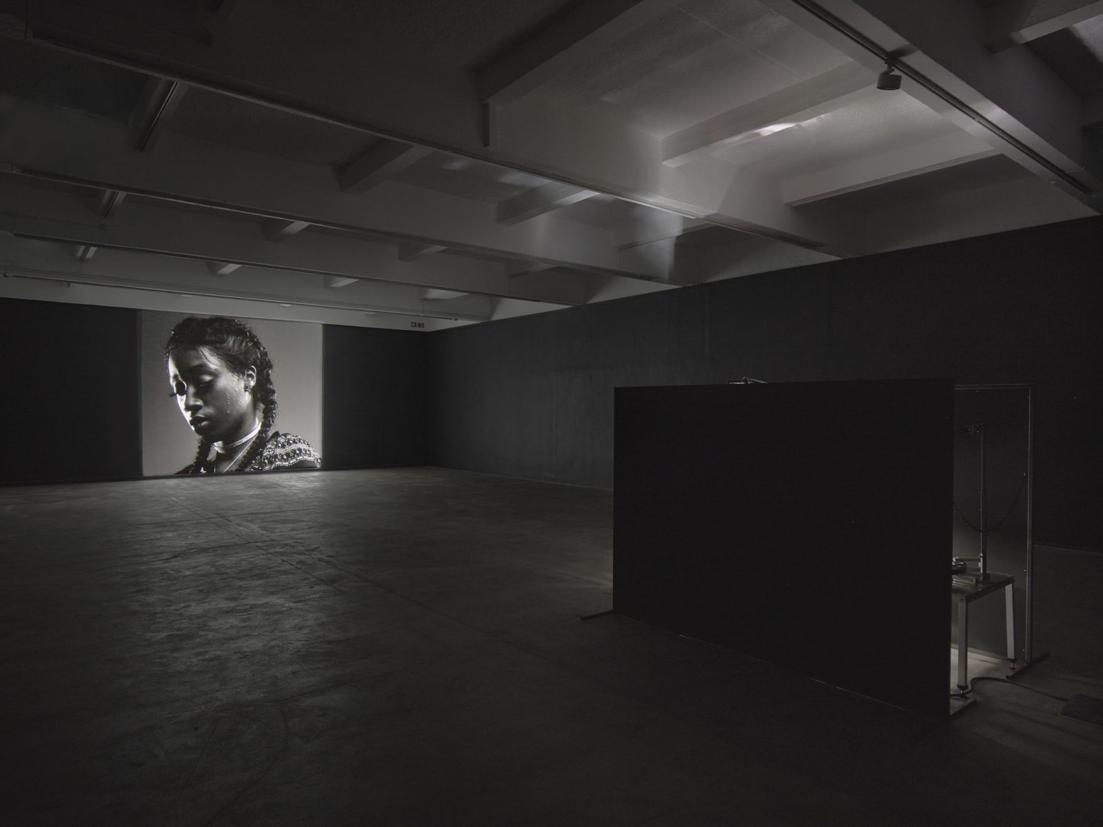
Luke Willis Thompson’s Autoportrait
In 2017 Luke Willis Thompson offered an alternative portrait of Diamond Reynolds, who broadcast the horrifying aftermath of the police shooting that killed her boyfriend, Philando Castile.
Holly Black wrote: “Autoportrait is undeniably cinematic, with visual cues that would speak of sorrow and dignity even if you were unaware of the film’s context. It is a powerful device that cuts through the cacophony of news coverage and social media threads that have engaged with Castile’s death, without denouncing their significance.”
2018
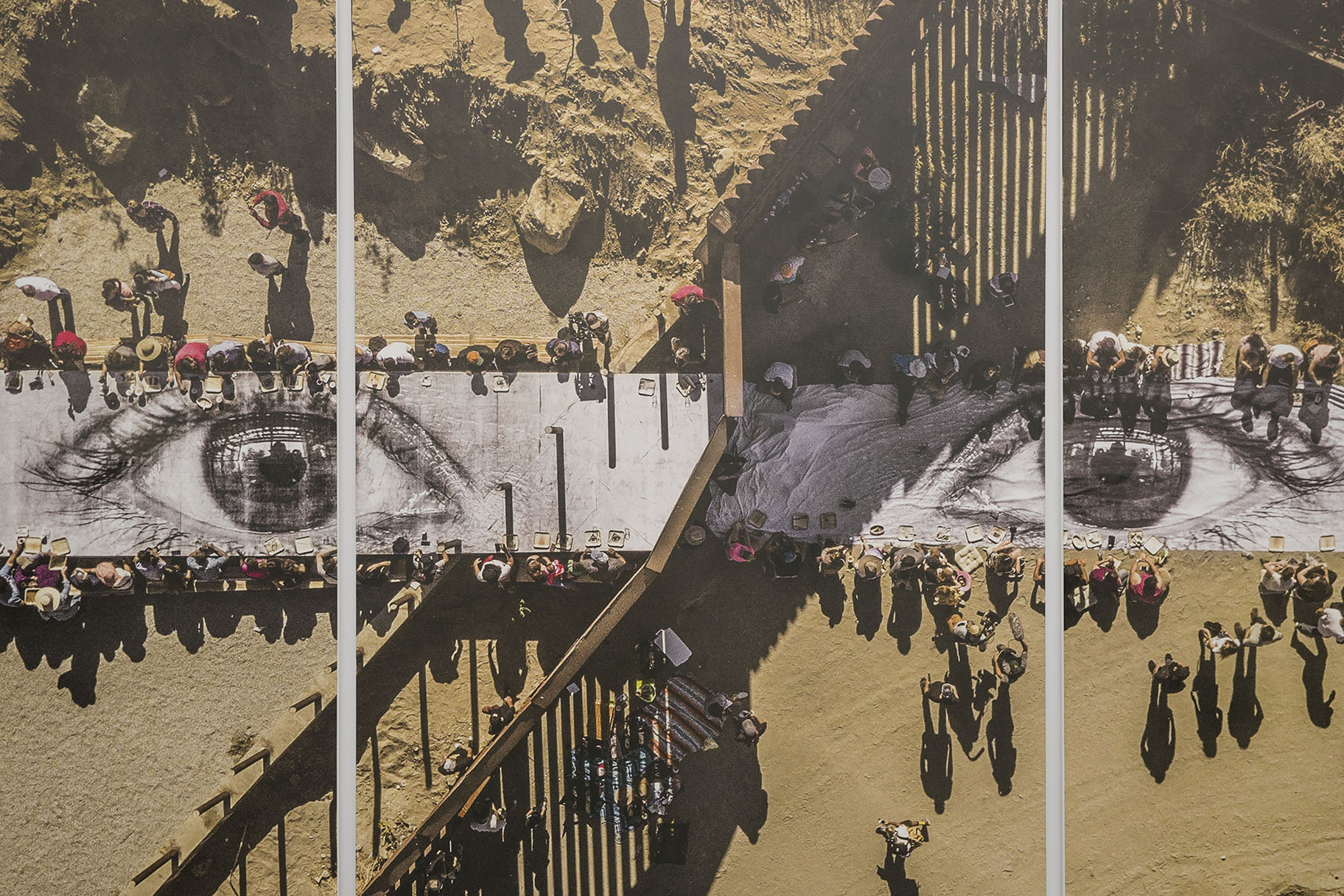
JR’s Picnic Across the Border, Mexico-USA
At the US-Mexico border in 2018, French artist JR invited guests, including undocumented immigrants, together for a “giant picnic” in a project that offered glimmers of community and friendship, against a heavily politicized backdrop.
Holly Black wrote: “The collaborative nature of this picnic was made possible by the people whose everyday lives are affected by migration politics and divisive rhetoric. The act of sharing a meal is always a powerful force for community and friendship, but in this instance, a seemingly everyday act became a defiant political statement.”
